This place gives that all-white San Francisco crib we wrote about back in December a run for its money.
What do you do for fun when you live inside a featureless, colorless void?
Sit around and stare at your Restoration Hardware 1920s German light bulb voltage tester bar, apparently.

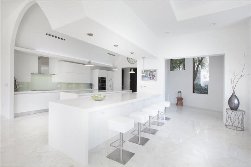
Strange… this place seems not nearly as colorless as the last post. Perhaps there was simply an equal level of various moderate tones in that one, which even out and weigh down the visuals without adding any delight for the eye.
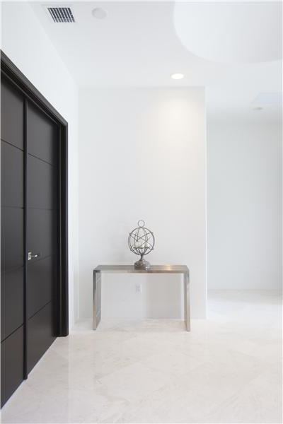
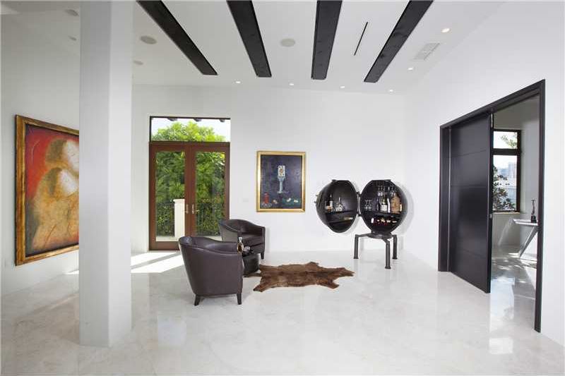
Here, though, dark counterpoint tones are used to highlight windows, doors, and a few built-ins. They’re also used in the most basic furnishings. But the dark neutrals don’t try to contend with the white for dominance; they are content to be appropriately placed articulations of form. Which works.
I’m not wild about so much shiny white flooring; a few more well chosen area rugs would be welcome. I do like the limited but consistent splashes of intense color: Mediterranean blue in Pic 6, magenta orchids in Pic 13 (in combo with zebra stripes!), more magenta in Pic 18, and the background bright greens of Florida’s year-round plant life, seen through almost every window.
I could use a few more of the color splashes, but too many would ruin the clean, open feel. It’s so clean and open the curly-q entry door insets actually work for me (Pic 25). I usually dislike anything even reminiscent of Spanish colonial (the added flourishes, not the general architectural genre) but here it works as a focal point of decorative design in conjunction with the focal point of architectural design – the main entry. Without the crisp white setting, though, it simply wouldn’t work.