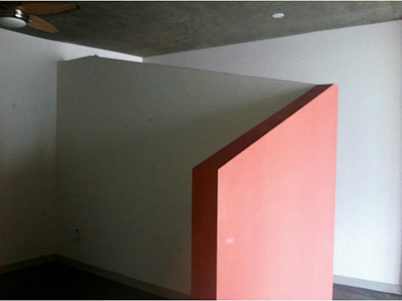
You’re looking at the primary photo for this $186,500 condo in Atlanta. The most-attractive selling point of the home, according to the listing agent. Um. Okay.
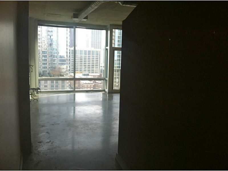
This one’s not much better, but the listing agent liked it so much they included it in the listing twice!
Words fail me.

Marty, at least it’s only words that fail you. It would seem both taste and imagination failed whatever functionary stood in as a designer for this… place. It almost looks like someone decided to use their interior storage space as a cheaper-rent studio apartment, except that it’s not cheaper. Not by a long shot. And there’s not even an upgrade from the polished concrete flooring.
Not often you see a place that has the kitchen as the nicest feature – plenty of cabinet space, decent finish, nice dramatic contrast between it and the back-splash. Too bad it in no way makes up for that, that… that tiny sort-of-set-aside-sort-of-not spot which I assume is for a bed.
The state of some urban living options… Yikes. Or maybe Yuck would be more accurate.
The bathroom must really suck.
I’ve seen some pretty bad listings, but this one wins the prize.
Well, 754 sq ft is bigger than my first apartment. The kitchen is way better than my first apartment, and I rather liked that old place.
That is where the good ends though. According to redfin
“Land $13,000
Additions $48,680
Total $61,680”
I was going to look at the neighborhood to see if I could find out if it was a good location and found a bunch more of these units for sale.
All with the same weird wall, but most managed to put the wall in a much better light/perspective. Like this one: http://www.redfin.com/GA/Atlanta/923-Peachtree-St-NE-30309/unit-1827/home/24799280
There was at least 1 other that used the same pictures as the original posted one too. Very odd.
Well, I figured about all you could really do is get a murphy bed, lose the wall, and go with curtains on a ceiling track as a divider – though as Samme notes, some *light* in the place and finished floors surely help. Then again, maybe they could rent you wide-angle glasses to approximate the lens they used for the nice pictures, too. :D
@Samme: Thanks for the link, Samme! Those are significantly better listing photos. The place looks like it might actually be somewhat pleasant to live in. The wood flooring does wonders, doesn’t it? Also, using the same color on the divider wall and the soffit above the kitchen keeps what space there is from looking chopped up. It being a fairly light color helps as well. That dark orangey one seems to plunge the back area of the unit into even more gloom.
The one thing I’d absolutely have to change, though, is to paint the ceiling white, or some other very light shade. The current raw color isn’t outright hideous, but it is a stark reminder that there’s an enormous slab of concrete just above one’s head. An oppressive psychological mood literally hangs over the place.
“Random Geometric Shapes for sale.”
Oh, and, um, ceiling fan.