Nothing says “I deserve to earn a 3% commission of $50,000” like misspelling the word “responsibility” on the primary listing photo. I’m digging the double copyright overlay, too. So classy.
Also, I’m really curious to know what definition of “ecological” includes a 6,500 square foot home.
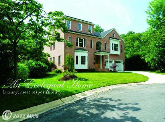


Good question on the eco- bit, Marty. There are some solar panels but it beats me how they can help that much when there’s so much square footage involved.
Also loving your on-the-mark comments about the listing agent’s lack of graphics and grammar savvy.
The house, though, is pretty darn nice. I especially like the combo shower/whirlpool tub with the large window and sky light. Even without it being full of steaming, bubbled water I can feel the stress of the day ebbing out of my body….. Sweet.
Oddly enough, the rational of some fraudsters comes to mind: “There’s plenty other people would’a done worse” … delivered in the context that whatever they’ve been up to isn’t so bad. Methinks it might apply to both the realtor and the “ecological” claim. ;D
My first thought was that having multiple generations in a house that size is more energy efficient than having 2 or 3 separate houses.
My next thought after looking at the pictures is that it is so boring and generic. I know that sellers often paint everything neutral and style generically to sell a place, but this place looks like it never had any soul in it to begin with. Only pic I liked was the bathroom with those great big tiles and contrasting tub.
@Samme: Welcome to the site, Samme! It’s good to see new faces here, so to speak, lol.
I’m usually the first to comment on boring neutral color schemes, but I was OK with it here. At the listing, picture 6 shows a really nice variation in the room’s volumes and picture 9 is well sized, proportioned and has the added touch of the (albeit fake) ceiling coffers. But picture 11… I’m with you – bo-o-o-ring!
I like the multiple generations thing as a means to be more energy efficient. But that almost never happens in the U.S. May I ask, are you from the States or elsewhere?
@Emerald63: Seattle area. Actually not too far from that condo that was added today. I don’t think it is just about boring color schemes, it is up to the buyer to add their own touches on a neutral background. My biggest peeve is when a place has no soul. Just a big box of ostentatiously over sized boxes to keep people in.
@Samme: I do understand what you mean, as I’ve had the same complaint myself. While this example is definitely bland in its unfurnished state, for some reason I don’t get the soul-less feel. Not sure why… Perhaps because it looks so move-in ready, so ready for me to graft my own tastes onto. I’ve seen places that made me think there was just nothing I could do that would really give it a “sense of place,” but I see possibilities in most of the photos shown. It would take work, but it seems possible. I don’t think that has to be the case for everyone, though. It strikes you as it strikes you.