Once in a while you’re browsing the listing photos of what is otherwise a perfectly normal 4.3 million dollar condo (with $4,312 a month HOA dues), when you catch something out of the corner of your eye that makes you do a double-take.
Like the bedroom table in this photo that was designed to look like a subservient little girl (or maybe just a small lady?) frozen in place, head bowed, forever holding up the glass surface just so you can have a place to set your evening cup of tea.
What?

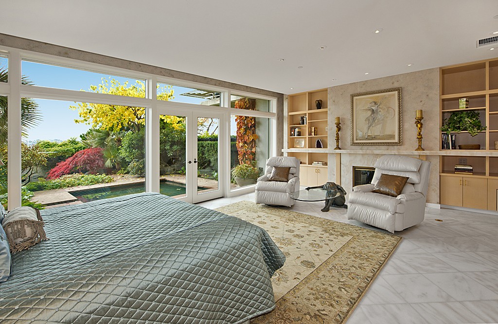
Well, giving them the absolute maximum benefit of the doubt – because the garden view out the window is super nice and the room is gorgeous, except for a bedspread that looks like something meant to wrap radioactive waste – ah, as I say, giving them benefit of the doubt …
I’m thinking that the round, glass top of the table is meant to represent a hoop, via its dark facing edge, and that the concept of the seated figure holding it is meant to relate to the picture over the mantle… which appears to represent some sort of acrobat and an elephant, dancing with a hoop.
It looks to me as though the elephant’s actually got hold of the hoop in the picture, but one supposes this is the table they could find.
@anodean: “…one supposes this is the table they could find”
Actually, given the stunning decor throughout the house, I’d say that’s probably a custom table.
@anodean: BTW, that was a truly inspired catch you made, of the painting and table possibly being meant to reference one another.
OK, I know this is *Looney* Listings, but it is SO nice to see such a beautiful home with such a high percentage of tasteful and attractive decor. Bravo to all involved!
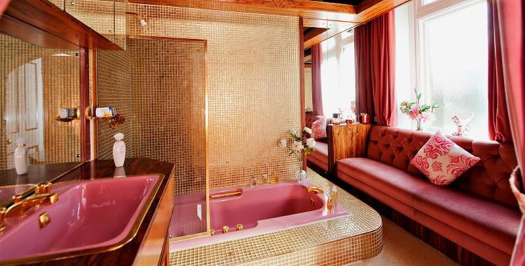
For my own tastes, I do think the dining table and the Egyptian themed bathroom are a bit over the top, but not only a bit. Something I would really like to see addressed, though, is the utterly graceless way the unnecessarily large columns meet the floor and ceiling. There’s a reason classical columns, with both plinths and capitals, are, well, “classic.” I find it odd as well that in such a nicely played out montage of rectilinear forms the architect used *round* columns. Ugh.
Other than those few minor points… WOW. Sign.Me.Up! Although most of the individual features aren’t superb on their own, the combination works extremely well. Not too much or too little of anything. (Baby Bear would be so pleased.) And I have to wonder if the classy decor has anything to do with the house being nowhere near Hollywood, lol.
I especially like the bronze and glass entry door, the black marble pedestal sink, and the way the black granite kitchen counter tops are set off by the blond woodwork. I might choose fewer highly polished and mirrored surfaces, but HELLO! I will deal with just about anything as long as I get that amazing terrace!!! HooBoy that is some little piece of Paradise! Lovely, lovely, lovely, and did I mention lovely?
Just one final thought… the listing insists this is home is all on one level, when obviously the structure has four levels. Does the structure actually house several condos, each on its own level? The place is so gorgeous I can’t imagine anyone wanting to have neighbors quite that close. Marty, can you explain this seeming discrepancy?
@Emerald63: That should have read “but only a bit” in the 2nd paragraph.
@Emerald63: Thank you for inspiring me to go look at the listing!
The decor is as wonderful as you describe – but for me, it’s real triumph is that they did all that inside a glass/concrete eyesore with all the intrinsic charm of an urban bus station.
What transports this place to my wonders-of-the-world list are the gardens. Look out the windows of each of those rooms. I’ve only heard of that effect being achieved. Now I’ve at least seen a picture of it. Wow.
Now look at pictures of the exterior, and mentally subtract the gardens: the place is nothing but a butt-ugly pile of angles. Add the gardens, it’s jaw-dropping. Sheer genius.
They definitely need me to look after all that for them. Sweet little shed in the back with a futon, I’ll dress up in traditional hakuma and wooden geta and keep it nice and spiffy.
This place is a few miles from where I live. Mostly it seems to be a beautiful piece of architecture made by and for designers. It is pretty, but mostly cold with all the white marble and tile. If I owned the place I don’t think my friends would know where to sit. We would all end up in the rooms in pics 11 and 12. Which by the way, the room in 11 is completely awesome. I love the glass table and the art over the fireplace. Those built-ins look like they should lead to secret rooms. The view is beautiful and everything in the room is (rightly) made to be able to see it while chatting on the couches or sitting at the table. There is another bronze statue there, looks like a guy lifting a big fisf or very small boat. People clearly put a lot of work into this house. It just needs more personal touches to warm it up (especially in the northwest).
@anodean: I’m sorry you’re not a fan of modern architecture, anodean. I certainly don’t care for all the different styles, but I rather like this one. This is a fine example of how the rectilinear theme of an exterior can be carried inside, reigning as well throughout the interior – and on into the terrace. The constancy of this organizing theme provides an emotionally satisfying framework, rich in elements, yet easily diversified without destroying the overall unity. (And yes, I realize that not only sounded like archi-speak gobbledy-gook, it is. But it’s also accurate, God help me.) My point is, I personally don’t feel the terrace would work as well as it does if it were paired with most other architectural styles.
@Samme: I definitely see your point about the cold sense. I had meant to imply a similar idea when I said I would have used fewer shiny and mirrored surfaces.
And I liked Pic #11 the best too! Nice squashy sofas, plenty of bookshelves (though woefully underutilized here), and a killer view.
One reason I love this terrace so much is that it strongly reminds me of Oakbrook Center in the suburbs west of Chicago. I grew up in nearby La Grange Park and we would often go shopping there. You can see an image of it, circa 1966, here:
this photo:
http://www.chicagopostcardmuseum.org/images/exhibit_halls/marshall_field_and_co/Oakbrook_Center_Marshall_Field_Store_F.png
Pics 2 and 9 here:
http://www.americaspremiershoppingplaces.com/apsp/locations/profiles/oakbrook-center.html…
also illustrate the Center as I remember it, although they’re contemporary images.
The Center has survived as a popular shopping area for many years, though these days the particular stores are *all* very high-end. When I lived in the area, from 1966-1974, the likes of Marshall Field and Lord & Taylor sat side by side with Sears and even Ben Franklin. I did not have an opportunity to return for a visit until 2006. In the interim, the upscale shops took over and some new structures were added, but the overall style, especially the mid-century modern terraces, remained intact.
Well, ok, you guys convinced me to go back and look again (and follow those links, thanks!). You are absolutely right that no other building style could bring in the garden views or support that terrace. And when I ponder it, I can accept the dignity of the rising rectangles – I think what defeats me are the railings. Perhaps it’s just the time of day/shadows, but they rasp the nerves like visual static in the exterior pictures. I’m not sure what would solve it, but that effect is very hard to bear.
As a result, I think my favorite picture of all is #2, looking inward to a wonderful promise of repose, answered by #5, looking outward from same. (Note the nasty railings having been neatly left off.)
The place does need more furnishings like those sofas and they could surely reconsider some of the piled-on ooh-la-la effects: even that lovely side-yard garden can’t overcome those dining room chairs. The massive desk ensemble probably looks better once you’re sitting there looking out, but – oiks.
@anodean: RE: “I’m not sure what would solve it, but that effect is very hard to bear.”
I’m thinking a single horizontal bar element (or perhaps a main bar with one smaller one below) with vertical tempered glass panels below that. Using the same spacing the current vertical rails provide would create a second tier of almost transom-like “windows,” similar to the already those found above the main windows.
One drawback, though – the glass would require frequent cleaning.
@Emerald63: One drawback, though – the glass would require frequent cleaning.
… heh heh heh. I also see a significant need for someone to skate about on poofy polish mop feet. :D