A little tasteful HDR can make for some good-looking listing photos.
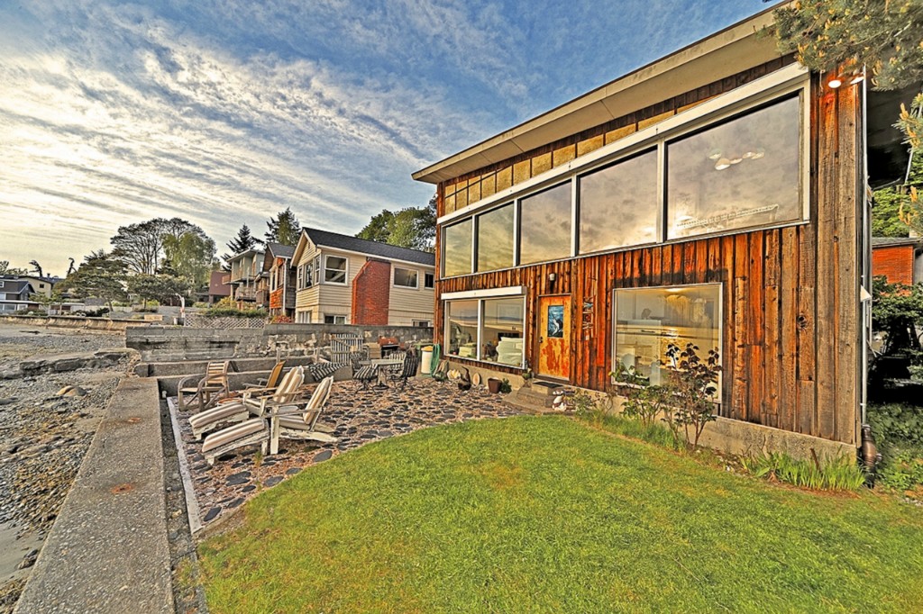
Unfortunately, the HDR applied to the photos of this listing is neither “a little” nor “tasteful.”
This would be a truly terrifying reality to live in.
The exterior shots are the least-terrifying of the set, but even those have an almost cartoon-like feel to them.
If I were the seller of this $1.2 million home, I would fire the listing agent and the photographer immediately. These photos are a bad joke.
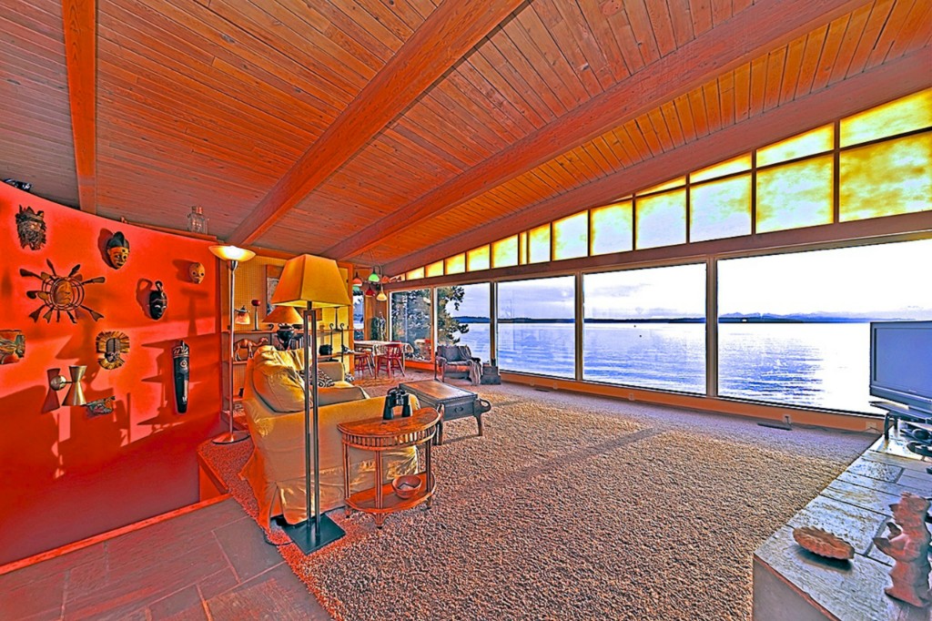
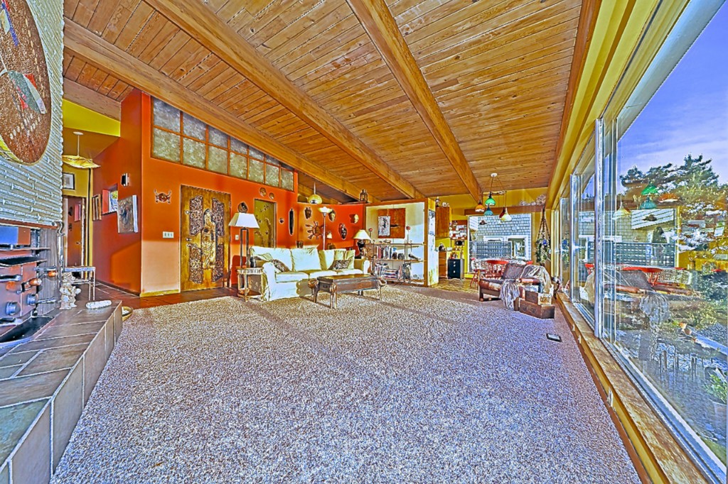
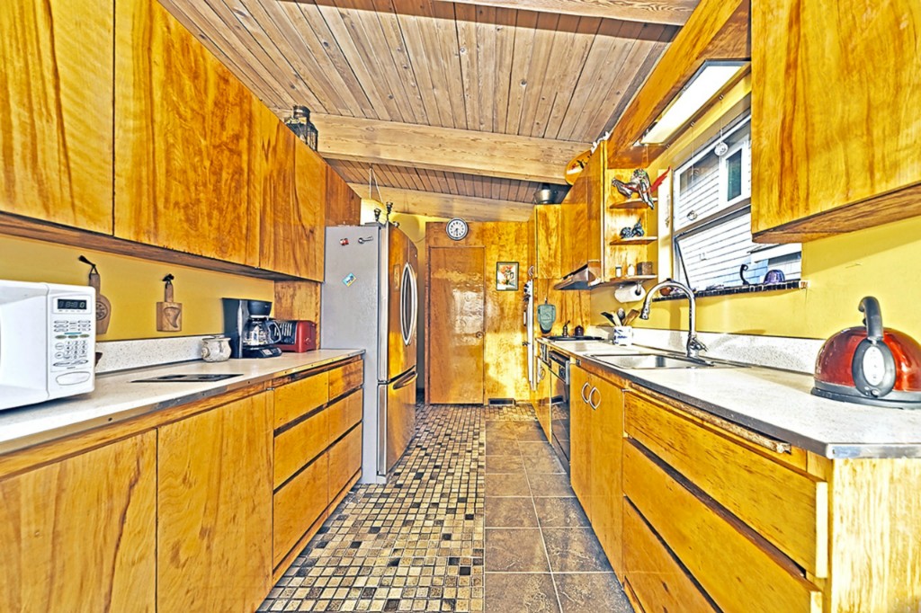
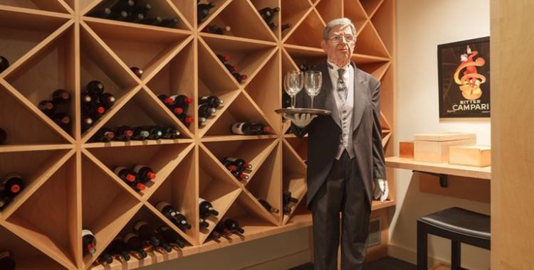
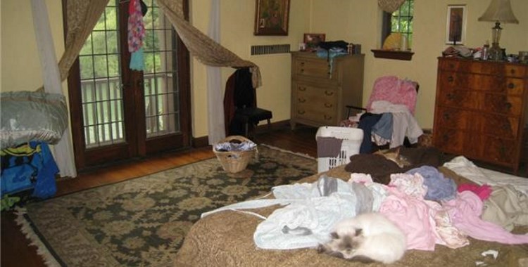
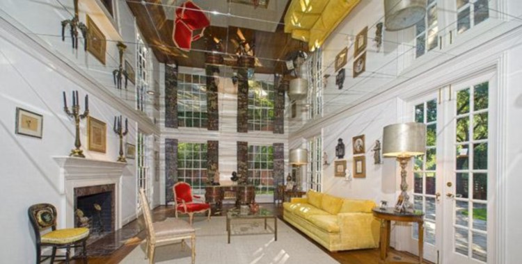
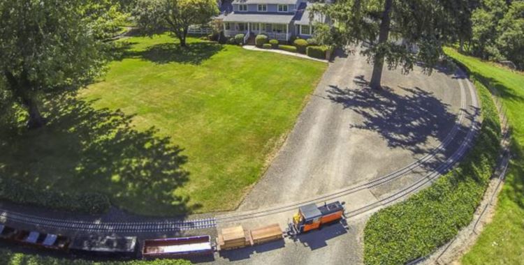
I’ve never dropped acid or taken LSD, but from the descriptions I’ve read, I wonder if this is how those kinds of drugs cause people to experience the world.
If so, count me out.
Perhaps this is a clever use of technology to fend off inquiries from the wrong sort of customer? Perhaps all the “right” people have special viewing glasses that allow them to view these cunningly distorted images in perfect comfort, while the rest of us shudder and pass on? Hmm…
If Tammy Faye Bakker weren’t dead I’d swear she took these photos, the 2D equivalent of her avalanche of make-up. Revlon wouldn’t hire her as a spokeswoman; sellers shouldn’t use this photographer. And being garish isn’t the only issue; there’s also major distortion.
The house has lots of promise. It needs redecorating but the basics of what’s there are pretty nice – soaring ceilings, expansive views, hardwood floors and the living room’s brick wall.
First to come out – the masonite peg board walls (better in garages and craft rooms) and the split personality flooring in the kitchen. BTW, the kitchen pics have some of the worst distortion; is it U-shaped (Pic 9) or a galley (Pic 10)? Maybe it’s a Hogwarts-style morphing space?
Other changes – the too-dark entry (Pic 4) and the alabaster-like wedges above the living room windows. The division of their space is awkward and their opaqueness detracts from the wedge shape of the wall.
Last, despite being authentic mid-century modern, I’d want a price reduction. Considering a complete lack of outdoor private space, the state of neighboring homes, etc, $1.2M is a bit much for me.
@anodean: I think rose-colored glasses might do the trick. Might.