The current owners of this home have definitely made some… interesting decor choices. Especially in the bathrooms.
They each seem to have their own “theme.” I guess sometimes you have to be in the right mood to go?
I think my favorite room is probably the basement den though.
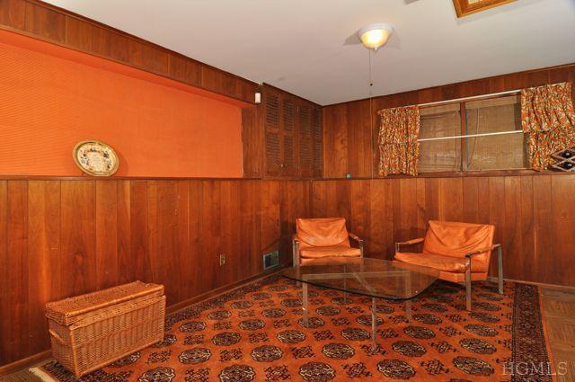
So that’s what it would feel like to live inside a pumpkin!
One could do a lot worse than this house and the proximity to Manhattan is a plus. Switching out the turquoise and pink bath fixtures may be too expen$ive, but there are alternative fixes…
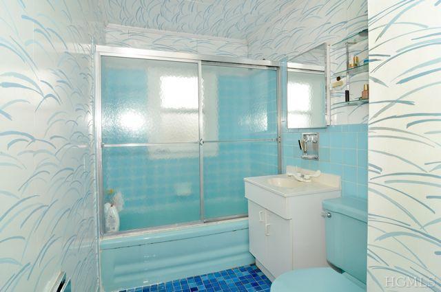
In the turquoise bath, remove the blue floor tiles, replace with 4″x4″ white ones, paint the vanity sides in a coordinating (i.e. lighter or darker) turquoise, return the ceiling to white. Result – horizontal surfaces white, business surfaces turquoise, walls can retain the current wallpaper without it seeming too busy or fighting with the previous floor color.
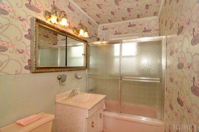
In the pink bath, ditch the wallpaper, replace the hideous mirror and light fixtures, and use a velcro-attached cloth skirt around the pink “marble” vanity to tone down the over-abundance of color and pattern. Minus all that, the wall tile is actually a decent pale gray. For the sink skirt, a *subtle* pattern (perhaps a small plaid to echo the tile) in shades of pale grays and pinks. For the walls, a palest gray or barely pink-tinted white paint. The result will be easier to look at, if not altogether attractive. If it’s possible to swap out the vanity for something plainer, then a much milder wallpaper could be added. But again… leave the ceiling white!
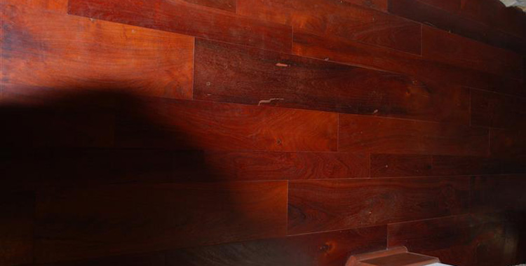
What to do with the pumpkin room if there’s no money to replace the paneling? Unless you *really* like warm colors, ditch the paneling-matching rug and furniture. Instead, use a complementary color scheme: a bluish pale gray as a background neutral and shades of slate blue for furniture and accents. Or… paint the paneling, though that seems wrong. (I’ve never been one for paint on paneling, or brick either, except on rare occasions.)
Also… The weird sliding curtain panels in the living room and the similar hideous closet doors need to go. Lighten up the overly dark kitchen cabinets (painting them is cheapest), limit wallpaper to either below the chair rail OR to a border print at ceiling level, and re-grout the floor tiles in white. Some new flooring for the patio area, expanded landscaping, and a new exterior paint color and you’re good to go without creating a money pit.
Bathroom 1: Not too bad, though I would only bring the wallpaper up about 5 feet, solid pale blue to the ceiling, then install faux pressed tin ceiling tiles in a nice matte white. Possibly even reduce the blue paper to a strip about 3 feet wide around the room, with white matte dado and a chair rail from the bottom of the strip to the floor. And sheesh, at least install a blue sink to match the tub and toilet, and break up the blue tile monotony with a nice white-to-blue-to grey ombre.
Bathroom 2: AAACK, too dang much pink…I feel like I’m inside a giant box of maxi-pads. At least the sink matches the rest of the appliances though. I’d do the same with this one that I’d do with the other room; dado and chair rail to about 4 feet, 3 foot wallpaper strip, etc. I’d drop the mirrors 6 inches down too, because for goodness sake you’d have to be 6 feet tall to use them comfortably.
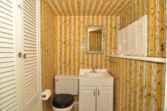
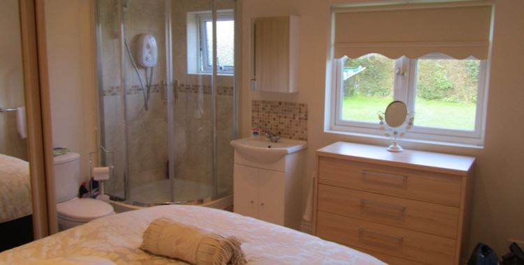
Bathroom 3: Sweet leaping Montezuma on a blind unicorn, this is the kind of bathroom you show guests to that you want to leave. I keep expecting Sheriff Woody to pop out of the mirror yelling “THAR’S A SNAKE IN MAH BOOTS! Dump the hideous wallpaper, bring in some nice pale neutral to make the room feel larger, put in a larger mirror, and…oh screw it, just take out the appliances and turn the poor room into a walk-in closet before someone bangs their knee one too many times on the toilet paper dispenser.
Basement Room: Well, if you’re gonna go all the way and make the place feel like a page out of Better Homes and Gardens 1965, this is so close you can smell Googie’s Coffee Shop if you open the window. Throw a starburst clock on the wall, put a Lava Lamp on the shelf, put in a Formica hairpin-leg coffee table, top it with one of those rounded-triangle ash trays made of tangerine glass, and get your MiMo on, baby!
I keep expecting Sheriff Woody to pop out of the mirror yelling “THAR’S A SNAKE IN MAH BOOTS!
*Snurfle!* Oh, that’s good. Yes, this deserves a place of honor in our “Wallpaper patterns that make it look like things are crawling on the walls… and the blind unicorn would know better than to slap that vigorous a pattern into such a tiny little room!
One cheap way out of the basement paneling horror show (my immediate reaction was “Yikes! – Campbel’s Tomato Soup!) is a sort of thick, tough paper specifically made for hiding wall faults – specifically, the troughs in crappy old fake paneling wall-board. Some of it comes with a concealing texture you can paint right over…
And while you’re right about how little it would take to re-stage it back to 1965, I think my head would explode. Not that you’d be able to tell it had, in that room…
I looked through all of the listing photos, and the conclusion is that I loathe the decor in every single room. Yuck.
@K: The good news should be that it’s the *decor* you loathe, not the actual house. Decor can always be fixed and/or completely changed.
@Denita TwoDragons: Ditto on anodean’s *snorfle*!
“…at least install a blue sink to match the tub and toilet…” You might have a bit of trouble matching the color. I’m not sure you’d even find anything at an architectural salvage place, since they usually tend toward classic items (classic, not necessarily classical). I’ve heard there’s a product and/or process for painting porcelain but I don’t know if it would work on synthetic materials. Definitely worth a shot, though.
“I feel like I’m inside a giant box of maxi-pads.” ERG…. Gross, yet highly accurate. “At least the sink matches the rest of the appliances though.” I noticed the sink top and the vanity sides don’t match each other. It’s the vanity that I find more troublesome. The faux marble look of the sink isn’t that bad and actually adds some visual interest to all.that.pink.
“…oh screw it, just take out the appliances and turn the poor room into a walk-in closet.” Now that you mention it, those louvered doors may indicate that this *was* a closet before it was a bath. Depends on whether they’re the bathroom exit of open to storage space. I hadn’t approached this bath before because “Kill it, kill it with fire” didn’t seem like a viable decorating process, lol! Anything, almost anything, done to that particular bath would be a massive improvement.
@anodean: I hadn’t heard of the paneling covering material before. It sounds like a great product, but also like it’s exclusively for covering fake paneling, the composition stuff (*boo-hiss*). I’m fairly sure what’s in this basement is the real deal. My parents’ family room had almost the same color paneling and it was 100% hardwood that had, sadly, been stained in the same extreme color.
When I looked at the photo again I noticed how the lower part of the wall projects out a few inches from the top part. That’s to accommodate the wider foundation wall. It makes for a convenient visual break line, as well as providing a convenient display shelf of sorts. It would make a natural way to introduce a two-tone wall scheme, going with either no paneling or painted/covered over paneling on the top half. IMO, it would be a shame to give up on nice hardwood paneling entirely, so I’d strip it and stain it a lighter tone. With that much color, though, you might only need to bleach it a bit to end up with that lighter look.