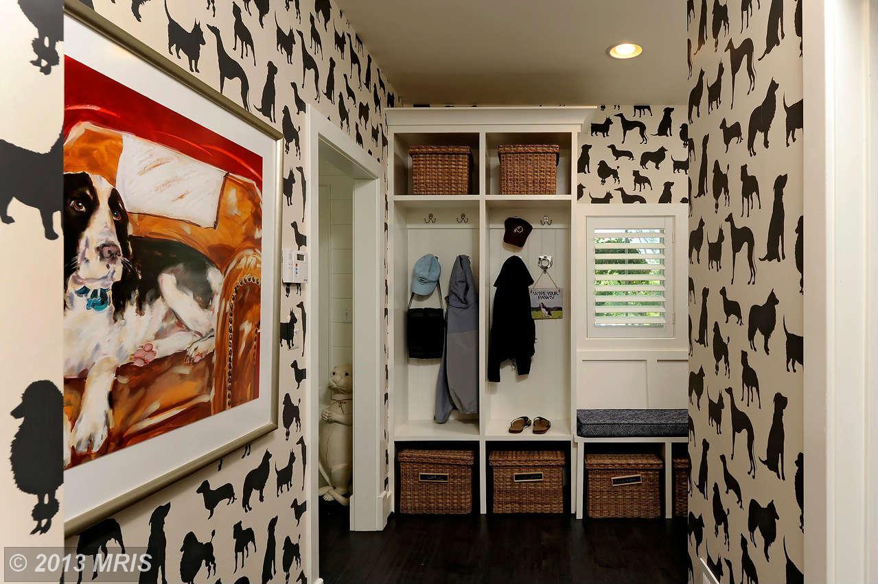
Why would brand new construction have a dog shrine closet? The rest of the house looks normal enough, so what the heck is going on with this closet?
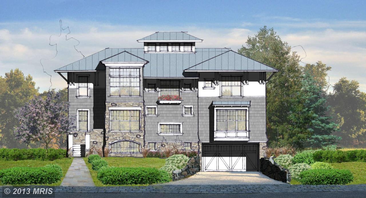
Also, the only exterior photos are drawings. Does this home really exist or is it just some kind of trap placed by intelligent canines hoping to lure in unsuspecting humans for a game of fetch?
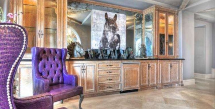
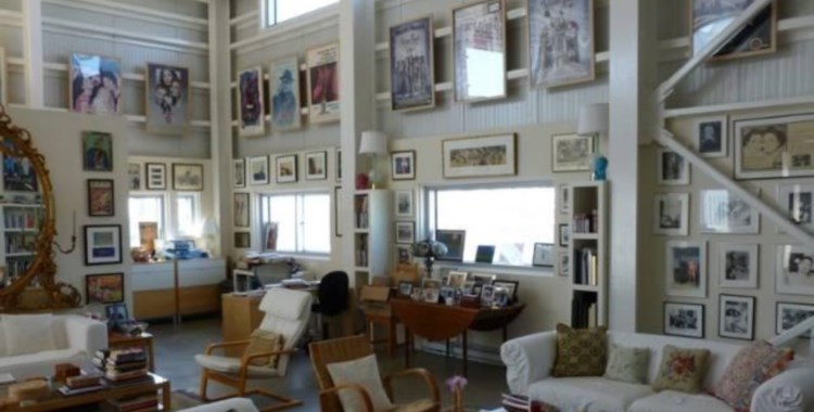
I forgive them the dog room since the rest of the house is done in such uber impeccable taste. Besides that, I just might do the same thing in that closet space with black cats instead of dogs, lol!
Definitely not a trap set by canines. Only cats have both the necessary level of deviousness and the large scale planning ability to pull this off. Unless this room is actually a hunting trophy room for cats, I surmise some human really likes dogs. Wanting the rest of the house to “look normal enough,” they needed to confine their doggie-philia to a small, secluded area. As offbeat as the shrine itself is, I’m more intrigued by the upright otter statue peaking through the doorway. Talk about devious looking… Hmm, I can’t imagine otters paying tribute to dogs, though. Nope. Humans.
I note there is a model home nearby; I assume the interior photos are of it. Any place done enough to have that much nice furniture in it would be complete, or near to it, so there’d be no exterior renderings, just photos.
Only two minor things caught my eye, the marble counter top in the butler’s pantry (it’s not a public area so why waste the money) and the Sheik of Arab-ee wall and ceiling coverings in the nursery (most unbelievable dust catcher I have ever seen). Both of these would be easy enough to remedy, though the counter should never have come to pass in the first place.
The one major thing is the down slope into each of the two garages. (The last of the listing images shows a single driveway servicing two homes.) It appears to be a fairly steep drop, even though this property isn’t very far from the Potomac (less than 1/4 mile), with a good sized canal between them. Worst case scenario is the Potomac in flood and the homeowners with a basement full of water and no flood insurance.
Now for something weird… I took a walk around with google street view and this neighborhood is already a neighborhood, and it’s not run down either. Nor does it seem the place to cram two $2M houses onto one piece of property, which necessitates permission to split the lot, although both homes would need driveway access. Unless, that is, the homes will only be leased. But that doesn’t seem to be what’s going on here. Given that the lots don’t look that big and many of the homes on the block seem much smaller, I have to wonder how the permit to build them here was acquired. Perhaps DC has fairly loose reqs when not in a designated historic area? Even weirder, the listing says there’s a home here, built in 1920 and updated in 1960, with 3 bedrooms, 2 baths, on one level with 1500 sq. ft. If the new place is already in the works (if…), why include this info? If not, just what is going on? Besides the dog shrine, that is.
@K: Black cats – Yes, Please! >^..^<
@Emerald63: Oh geeze….. that did not look *anywhere* near that long when I was typing it!
oops…..
@Emerald63: However, your stream of thought was fun to read anyway. I thought the house was pretty.
As is my habit I am picturing the family who lives here. They just bought this newly remodeled house and most of it was very nice. They decided that the mudroom needed a little sprucing up though. Since it would be the place to keep the dog stuff to keep it tidy and accessible for walks and such they decided on a dog theme. So they went to the wallpaper store and found a little wallpaper sample with dogs on it. They pasted it up on the wall and then realized that a little bit of dogpaper is cute, and an entire room of it is insane. Also that applying wallpaper sucks.
After wallpaper-gate they vowed to live with the dogpaper as a reminder and forever onward they paid a professional decorator.
@Samme: I like the house, too, regardless of which one we’re seeing – one of the two planned and/or under construction at this address or the model home nearby. The one (two?) that is for sale is new construction, though, not remodeled. Presumably the 1920 cum 1960 house is either gone or will be. Like I said, it’s all very confusing as to what’s actually going on.
Marty, could you perhaps use your real estate listing fu to figure this out?
Thanks for the kind words, Samme. Brevity has never been my strong suit (or even my middling suit). I like your analysis that the roomful of dog paper serves as a warning against the evils of wallpapering… the verb, that is. The noun is OK. Just so long as someone else is sticking it where it’s supposed to go. :P
@Emerald63: LOL “Sheik of Arab-ee wall and ceiling coverings”! I looked at that room and imaginedd this conversation:
“My vision is to do this room in beige! Beige with sand and ecru accents!”
“But, honey, beige is so…well…so *boring*.”
“But not just beige! Sand and ecru accents! And zigzags! And swoops of fabric on the ceiling and walls! It will be the busiest beige room you ever saw!”
“But…where will we get enough beige fabric to do the whole ceiling and walls?”
“Oh, I already got it. I found 15 bolts of beige fabric on sale at JoeAnne’s.”
So personally I don’t care for the busy-beige baby bunkhouse. But I’m fairly certain that the blue-and-white curtains in the master bedroom are the same ones I have in my own.
@JMixx: I’m not in with the color scheme, either. But ya know what? Studies have shown that very young babies don’t really see color very well, or have trouble separating color and pattern, or something like that. The researchers found that strong, geometric patterns in black and white got the most attention from babies and maybe helped them develop eyesight focus control and/or brain-enhancing attention spans. That’s why there were a lot of b/w patterned nursery items around for a while, and quite a few are still available. No clue, though, if the strong b/w contrast is mandatory or if the less contrasty beige/sand/ecru would still do the trick. All I can say is, as bad as this is, just try to imagine the room in black and white. (O_o)
@Emerald63: I agree with Samme. I love your commentary. Don’t mind if it goes long.
I thought it was funny that you mentioned the butler’s pantry. If you are looking at photo 5, I think that’s one end of the kitchen. The other end can bee seen in photo 2 as it spills out into the dining room. I thought it odd that the actual kitchen area seems smaller than the bathroom in photo 10.