Sometimes you wonder if a listing agent was drunk when they uploaded the photos of the home they’re allegedly attempting to sell…
And drunk when they took the photos.
Actually, given the home’s decor…
…I can’t help but wonder if the residents were also drunk when they chose their furniture and accents.
So many questionable choices here.
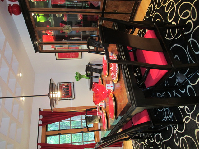
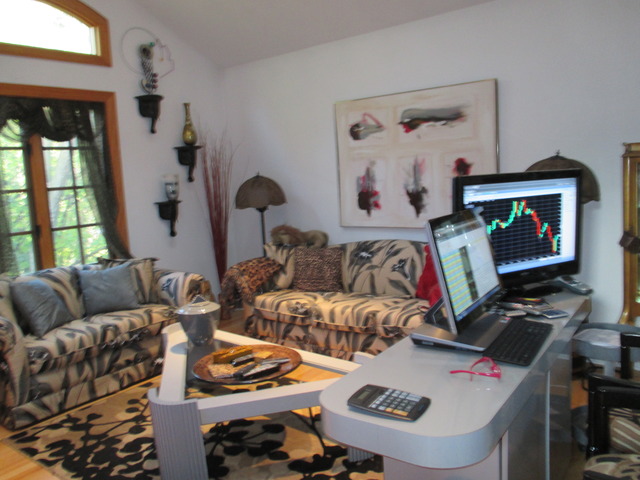
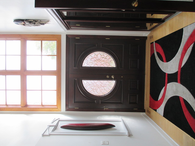
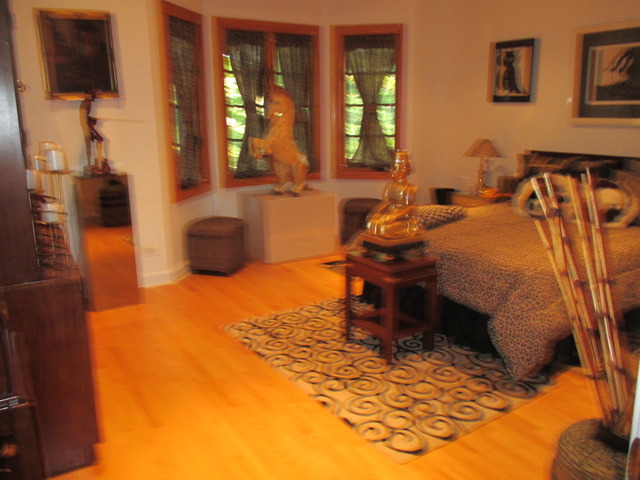


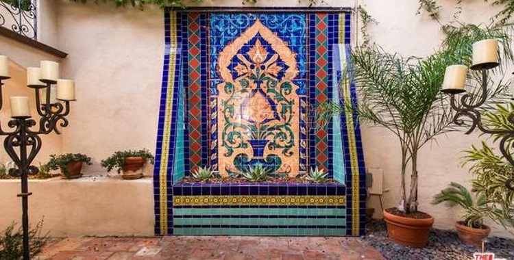

Looks kinda like the architect was drunk, too (Pic 1). Tudor, Norman… Generic… What the heck is it? The interior, sans decor, isn’t bad though.
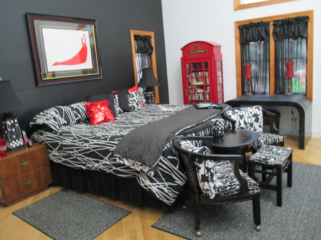
Other than the bizarre wall decorations in Pics 6 and 14, I can get on board with black, white, gray, and red (love the phone box book shelves!)… just not in this setting. They don’t work with the wood-tone window frames, cabinets, stair rail and floors.
Another “doesn’t work” bit – the occasional lime green item. Whatever effect they were aiming for, they missed. The worst bit is the chair choice in Pic 18. Something between “ACK!” and “UGH!” slipped out the moment I saw them. The designer seems in need of a “special test” and the buyer should be Gibbs-slapped then required to take an aesthetics class. Seems they were trying to recreate Tim Burton’s “Alice” …and we all know that’ll never work without Johnny Depp.
BTW… if you’re showing computer on, don’t have a downward trending graph with lots of red onscreen and, for heaven’s sake, don’t show any bathroom artwork that seems to feature a person in need of laxatives! (O_o)
Well, my “Don’t look at things that tumble” rule kicked in again after the first picture, leaving:
“Oooo! All the yummy fancy red Jello mold you can eat! … sideways. Um. Oops…”
Am I just a little more tippy-canoe than usual, or is interior design becoming an xtreme sport?
@Anodean: Always has been in some venues. Sometimes it’s like modern art – it has a real PoV it’s trying to express, legitimate avant garde if you will. (Which doesn’t mean it’s attractive, BTW.) But more often it seems extreme interior design is just weird for weirdness’ sake. Kinda like lots of other things these days, IMO.
Of course there’s also the old stand-by – weird as an unintended (and even unrecognized) consequence of CAI – Congenital Aesthetic Impairment. It’s a devastating disease, but thankfully Duchess Catherine of Cambridge (Princess Kate) has agreed to re-energize the late Audrey Hepburn’s ISI – The Institute for the Style Impaired. Ms. Hepburn was known for her humanitarian work in Africa, but few know she also toiled ceaselessly behind the scenes all over the world to promote aesthetic awareness, especially among the most dramatically effected CAI sufferers… members of the too often taste deficient “new money” set. Thank you, Duchess, thank you. We know how very much work lies ahead of you and we wish you the best… literally.