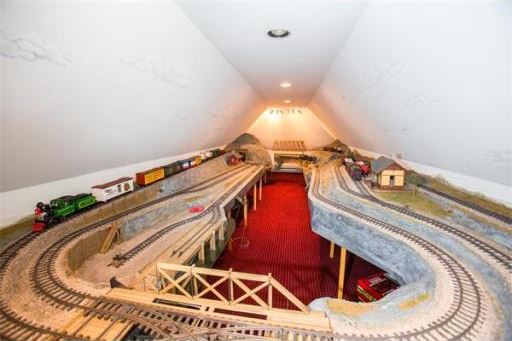
What I love about this one is how the model train occupying the entire attic just suddenly jumps out of an otherwise perfectly normal photo set.
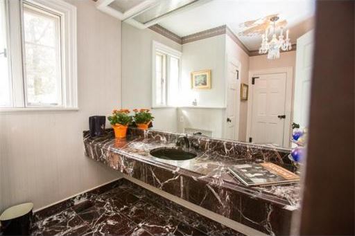
Okay, a mostly normal photo set. I especially love the LP on the counter. Because the bathroom is where people keep their vinyl.


Perhaps I am not the only one who requires accompaniment/drowning out (pun totally and completely intended!) when singing in the shower. Get that vinyl spinning, and crank up the hot water!!
“AAHHHahhhahhh…wanna rock and roll all NI-II-IIGHT! And party every day! Lemme hear ya sing it! AH-Ahhaahh…”
What with the ivy-covered brick exterior and the multiple arched windows and doors (the latter painted turquoise blue, no less), I’d call this place “quaint” …except for the 8500 sq ft of living space! (O_o) To get a better idea of just how big it is, check out the Virtual Tour link about 1/3 of the way down the listing page. (It’s actually just floor plans, including all 3 floors of the main house *and* both floors of the 3 bedroom carriage house.) The living room alone is a whopping 22’x33′!!! No wonder it isn’t overwhelmed (just whelmed, I’d say) by exposed dark-stained beams. And what does one do with a 24’x14′ “reception” room, which is *twice* the size of my own living room? How many guests do these people receive, anyway?! (BTW, Virtual Tour #2 is nothing more than the listing pics in a slideshow set to music.)
It’s a pity so much of the interior doesn’t live up to the almost whimsical nature of the exterior. There’s loads of Colonial formality going on in the main level, including rooms being a sequence of separate, boxy spaces, which are not helped by the dark stains on paneling, floor, and furniture. Purists might call it sacrilege, but I’d be sorely tempted to paint over a good deal of it.
And the kitchen… Gods help me that has got to be THE most boring kitchen I have seen in ages. I’ve seen closets more exciting than that space. Even the generously sized butler’s pantry puts it to shame. Perhaps they were trying to make up for it with the hideous bathroom. Veined black marble has its uses, but vast expanses of it in an otherwise conventional powder room shouldn’t be one of them. (And is that possibly a book, rather than a vinyl album?)
The one interior (or semi-interior) space I do really like is what’s labeled the family room on the floor plan. I’d call it a day room or sun room myself. Not only are the arched window/door combos fun, the vaulted ceiling is too. It’s also a good example of how a heavy material on the lower half of walls can be counterbalanced with lighter tones above. While the leather sofas are a bit heavy-handed, the green carpet makes a fun transition to the outdoors.
The red carpeting in the train room is interesting, though it does make the room seem awfully confining. Perhaps if there were dormer windows (Please!) the heavy tone would seem more sporty and less visually weighty.
I’d have to see more pics of more areas before saying whether the place has serious layout issues. The floor plan seems to suggest that there isn’t a good sense of flow among spaces. Nice carry through of coordinating decor can sometimes help with that, but if it were mine, in addition to that I’d prefer to somehow remove elements that are making the spaces seem compartmentalized. And I’d definitely be looking to move towards a more casual and/or lighthearted feel. It’s nice now, it’s just not me.
See, I took one look at the train set and thought, “Nonsense! What you want up here is a bowling alley!”
Sing anything you want, J, I got you covered. Pin boy! Rack ’em up! SPLOK BLOKKLE BLOKKLE BLOKKLE BLOKKLE SPLOK!
@Emerald63: “The floor plan seems to suggest that there isn’t a good sense of flow among spaces.”
Definitely no feng shui here. From a purist standpoint, I like it. I could live here. However, I do like spaces that have a natural flow to them that produces a more efficient and functional space.
@anodean: ROFL!! My rendition of Paul Stanley’s vocals is rendered inoffensive!