From the listing description:
True to the streetscape of historic Greenview Avenue, this classic Princeton home, Victorian in style with its picturesque turret, has been completely re-built and transformed by J. Robert Hillier as part of a seven unit enclave of exciting new homes.
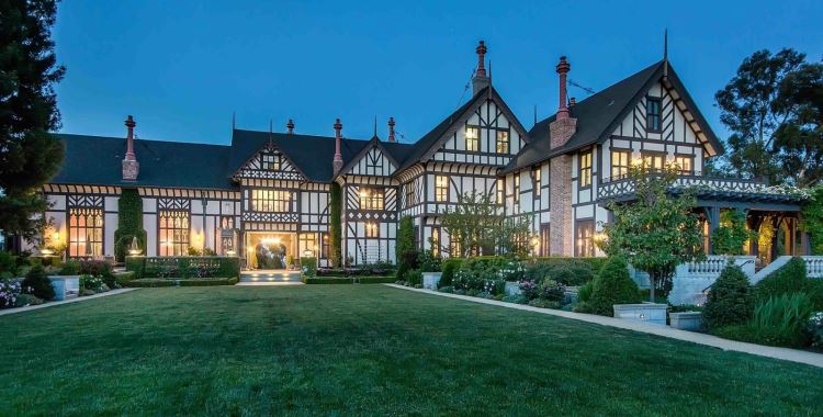
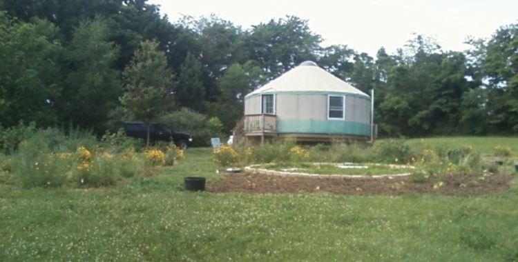
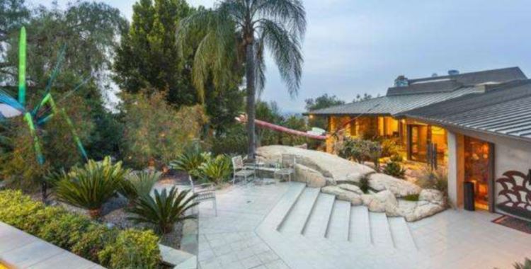
You’d be forgiven if you can’t spot the picturesque turret, or the “Victorian in style” home at all in many of this listing’s photos, because for some reason they decided to include a bunch of unrelated exterior shots of the rest of the “seven unit enclave.”
Once you get inside the actual home for sale, I hope you like white.
And cheap pine cabinets. Click through to the listing if you want to get dizzy spinning around every interior room.
As for “the streetscape of historic Greenview Avenue…” Check out the view directly across the street from this place:
Picturesque!
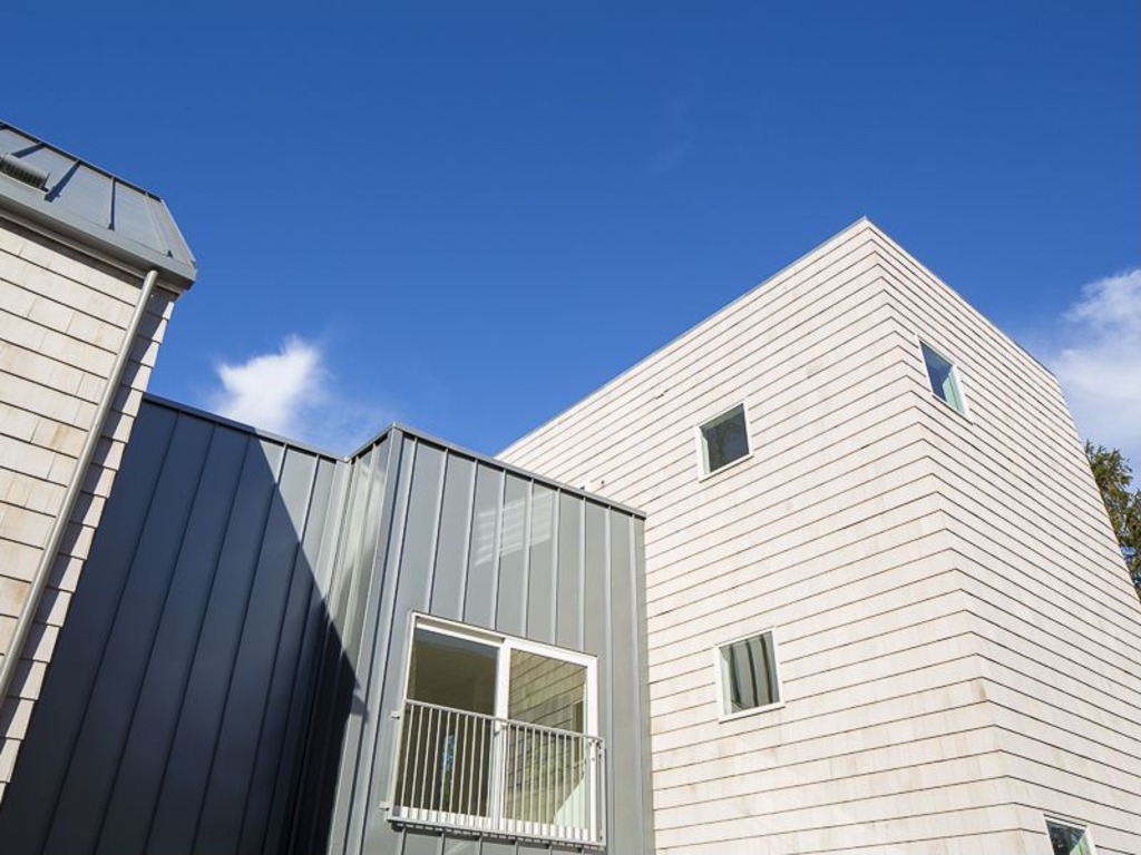
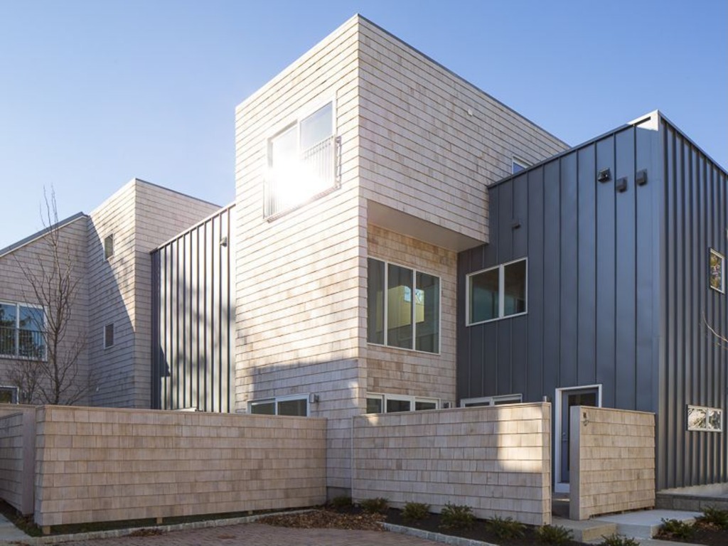
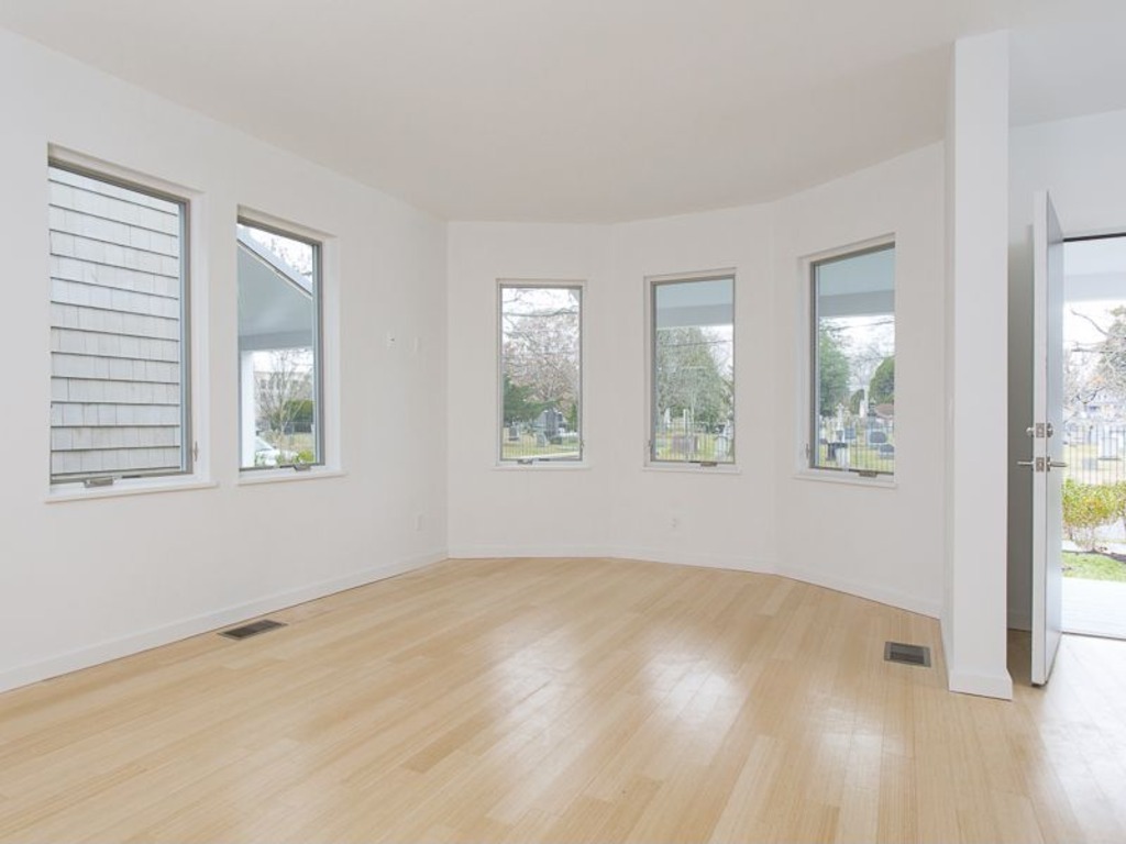
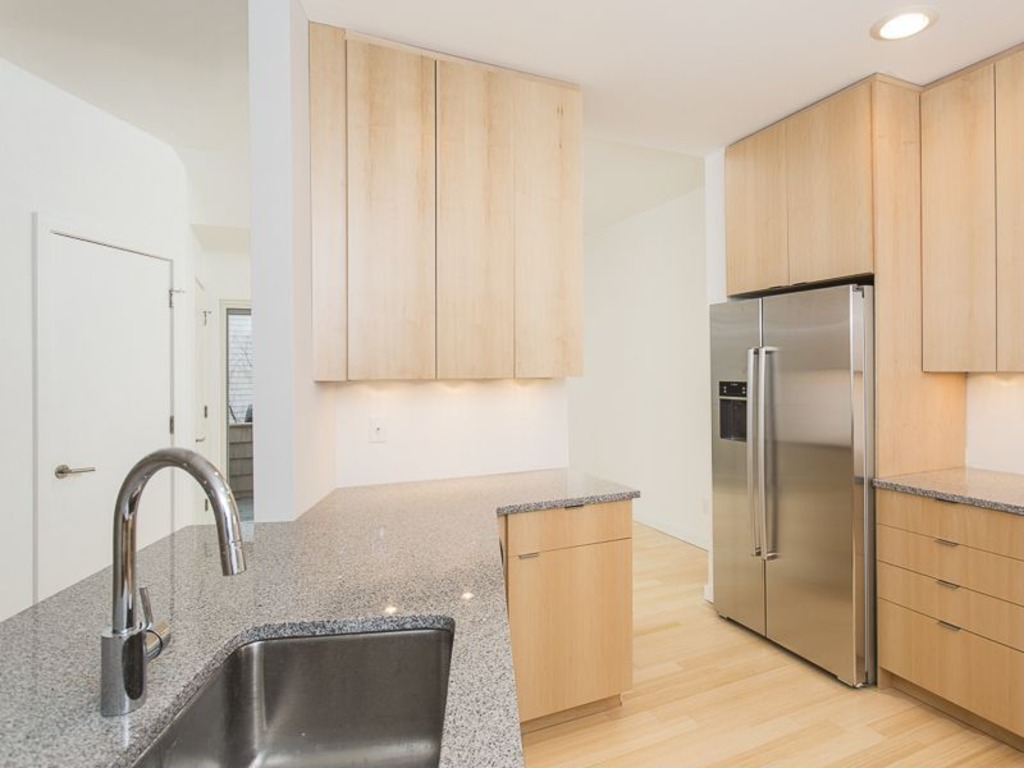
I guess the white isn’t as bad as looking at the cemetery out the window….
There used to be some old-home-preservation type magazine that ran a regular shaming feature called “Re-muddling” before advertiser pressure made them stop. Marty’s first two pictures here beside “Victorian with picturesque turret” gave me a flashback to a really bad one.
It was an old Victorian/Queen Anne with a round tower and a complex roof that someone had “remodeled” by completely removing everything above the joists and laying down a flat composition roof. It looked like it had been sheared off by space lasers. Then they clad it in vertical siding with plain modern windows… and advertised it for sale as having preserved its historic character.
I may have to go lay down for awhile before I can look more closely at this one, guys.
@Colleen: I dunno… the cemetery is a really nice big open space, green in the warm months, picturesque with snow, and likely to be quite historic, given it’s called Princeton Cemetery. My college dorm was across the (4 lane divided) street from a cemetery where most of the people who were killed in Quantrill’s Raid of Lawrence, KS during the Civil War are buried. It was a popular spot to hang out in nice weather, play frisbee, study, or just sunbathe. And for sure it means at least half your neighbors are really, really quiet. ;)
Oh, and welcome aboard, Colleen.
I hear you, Anodean, of how I hear you!
“…the clean, crisp contemporary spaces and finishes which are hallmarks of Hillier’s architecture.” Sounds to me like a good excuse not to bother with detail work. A number of older houses in Lawrence were given the “land whale” treatment, turned from vertically oriented Victorian era homes into horizontally oriented… no-specific-personality era homes of the 1980s. Bland, bland, and did I say bland? Luckily, Lawrence has enough historic architecture buffs with the political wherewithal to actually do something that after just a few years that all stopped. There are now pretty stringent design guidelines in the historic neighborhoods. The results aren’t always as nice as what was there, but they’re way better than what was happening in the ’80s or leaving the ones that haven’t been tended to in decades.
Note the listing says this house is (make that was) “Victorian in style,” not necessarily actually Victorian. Google street view still shows the original state of the home, with a white stucco first floor, green stained shingle upper floors, and a front porch with Ionic columns and leaded glass entry doors. And what’s there now? A plain post and lintel porch, single pane glass doors and windows, and overall large scale shingling. Not sure if they plan to stain it (that might help), but it definitely looks like “quick and easy” were the developer’s and/or architect’s catchphrase of choice. I’d have thought post-modern archetypes (the architectural equivalent of music sampling) would be passe now. Too bad they’re not, as they give the same repeating, hollow, and watered down result as the sampling. BTW, the street view house number is 52, not 9. The odd numbered abodes are all in the cemetery.
I’m also hard pressed to guess just how, or if, one could warm up the inside of the place. It’s as sterile as an operating room, if you ask me. If the buyers are at all normal, and not strict modernists, they’re going to need every texture, material, and color they can get their hands on. That and some really good blinds, since the neighbor’s house seems to be only mere feet outside a big picture window. The other windows, the ones that are all single panes… I think they may be either awning or hopper style windows. There’s some sort of hardware along the bottom that doesn’t look like casement (crank-out with side hinges) style. At any rate, they’re not traditional double hung windows that ought to be there. That may look “clean and crisp” but it’s also lazy. And cheap. It’s easy to create a clean look when there are no details to speak of. But a simple lack of detailing and quality modern design ain’t the same thing, no matter what Mr. Hillier says. Hopefully, buyers will be able to walk just a few blocks to Princeton University to soak up extent history. If all else fails, Philly and NYC aren’t too far off. That’s no excuse for watering down historic hometown flavor, though.
I actually think it would be nice if the seller took the time to repair, mud, sand, and put nice white primer on all the walls so they would be ready and waiting for the buyer to paint. With those floors I think lighter-colored walls would be best, so white primer would be ideal.
No idea why they did so many exterior shots of the house though, that’s just silly.
@Samme: Maybe because there’s so little of interest inside?
It hadn’t occurred to me that the white interiors might be primer. You’re right that lighter floors go better with the light wood flooring, which is why I’m personally not into light wood flooring. I simply prefer a richer palette. But to each his/her own. Good to see you again, Samme. :D