This is what I imagine a $3.3 million home would look like if a nuclear weapon had just been detonated ten or twenty miles behind the photographer.
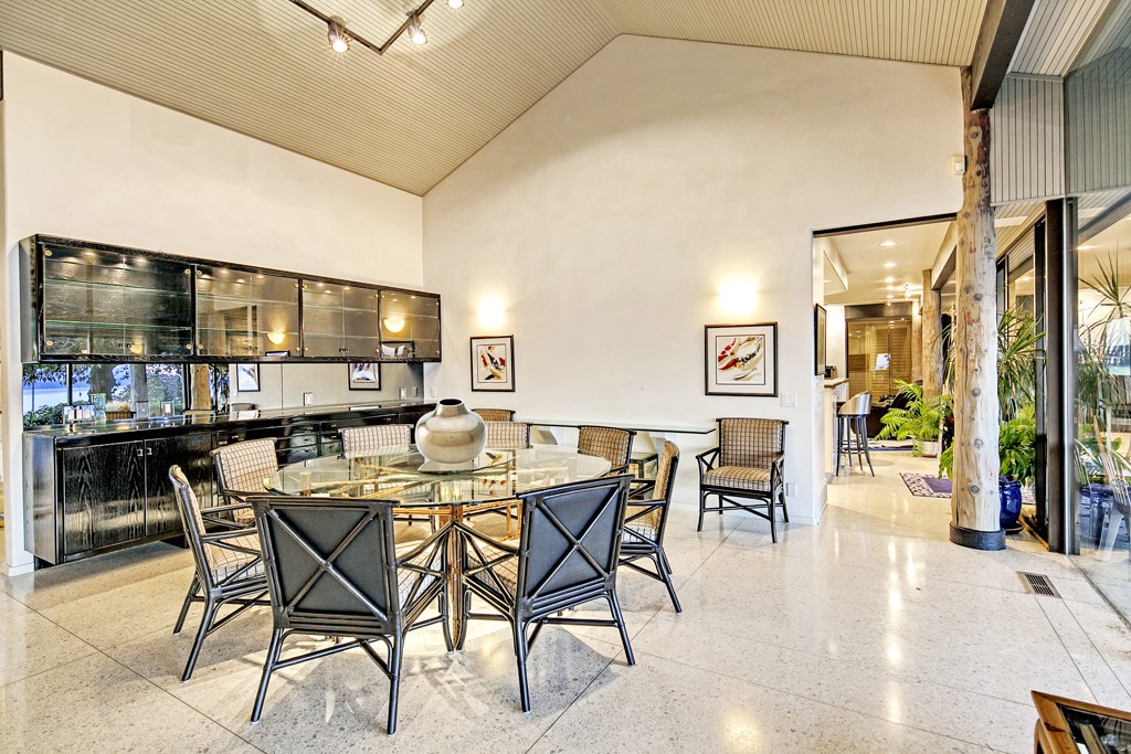
The interior is just as unnaturally bright. Somehow even the black cupboards appear to be emitting a radiant glow.
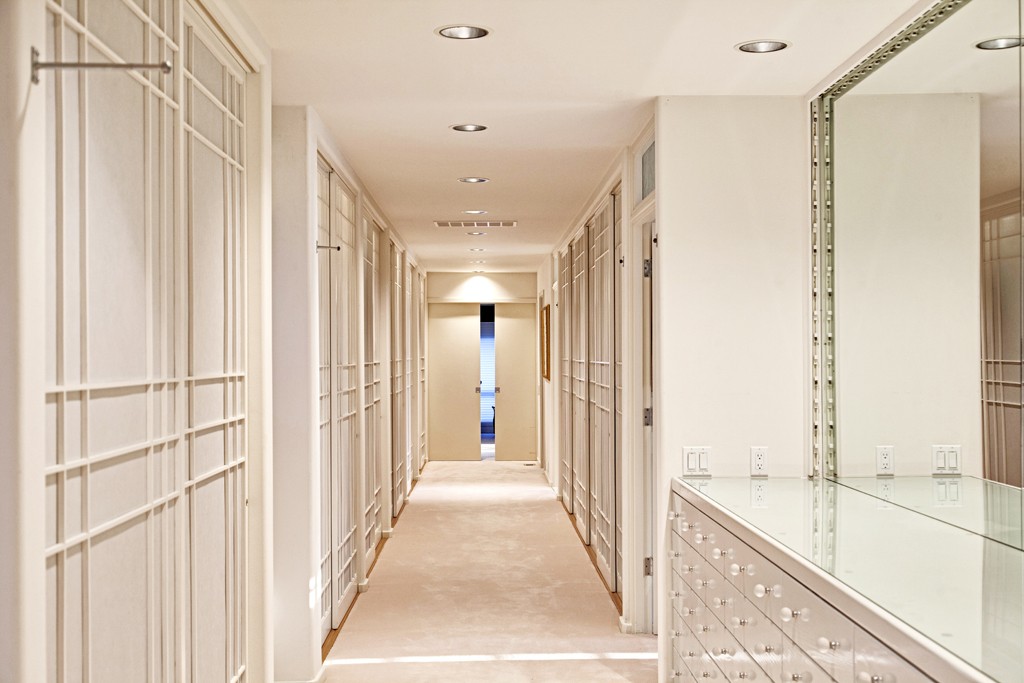
That is a lot of drawers and sliding doors. I think this is a hallway but it almost looks like a closet full of closets.
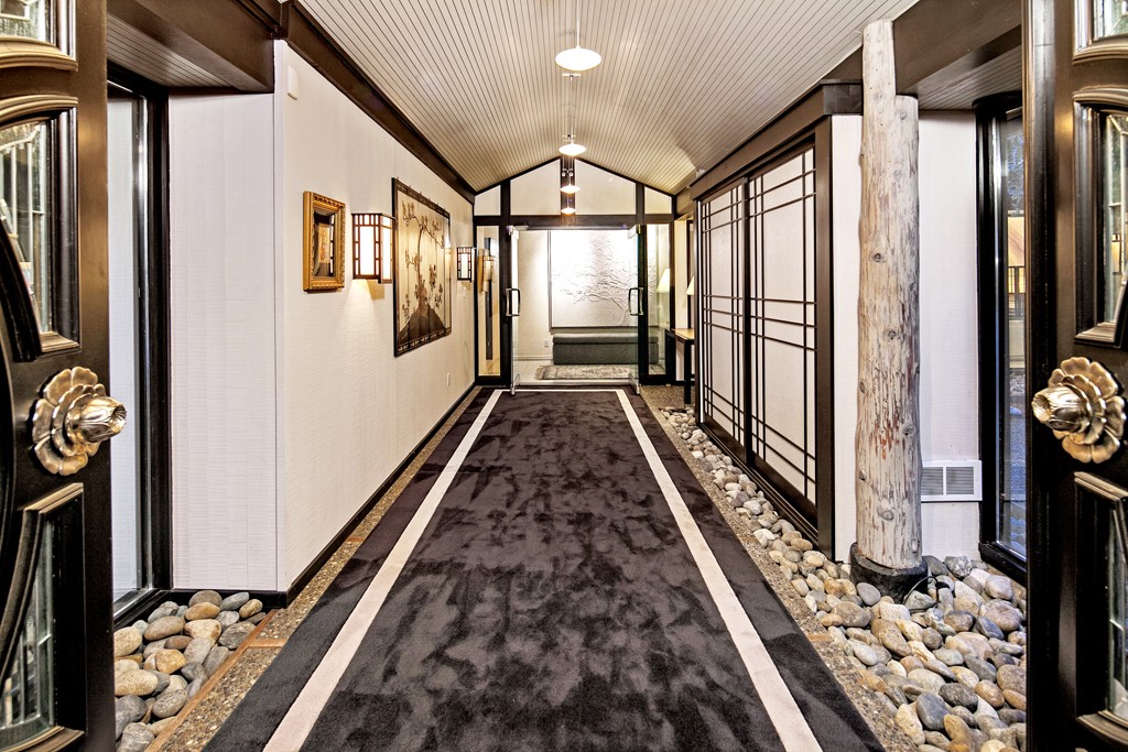
When your landscaper doesn’t stop at the front door… rocks on the floor, inside the house.
Don’t miss the listing description, either. The listing agent for this home, one Wendy Lister (because when your name “Lister” of course you’re going to become a real estate agent), is fairly notorious in the Seattle area for her expensive listings and over-the-top prose:
Extraordinary Big Sur extended profile. . a statement of authority above the astonishing saltwater isle/view plateau. Moments of appreciation ~ subtle to sensational. Elongated entrance foyer, unprecedented. Protracted hall of wardrobes to two substantial owner suites. Without reservation, the colossal great-room of white terrazzo, brilliant seascape spectacles, the sheer volume are powerful. Remarkable: pool, resort-size cabana (fpl, bath), tennis, coach house, gated. 3 more living zones.
It’s no “egrets seek the sky, involuntary sigh,” but I still call it listing gold.


…and that statement of authority would read something like, “EVERYTHING HERE IS MINE,” a la the traditional Ferengi greeting, eh?
“Protracted hall of wardrobes to…owner suites.”
If it were an ordinary home, one might object to having to walk through the closet to get into the master bedroom. Thank goodness this is a “Statement of Authority.”
On the other hand, that is a *very* protracted hallway. It would require a special butler to check the hall every night, to make sure I didn’t fall asleep on the “subtle moment of appreciation” that is the hall carpet, on the way to my substantial owner suite. Be sure to support my head, Jeeves, as you carry me to bed and tuck me in. Either that, or roll a dessert cart through the wardrobe and, like a cat to a can of tuna, watch me leap awake and trot after you.
Interesting house.
The HDR was done better than most, but it’s still extreme enough that it looks more like CGI from a shooter game. I kept looking for the digital gun barrel on the bottom and remaining lives/ammo in some corner of the screen. Is that a bad guy or monster hiding just around the corner? Pew pew! Got him.
In other news… Terrazzo is a selling point? True, it’s durable and easy to maintain, but it’s so institutional. Am I at home or still at the grocery store?
Is there a pest control service in the area who knows how to keep pests from living and breeding under the rocks inside without making the place unlivable? How do you even clean the rocks? Sweeping, vacuuming or mopping don’t seem to be viable options. So every Saturday, we’ll remove all of the rocks, wash each one, clean the place they sit, and put them all back. I guess that would take care of the pest issue. Too much work.
Otherwise, I like forests. The tree trunks are an interesting idea, not that I’m going to be installing them where I live anytime soon. But I could live with those.
It’s always such a pity when someone who doesn’t know what they’re doing attempts to visually quote from a long, distinguished, history of brilliant (and subtle) design. Someone thought they were creating an impressive reproduction of a fine traditional Japanese home. Someone was wrong. And it has little to do with the updates for modern convenience.
Let’s start with all those raw tree trunks. A small alcove, called a tokonoma, is set aside for a piece of artwork and/or a horticultural display. (Read a short article here: http://en.wikipedia.org/wiki/Tokonoma) The alcove is not to be used as regular living space; it has a near sacred status. A raw (or rougher than usual) post, the tokobashira, is placed very specifically to define the space, but is also an object of reflection in itself. The overall result is meant as means for reflection, contemplation, and calm within the home. In this listing “someone” has turned the otherwise mentally elegant tokobashira concept into a tabloid headline, exacerbated by having a copy at every.single.checkout.stand. *Sigh* It’s the architectural equivalent of turning the vaunted Japanese Tea Ceremony into a fast-food rush hour debacle. Note the dissonant use when compared to a proper example, here: http://en.wikipedia.org/wiki/File:Tokonoma_morse_edit.png.
Large Japanese interiors do sometimes use multiple rough-hewn trunks as support columns. However, any structural intent in this case has been squandered as well. Pics 6 and 10 clearly show deep cracks in the trunks. There is also an apparent lack of any structural connection between the trunks and the beams they play at supporting.
I simply can’t get over the seizure-inducing number of patterns and textures, either. It would be unpleasant anywhere, but in a “Japanese” setting it’s beyond incongruous. The overall traditional goal of balance, harmony, and serenity is completely blown. Pics 5 and 6 are “good” examples. Note the spotted floor, striped ceiling, and rock wall. Add in the two planters and I’m hard pressed to figure out whether nausea or a splitting headache would be first to manifest. What’s utterly bewildering is the near blank wall at the other end of the same room (Pics 7 and 8). Blank space isn’t a bad thing, not if it’s properly situated and countered by elements that help define it. No such luck here. Another example of the Pic 5 and 6 phenomenon is shown in Pic 16. Even the elements being almost all one color doesn’t seem to help.
And imagine, all that “Agh!” doesn’t even include the farcical entry hall. It’s meant to visually quote a stream bed, a natural setting common to Zen gardens and even interiors. But this attempt is cartoonish. Someone took a list of the usual elements and simply tossed a big, uncouth version of each one into the same space. What could have been the delightful experience of transitioning from outdoors to in by “journeying” down a stream-side path has been turned into the Roseanne Barr rendition of the Star Bangled Banner. Even the prime opportunity for a visual focal point at the end of the hallway has been missed. I mean, you’re staring right at that point the whole time you’re walking down the hall! Who caps off that procession with something so incredibly visually weak? You wouldn’t want something so overwhelming it takes away from a (what could have properly been done) Zen journey, but ignoring the obvious terminus of major circulation feature is not the answer either.
There was so much potential for a wonderful concept in this home, yet it ended up with so, so much FAIL as a result. One has to wonder if the over-the-top listing agent’s description isn’t just the cherry on top.
@Frodo: Pest control… a very good point. Along with the artificial stream bed critters, you’ll need to worry about whatever might make itself at home in all those tree trunks. I think (hope) proper pressure and/or chemical treatment might prevent it. Or maybe it would just delay the inevitable.
“Am I at home or still at the grocery store?” LOL! No doubt a snooty, overpriced grocery store. Whole Foods, anyone?
@Emerald63: I’ve just noted the image URL I included doesn’t work. Easy fix – it’s the black and white drawing shown in the Wikipedia article I linked to.
Been catching my hubby up on some of the more… interesting… entries here of late. He made a couple of observations about this one. He thinks the protracted hall of wardrobes looks just like the catwalk in a prison cell block. All the little decorative trim ends up looking like cell bars.
But the funnier item is what he said when I told him I’d originally thought the first image was a painted or CGI rendering, at least until I saw the enlarged version at the listing. He said he still thought it was a painting because, well… just look at all the “happy little trees”! Ya know, if you look real closely, you really can see Bob Ross peaking out from behind the hedges… :P
Anything looks that happy to see you, you should worry whether it’s hungry.
@anodean: We’re Doctor Who fans so, ya know… that doesn’t seem like an entirely unrealistic concept. (O_o)