Gee, I wonder what this seller’s prized possessions are?
The listing agent had an allotment of 30 photos to showcase this 11,500 square foot home. Here’s how he used them:
- 9 photos of the two white sports cars
- 4 photos of the living room
- 2 identical photos of the bathroom
- 2 ridiculously over-processed, hyper-saturated exterior shots
- 2 aerial shots
- 1 site drawing
- 10 photos of the rest of the house
That one is the primary photo.
This would be a terrifying reality to live in, frankly.
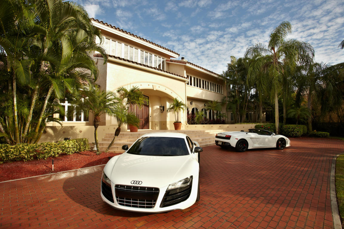
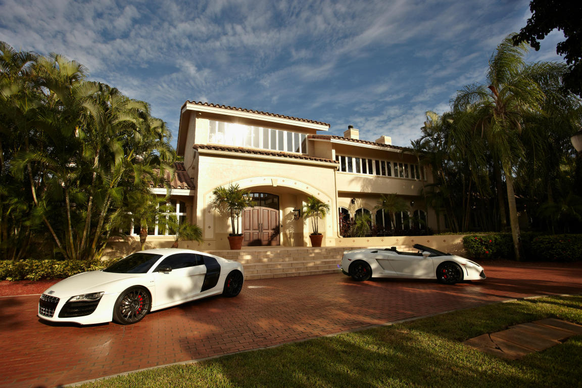

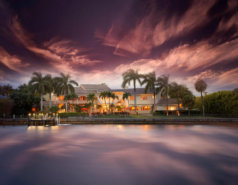
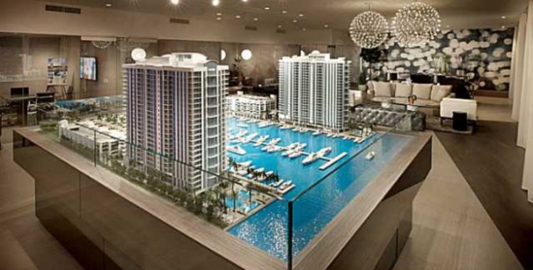
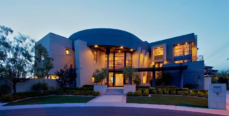
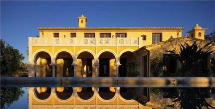
The primary photo, it’s like the visual equivalent of artificial grape and orange flavoring. Acceptable in small doses but gut rumbling in larger ones. (Or in the visual example, eye crossing.)
Nice looking place. Not the most refined architecture or decor, but certainly not as doggy as many we’ve seen. Lots of light… I like that. I do have to wonder, at the very minor end of the complaint scale, why someone chose the streetlights they did out front. Yeah… those are just not hooking up with the Mediterranean/Spanish look the rest of the place has. I like that style of lamp, just not with that house. But the cars can stay, regardless of whether they “go” with the rest of the design or not. They do convey… right? Right??