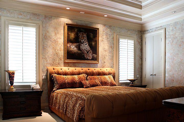
Wow. I guess somebody really likes leopards.
This one kind of looks like it might just be from a personal photo shoot of one of the home’s current owners. Kind of an awkward thing to just leave up in a listing.
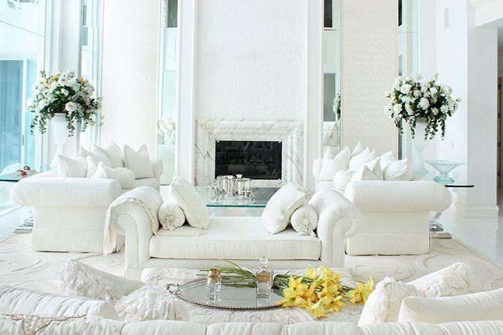
Much of this home has that extreme white-on-white-on-white theme we’ve been seeing pop up a lot lately. I guess white is the new black?



BLINDING GLARE ANYONE?
~ Dons industrial strength Ray-bans ~
Ahh… that’s better. :D Hmm… pretty nice place. Some real show-stopping features, like the “floating” marble archway in the entry. Wow! Very cool idea. The architecture in general is fairly successful. Oddly, while I like the graduated, segmented roof sections outside, I’m less keen on all the recessed ceilings inside. Some work, but some are just trying too hard.
Not sure about the decor though. So.Much.White. I’ve never understood how anyone lives with that, even without kids or pets and with tons of servants to clean. Also a bit mystifying why there are so many bunched up window swags. Most don’t really go with the style of the house and they’re huge dust collectors.
I do like the last picture at the listing. That’s an amount of white I could deal with and the room looks both comfy and scaled for coziness. Oh, and the entry court and “back yard” are simply luscious! :)
Classy if bright, especially when you can be blinded by going out to the beach. Come inside and leave your shades on.
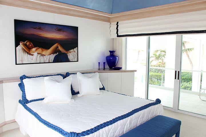
Re: the image over the bed: “Paint me like one of your French girls.” Looks classier if more revealing than the Mickey Mouse painting in the previous listing.
Never thought I’d say this, but – “Needs more beige.”
@anodean: LOL!!!