Personally, I probably would have gone all-in and just led off the entire photo set with the Cap’n, but instead, the listing agent decided to lead with this:
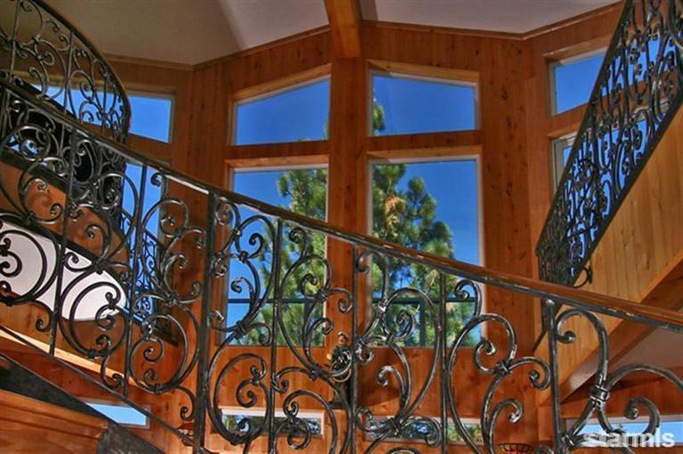
They’re… um… really proud of their stair railing, I guess?
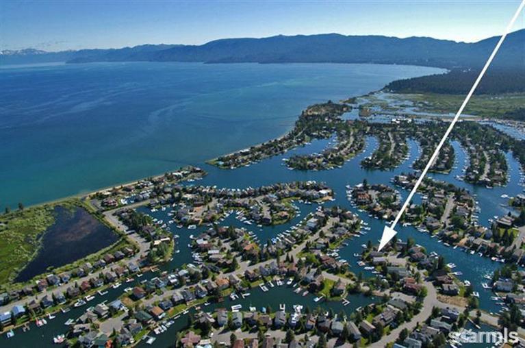
Photo #2 in the set:
Because giant white arrows are always the best way to say “this $1.5 million home is super classy.”
Later on in the photo set we get the stair railing and the Cap’n. Double win!
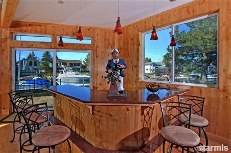
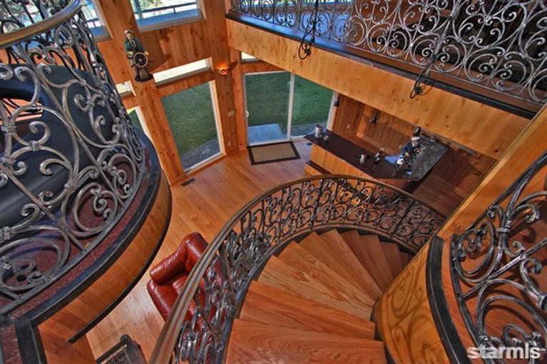

Right behind the railing there’s a captain hanging on the wall too. You can see him better in photos 9-11.
This home has a single spectacular living space. The rest is kind of high-quality average. I’m guessing the value of the property comes from its location and access to the water.
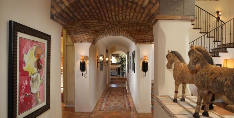
For such attention to flair inside, the exterior (Pic 3) is plain old butt ugly. No joke, “Eww…” popped out of my mouth unbidden when Pic 3 came up. But as nice as all that wrought iron is, it’s too bad it simply doesn’t belong in this style of house. Nor do the fancy kitchen materials. The Mission style bedsteads in Pics 19&20 would have been a better inspiration for the living area railings. A shame, since it really is nice iron work and I really like the last photo above (which looks even better at the listing, Pic 10). That’s a right nice composition, that is, and it would have made a better opening pic, too. Pic 18, however, looks like it was taken from a surveillance camera vantage point which, given it’s of a bathroom, is pretty creepy.
The spaces in this house are definitely inviting. It’s the materials choice and detailing that are questionable. And for $1.5M I think they could spruce up the yard just a bit.