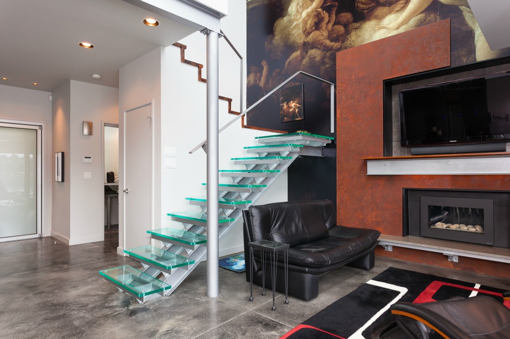
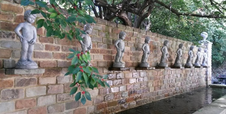
Nobody can accuse this home of being just like everything else on the market, that’s for sure. From the lead photo of the contemplative statue staring out at the water to the giant mural that appears to take up an entire two-story wall, this home definitely stands out.
From the description:
Live in a work of art on Riviera Beach! For the unique person who appreciates beauty & distinction.
No doubt.


For the unique person who appreciates beauty & distinction…
…and will therefore be willing to spend all their time looking out the windows at it. Two sets of WTF-Sensitive Sunglasses for use while approaching the property and becoming accustomed to its contents will convey at sale.
Actually I was primed to dislike it, but I got to the perfect little office and started over. First impression was that it was that someone had made it a fishbowl to maximize the view, but it works. It is a beautiful location. The pictures make it look a little too open for my tastes but I would have to see it in person. I actually looked to see if they had an open house since I also live in King County. Those stars are gorgeous, the statue is fun, and the mural would be one of the few things that just doesn’t work for me.
@Samme: I admit, the statue may be its one redeeming factor… but do note that in order to enjoy it properly, one must crop away virtually all the rest of the exterior. :D
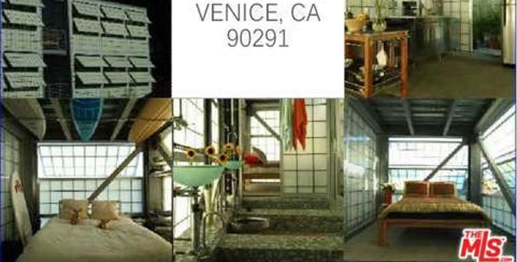
Went back and checked the office. Um? Perhaps it is because I am often tired and clumsy, but it looked like a rather confined opportunity to walk into a lot of sharp-cornered drawer-pulls to me.
And with my luck, the whole place would flood from global warming, leaving me to boat away from a total loss in some disreputable surplus Zodiac – with the statue, which with my luck would chafe a hole, hence the total loss.
Sigh,
Hmm… I’m not that crazy about the overall design, either. It’s better being inside looking out, but even then the green algae in Pic 3 puts me in mind of bad smells and how cold and damp the place is likely to feel, perhaps frequently. It doesn’t help that the interior features lots of chrome, black, and gray – LOTS of gray – and that a lot of the furniture looks really uncomfortable. Also, who shoves a bed up against a bunch of drawers? There doesn’t see to be anywhere else for it to go, which is *bad* design. And if it’s supposed to be a doulbe… whoever’s on the inside is screwed, and not in a fun way.
However, I do like the carpet in front of the fireplace. Nice pattern and colors. And I’d love to have some of those glass bi-fold doors!
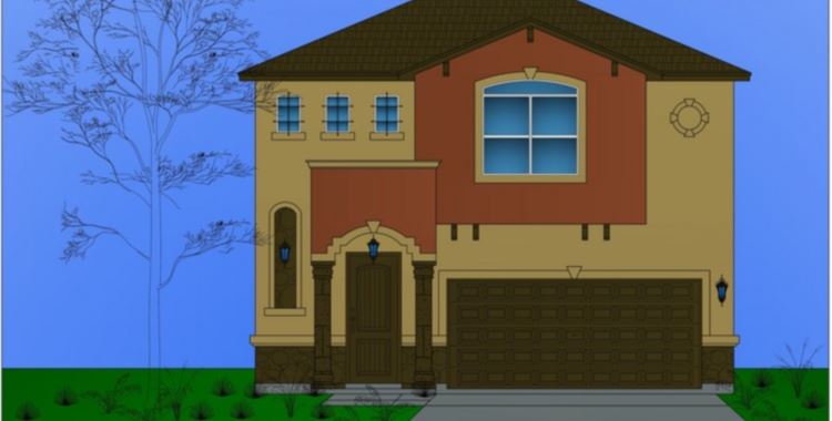
The outside… my, it’s… different. Different materials with different shapes, mostly. Too much without enough coordination for me. I keep thinking I want to reach into Pic 2 and push down on the roof, like it’s spring loaded and has accidentally “popped up.”
But I know all these things are very popular with some folks. That’s fine… Not everyone has to like everything, right? Just not my style, I guess. :\
Judging by the rest of the houses in the area, this place should be called “Pretentious Sore Thumb Estates”…Expect the neighbors to pelt you with dog doo every time you show your face beyond the glass.