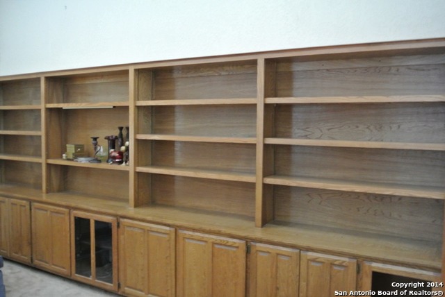
“This massive wall of empty shelves looks too lonely. Better do some staging…”
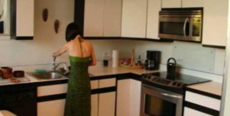
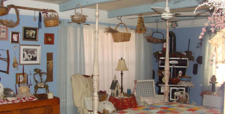
“Ahh, there. Much better.”
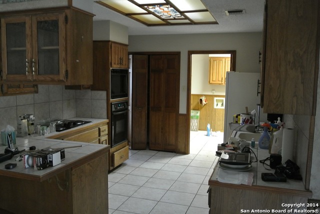
The weird thing about this listing is that most of the home is totally empty, no furniture, no decor, nothing. But the kitchen sort of looks like the owners just barely stepped out of frame.


My first take was, “Well, now we know where all the oaks on Center Oak Woods Lane went, eh? Cabinetry!” – but the outside of the house is so appealing I went through the pictures again, then read the listing: it was “the builder’s personal home.” So, no joke – it’s quite likely that the fellow actually did name the street, and spare the big aak in the front yard, and build this lot for himself because of his love for oak.
I didn’t spot the year-built, but if the builder and the realtor pictured were contemporary pals, the place looks odd because the fellow used modern materials to express a sort of 1950s vibe that bespoke home to him – and it’s oddly staged because the listing pictures overtook the family clearing it out for an estate sale.
I’m hoping they had some good, happy years there. I’m sure Emerald could do wonders with the place. :)
@anodean: “aak” was meant to be “oak.” But you probably figured that out.
“I’m sure Emerald could do wonders with the place.”
Thanks, Anodean. I’d love to give it a shot! The place was built in 1979 and boy, does it show. I agree the front exterior has some appeal, mostly in how the volumetric forms are juxtaposed. That said, the “concrete visitor parking pad” needs Big Help. Not only does it just Stop! it does so at a solid brick wall. Nothing says “C’mon in for a visit” like a solid brick wall… not. Nor is there a bit of transitional landscaping around it, leaving a concrete||grass abutment that is oh-so-lame. Also, are there missing or replaced shingles here and there? The white spots on the roof… what are those?
There’s not really enough shown of the inside to know the minimum amount of work it would take to update, but I’m guessing quite a bit if you wanted to do a decent job of it. The spaces seem small, especially for a 2200sqft home. Also, other than in the living room, the ceilings seem low. Both things would be difficult to overcome, and pricey. But perhaps the spaces aren’t quite so bad; perhaps it’s the photos or limited number thereof.
Moving to the backyard (if you can call it that), space for outside activities is pretty much non-existent. There’s another concrete pad that just lies there, as well as ancient and hideous stockade fencing. And… another brick wall! It seems to be one side of the garage, but that’s no excuse for just letting it sit there, turning the tiny bit of lawn into your own home prison exercise yard.
So, the guy who built this owns/ed it? If there’s so little imagination (despite the noted front facade) and seemingly no extras for his own place, I wouldn’t want to see what he might try to pawn off on others. No wonder he kept the oak tree for himself – it’s the only real bit of quality design involved.