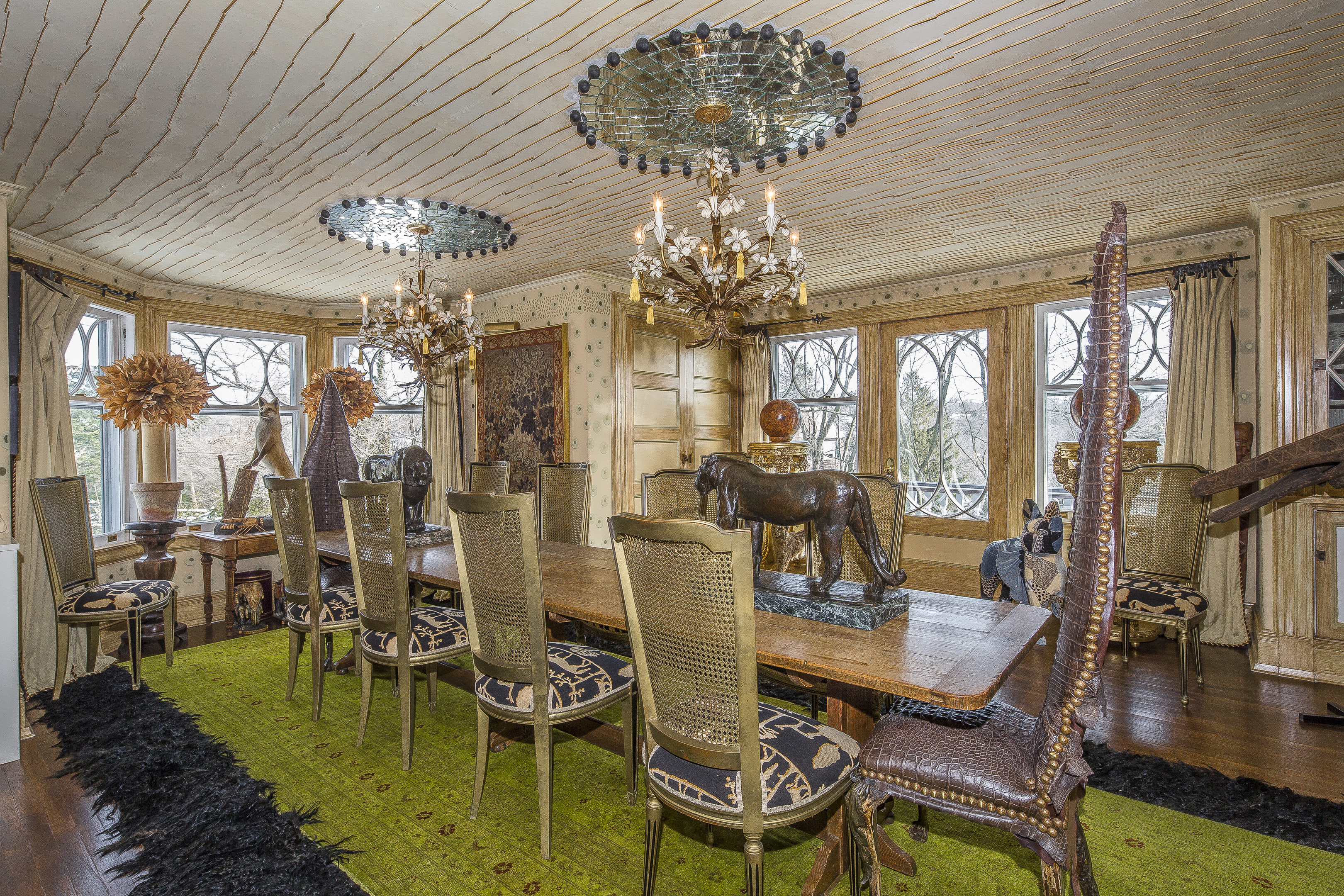
You’re looking at the interior of a 117-year-old, six thousand square foot home in Bronxville, New York listed at four million dollars.
Note: If this page was slow to load for you, it’s because the photos for this one are huge. You might want to right-click on each picture and open in a new tab or new window to fully appreciate them.
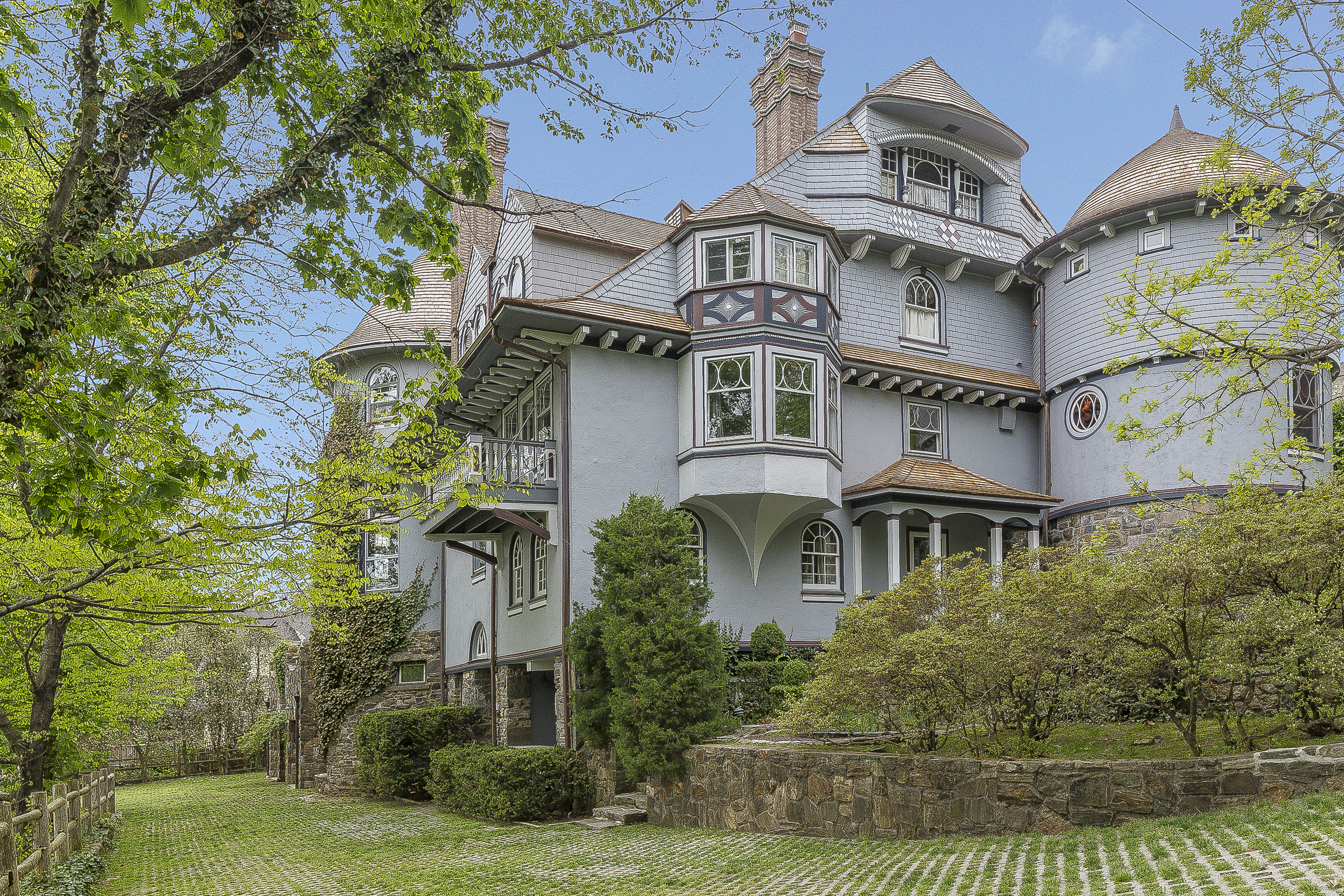
Here’s the exterior:
Inside again…
For once, the listing agent gives us some back story to explain the eclectic decor:
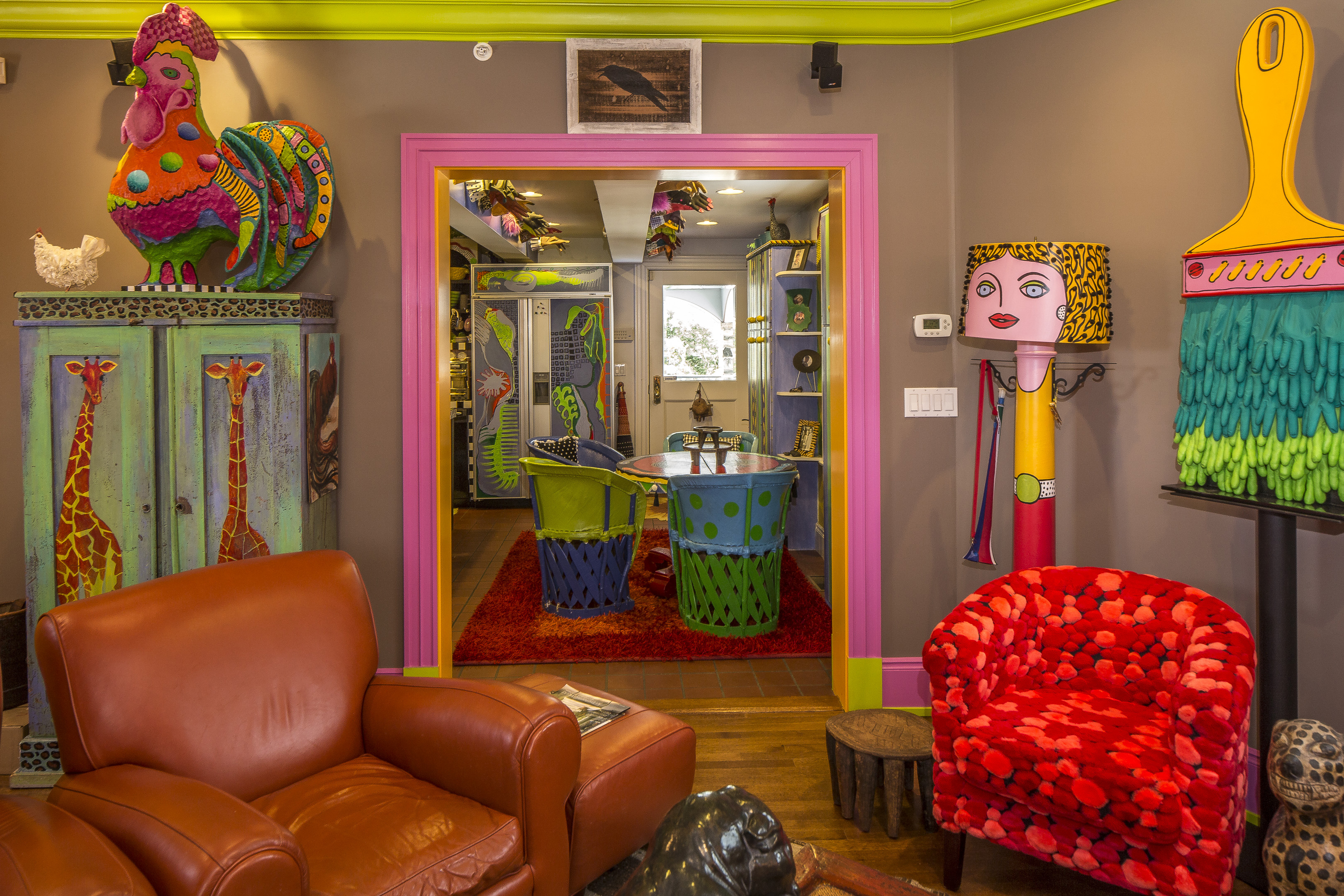
Two very different artists live in this house; one does caricatures and collects historically significant bronze animal sculptures, the other creates wildly colorful installations, sculptures and paintings, which are spread all over the interior…walls, floors, cabinets and ceilings. Their South African heritage, together with items brought back from travels to India, Mexico, Ethiopia, Mali, Burkina Faso and Morocco blend into eclectic, international interiors.
That is actually pretty delightful.
Some of the rooms are relatively subdued…
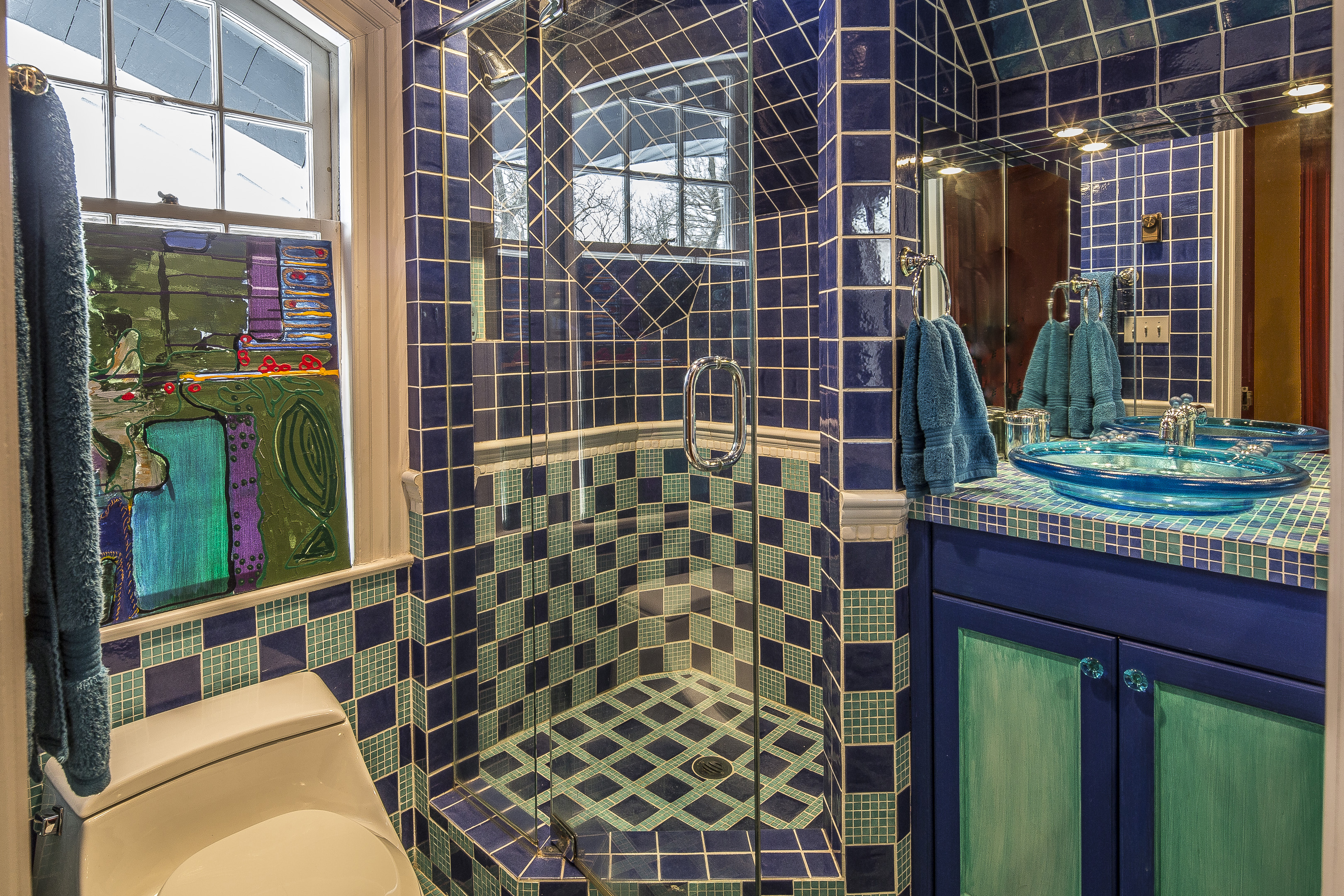
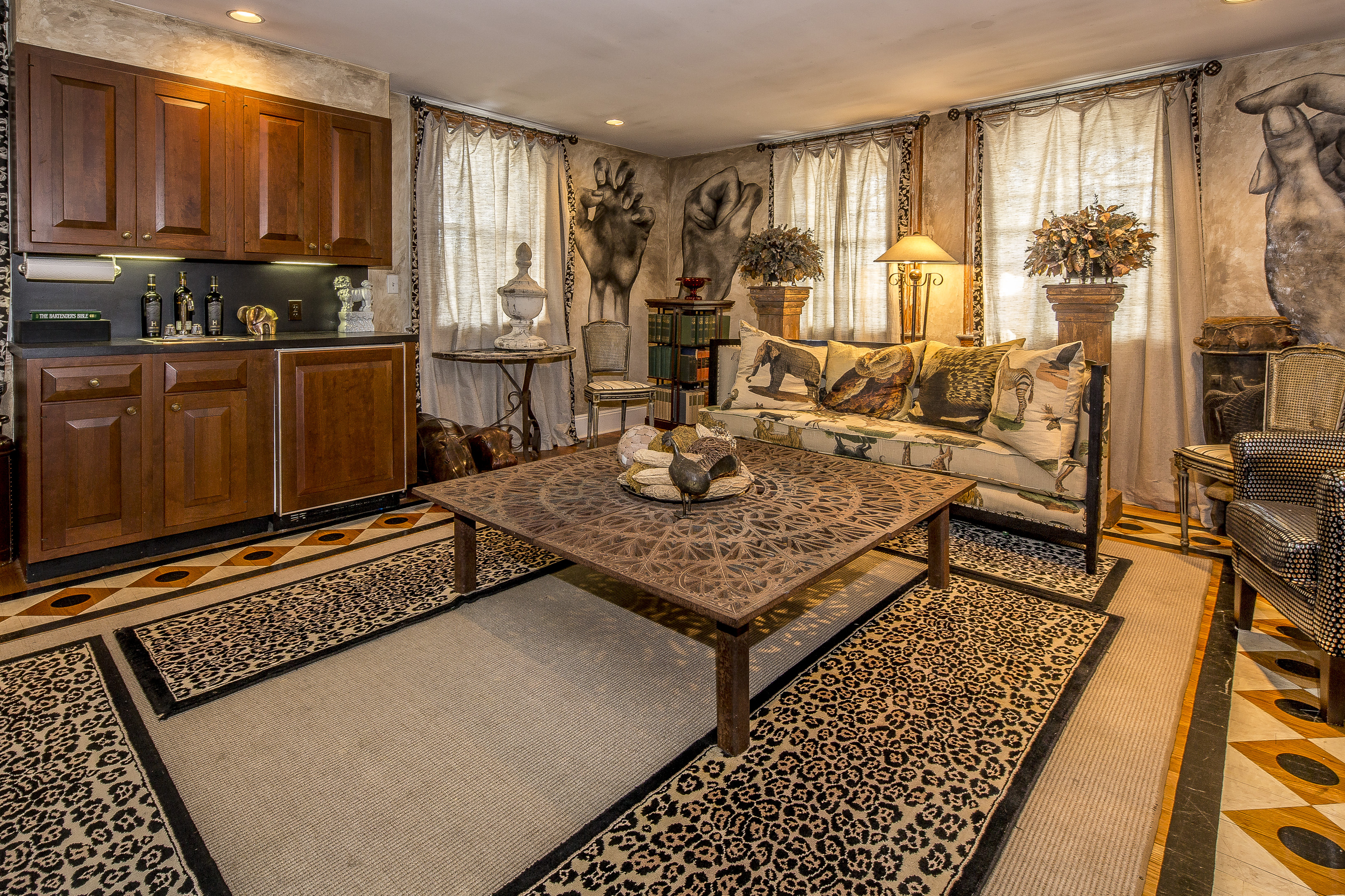
Others, not so much…
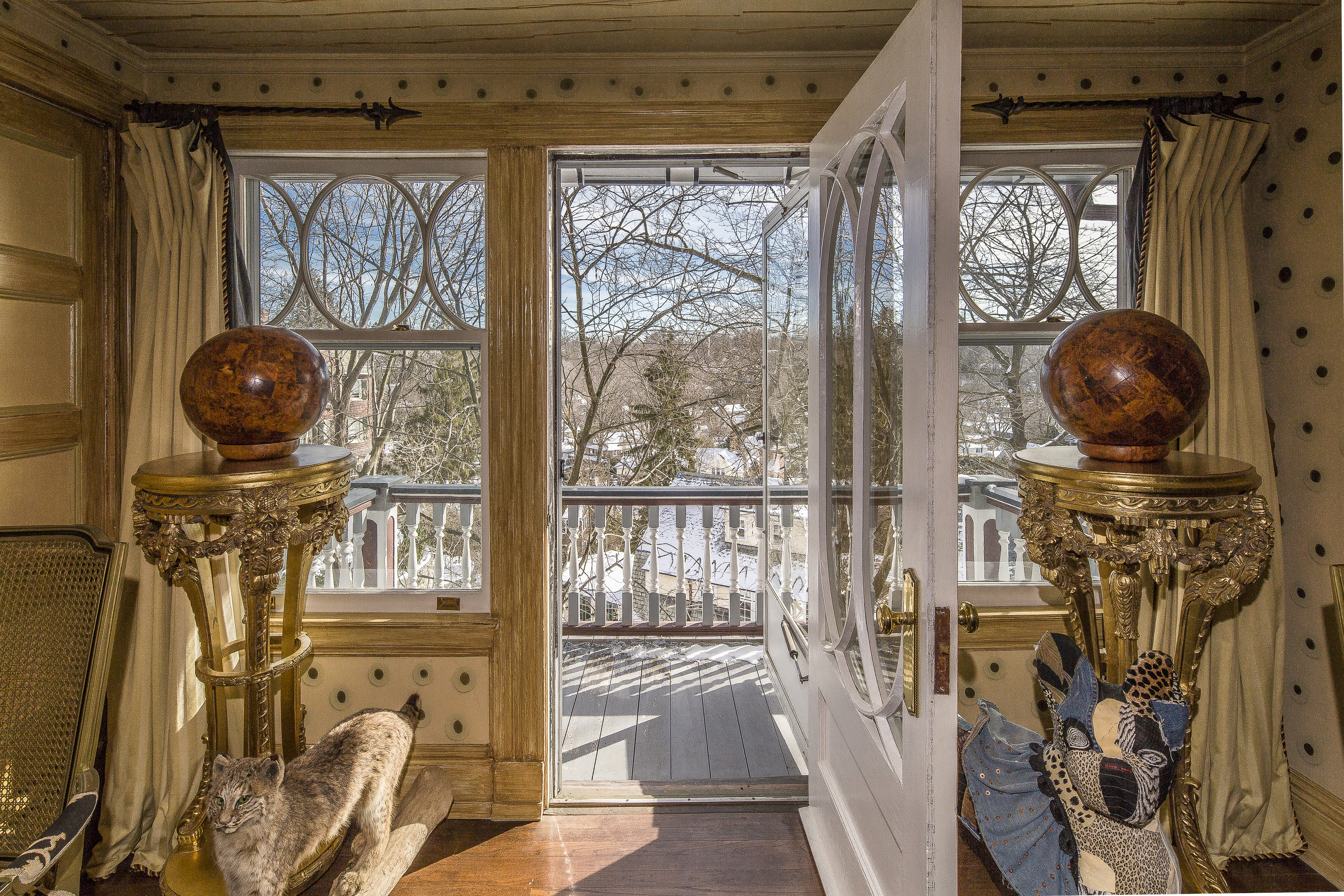
I thought the shot below was on the “subdued” list…
…then I saw the taxidermied cat and the stuffed cat flanking the door.
I think those giant clutching hands are actually painted directly on the wall.
The decor definitely isn’t my thing, but the house itself sure is neat.
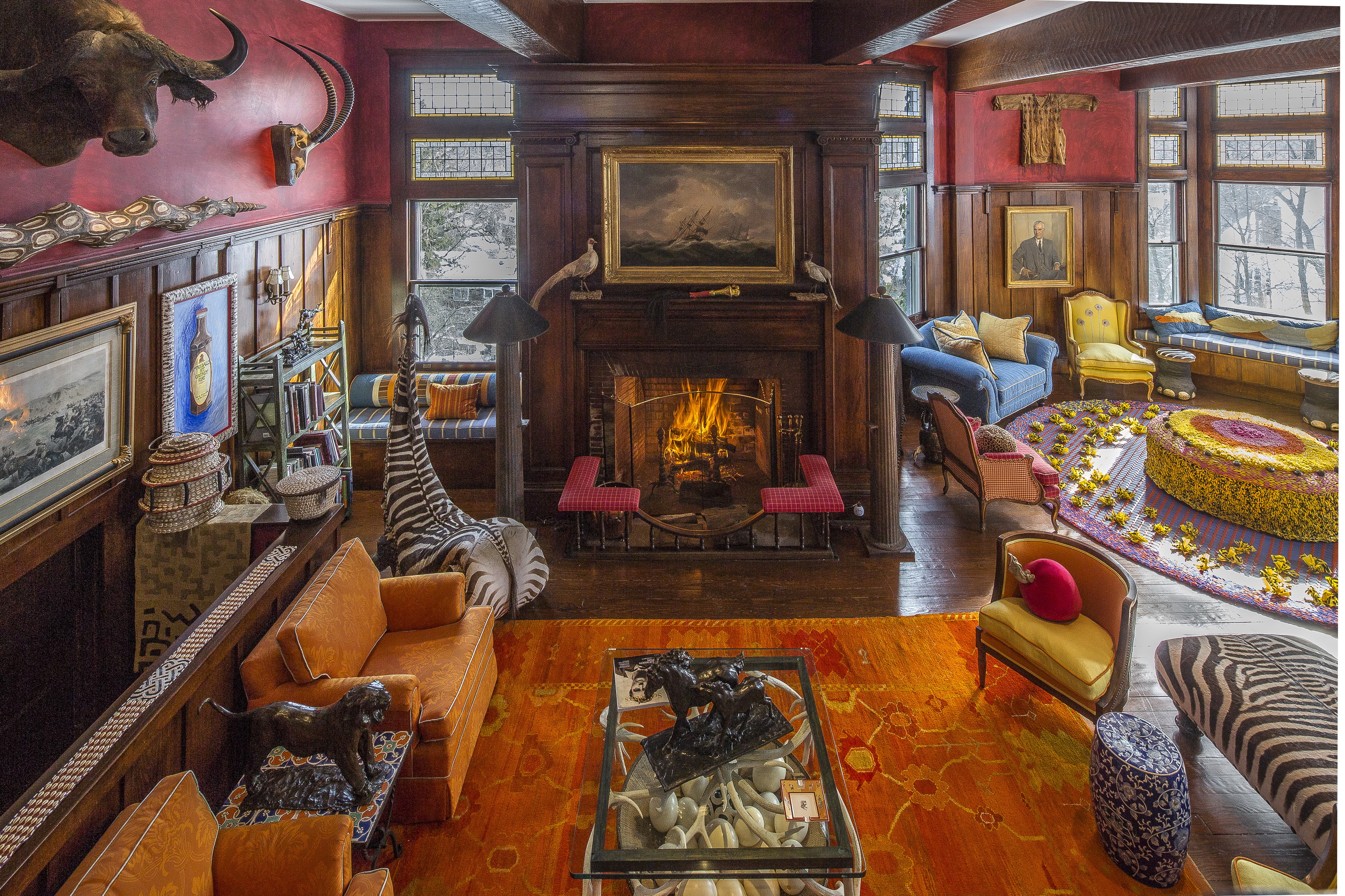


Is that a zebra-butt chair next to the fireplace?
Alrighty then!
@Frodo: There are also tall crocodile back dining chairs. Huh…
@Emerald63: Hehehe – I guess that’s one way to sit down for a bite.
Exterior – OMG… Gorgeous! Late 1890s Victorian at its best.
Interior – OMG… Not so much! It’s not bad, just really intense in places. But hey, it’s not another beige-apalooza, amiright? How about that magenta bedspread? The visual equivalent of walking into a pre-heated sauna. BAM! right in the face. I think my cones need to go on a color-free vacation for a few hours.
I really liking some rooms, at least in some views, before the next pic shows the other side. E.G., the kitchen with checkerboard tile counter tops is bright, airy, and cheerful. But turn around and another BAM! Although, it looks like the uber-colorful folk-art painted cabinets have since been whitewashed. A lot of things seem to have been toned down in some views but not in others.
E.G., a couple pics after the kitchen is a small orange TV lounge at the base of curving stairs. It’s nice, but the pink cabinet is out of place next to a rust colored recliner and bright red chair. Still, it used to be worse. Going back to the pic of the kitchen table and painted cabinets, we can see the lounge through the door. Seems the front of the built-in shelves used to be pink, too. And the cornices used to be bright jungle green. Bright jungle green is one of my favorite colors. But.Not.Next.to.Pink.Shelves.
The pic after the view of the updated lounge shows the other side of the room, which I assume is before-toning-down. The giant stuffed chicken and oversized paintbrush are kinda fun, but the lamp-painted-as-a-woman is just creepy, especially the ornate hooks that end up looking like tiny T-Rex arms. The view into the kitchen suggests the refrigerator used to be brightly painted, too. Marty, if you think the giant hand murals are of interest, go full-screen and check out what lines the beams over the kitchen in this pic. I gotta hand it to them, that’s some pretty unique decoration.
Google street view shows the area is tightly packed and hilly. Despite its size, the house is only about 20′ from the curb, but that’s wider than the one way street in front of it. To the side is what looks like a brick driveway with lots of grass growing in the gaps. But no… that’s a street. You can follow it for a couple of blocks. (How’d they got the google car in there?) You can see lots of homes are close to the curb and without much yard on any side. There’s a certain charm to this sort of neighborhood, but it definitely cuts way back on one’s ability to admire the view… of anything. A shame when the houses are so pretty.
@Frodo: Nooo… that’s one way to sit down as a bite. =:O
@Emerald63: “it’s not another beige-apalooza”
No kidding. The colors are certainly interesting, and I can appreciate them somewhat for that. This is not a pallet borrowed from every mid-level hotel from Cape Hattaras to the Golden Gate Bridge.
Good catch on the toning down of the house. They really took it down a lot! I imagine it was hard to sell for the price they wanted. A coat of paint over most of it and the perceived value is likely to go up. The white piano is conspicuous. First, it must merely be a decorative piece. You don’t help a piano by painting it, much less painting it twice.
@Frodo: Forgot to mention I’d love to see the reflective effect in the dining room after dark. Both the chandeliers have mirror mosaics above them. I bet the result is impressive. If they did it right they might even have little rainbows flitting about. :)
Just finished showing the house to my hubby and noticed a couple of things. Gods save us, there are TWO magenta bedspreads. One in the round, painted-to-look-like-crumbling-stone-walled bedroom, the one with putti (cupids) flying about on the ceiling accompanied by brown(?) stars. The other in the smaller bedroom with the mermaid front cabinet. I was referring to the magenta bedspread in the second room. Gotta be from one of their trips to India.
I also noticed that in the before view of the TV lounge, the one seen from inside the kitchen, there seem to be… shoes on… skewers decorating the… window. And a variety of boots adorning the curved stair’s railing. Ooookay…….
So, am I the only one who noticed the creepy skin-and-horn-covered chair and side tables around about photo 21-22 (I lost count)? And am I the only one who watched the video and caught a glimpse of the bathroom decorated with rolls of toilet paper suspended from the ceiling?
@MsWildhack: Whoa, an actual video! A huge percentage of real estate “videos” I’ve seen are just the pics in a slide show with crappy music. I’d given up on them ages ago, so thanks for the heads up on this one.
I guess I’d sort of glossed over the chair and tables because, despite their exotic materials, they’re so bland in color next to… everything else. They used to be a thing back in the day when lots of folks went on shoot-to-kill safaris. If it were my house, I’d prefer furniture made from the body parts of those who still go on such killing sprees. Hey, what goes around comes around.
Yes… the “decorative” rolls of toilet paper… Considering what it’s supposed to be used for, that’s just kinda… well, gross, although I admit it probably stymies any cats that may live there. However, seeing as how the TP is (currently) unused, IMO it is in marginally better taste than the plaque next to the “shoe curtain” in the TV lounge (3:25). It reads “Cry all you want – you’ll pee less.” You want that as part of your decor? Fine, whatever. But recognizing that folks who are considering giving you lots of money for your house my find it in very poor taste could prove helpful, as in the concept of “Geeze Louise – take that thing down before showing the place!” might just occur to you.
Oh, well spotted. Can’t say that it’s anything I would want on my wall.