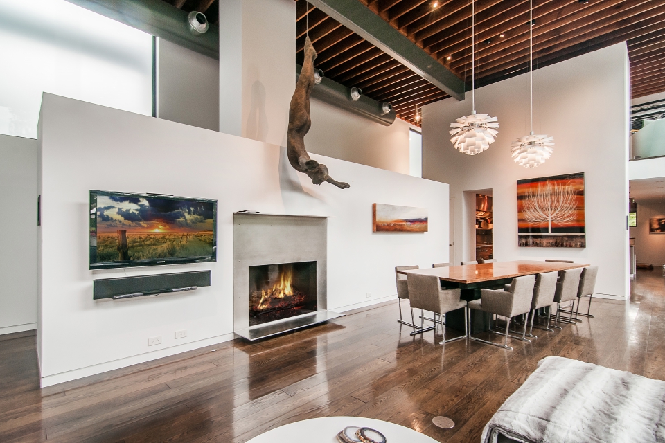
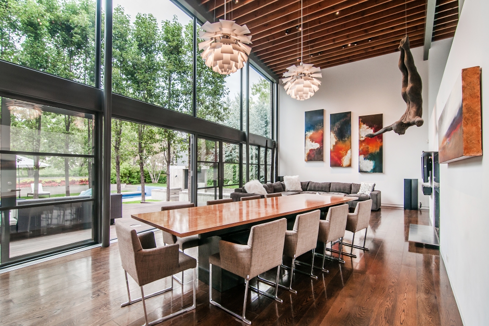
That’s certainly an interesting piece of sculpture, and it appears a lot in this photo set. It seems odd that the listing photos would focus so much on a piece of art when the home itself is… well, have a look for yourself:
Apparently burritos are good business.
Never before on the market, this exceptional contemporary home was originally built for Steve Ells, founder of Chipotle.
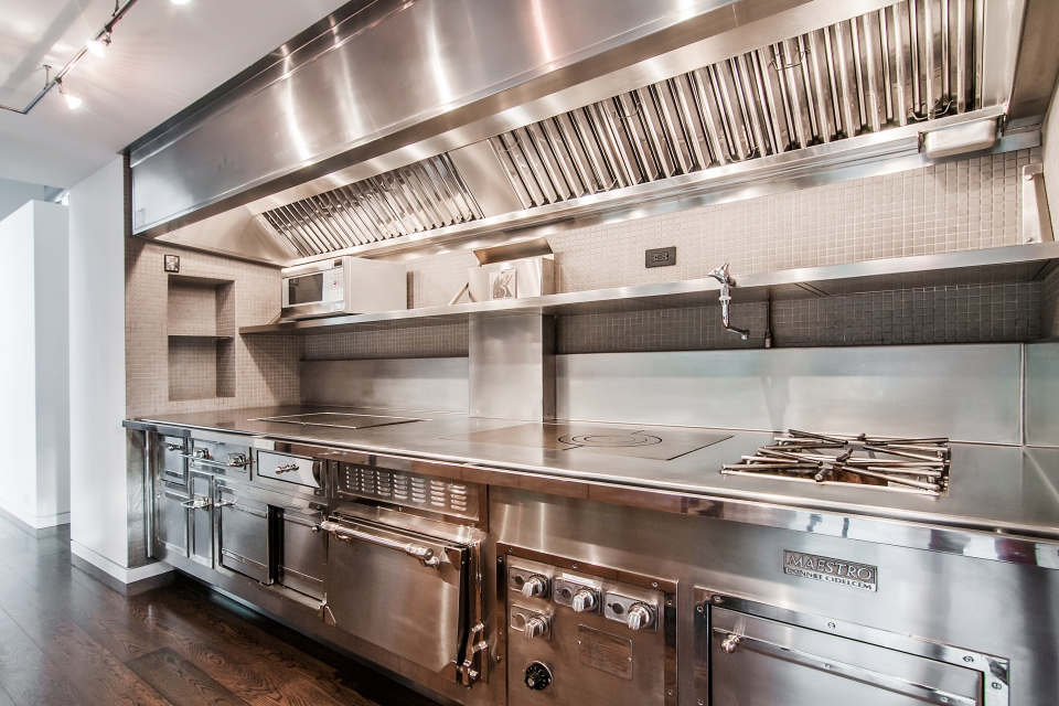
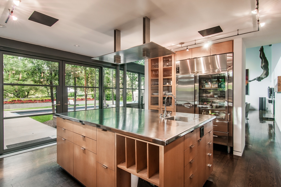
Not surprisingly for someone in the restaurant business, this place has one of the nicest kitchens I’ve ever seen.
Here’s the other side of the kitchen, and a conspicuous shot of that sculpture again:
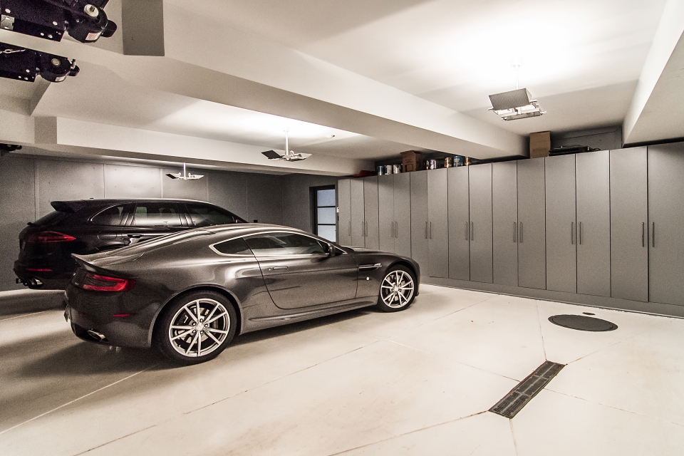
And of course what rich person’s modern home listing would be complete without the obligatory shot of the pristine garage with their sexy luxury cars?
Okay, back to the sculpture again.
Also: I hear some of you on this site like… stairs?
All right, let’s close it up with yet another shot of that sculpture.
There are lots more great photos on the virtual tour. Just beware, that link auto-plays a dumb video by default. Click “Photos->All” on the upper-left to stop the music and get to the pictures.
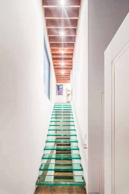
“Like” stairs? Yeah, sometimes. Like these stairs? Oh.Hell.No.
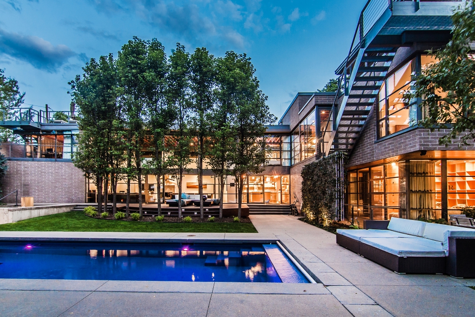
Lots of mid-century vibe here. For me, it’s a lot of mid-century school vibe. The boxy form, the horizontal band windows, the gray-brown brick, the heavy steel railings and exterior staircase make me feel like I’m back in elementary school. They’ve done it quite well, but it still gives me flashbacks. Maybe younger folks who attended more modern schools (and weren’t bullied) wouldn’t have the weird deja vu.
One mid-century school feature is a real problem – a flat roof. In Denver? Really?! Sufficiently structuring it for snow loads needs deep pockets, which apparently Mr. Chipotle has, but it’s still an odd choice. As are the floating brick exteriors, as in Redfin’s Pic 3. I’m not sure if I’d be more nervous walking under that overhang or attempting to tend to the fireplace while Miss Swan Diver looms over me. The bricks sit on a steel shelf cantilevered from the main structure. It’s done all the time, so is known to be safe (if done properly and not at all in earthquake territory). But it still bothers me. It’s also not an “honest” use of material. There’s no way brick should be able to “hang” anywhere. So why not use large, yet thin stone slabs? Their dimensions don’t suggest load bearing capacity and pretty much anyone can figure out the slabs are held in place by brackets on the back. A larger, aka worse, example is next to the outdoor dining area. That even heavier load of bricks seems propped up on a single spindly steel post.
Elements of he kitchen and main bath are also problematic. Doesn’t matter how chic it’s supposed to be, I’m not bathing in a steel cow tank. At first I thought, at least there’s a neat gas fed rock fireplace next to it. But no, it’s a… planter. That looks open to the sky. In Denver. ‘Kay… Since a hot bath before bed is not on my agenda, I might want to head down to the kitchen for a midnight snack to help me relax. But wait! That stove… “complex.” OMG! It’s actually a T-1000 Terminator in disguise!! AGGH!!! So, loss of appetite and ability to sleep.
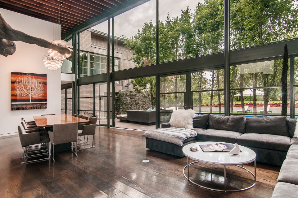
Compared to all this the other two points I noticed pale in comparison. That shaggy sofa in Pic 5? Massive dust catcher and thus massive allergy inducer. On the upside, pet hair – not a problem anymore. Either way, it probably doesn’t convey. (They’re welcome to keep the brown glass… hippo?… on the coffee table, too.) But the interestingly placed shower in Pic 21 does convey. All that money and they don’t bother to give a person showering a privacy wall. Go figure. At least there’s a door between the bed and toilet.
I think if it weren’t for the use of this particular mid-century furniture and accents (Pic 4, 10, 19) I’d like it a lot better. I do like the interior volumes and flow of space and I actually really like the minimalist clean lines of the outdoor entertaining areas. The impact of forms, colors, and element placements are well balanced without seeming either too sparse or too busy.
Hey! That brown glass hippo is my favorite thing about this place! :)
I’m totally with Emerald63 on that stairway — not. a. chance. And that guest bedroom or whatever it is with the shower right next to the bed and just opposite a wall of windows that looks out onto — a brick wall and metal stairway. For the love of Mike, why? If I went to visit someone and they put me up in that room, I’d think they didn’t like me and were looking for a way to end the friendship.
And, maybe it’s just me (I can’t stand tile countertops in the best of circumstances), but that master bath is horrible — $4 million house and you cover almost every surface in the master bath with cheap-looking blue tile? Yecch.
I hop they don’t throw stones…..?
@Colleen: At least passersby won’t. The place is hidden behind quite tall hedges.