Park your butt and get some work done.
I have to say, I don’t really understand the point of photos like these that almost exclusively feature furniture, decor, and other items that won’t be sold with the home.
Cool table! Now I’m totally going to buy this home!
On the other hand, when this is the most exciting shot of the home itself that you can come up with…
I can see why you would prefer to feature the decor instead.
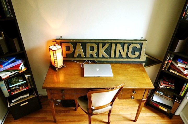
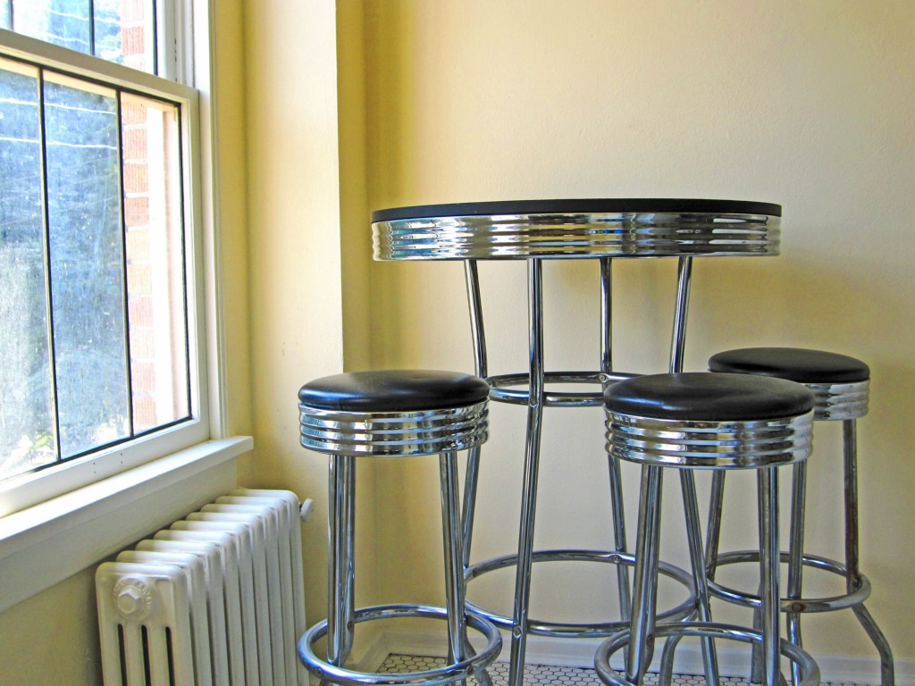
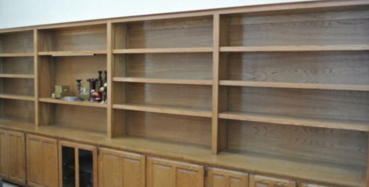
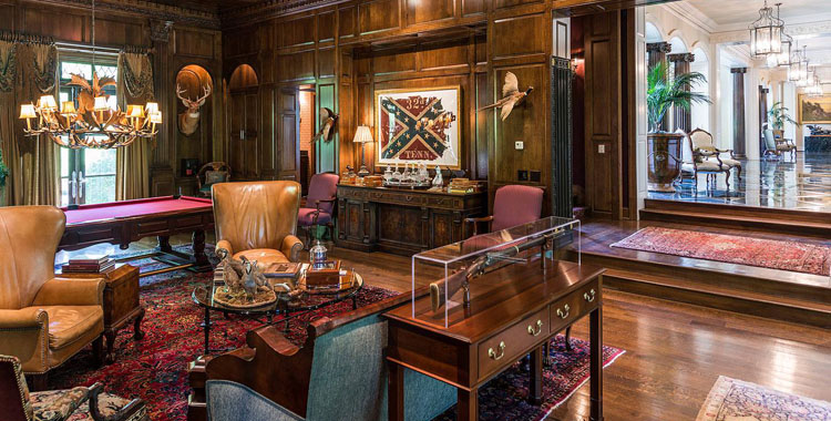
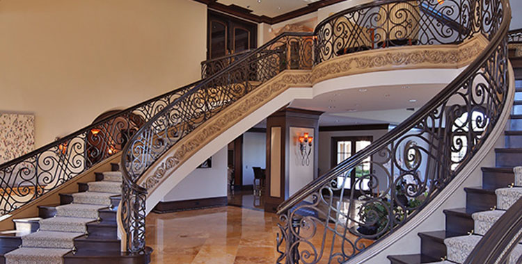
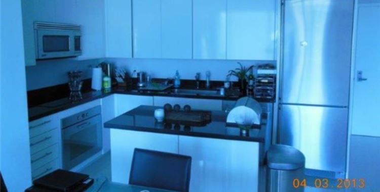
Perhaps it’s so small that you really can’t get anything in the picture except the furniture. Not even the fish-eye lenses can make the lack of space appealing.
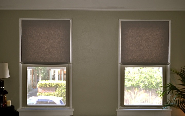
The windows look like half-lidded, sleepy eyes. Even the house itself is bored with its own dull interior.
@Frodo: I was thinking the same thing – the place is too small. When there’s no there there to back into, so you can take a picture, there’s not much you can do except take close up photos.
I was pleasantly surprised that there were a few shots at the listing that show rooms to some degree, although it’s still obvious the place is small. Even if it didn’t actually say 700 sq ft it would be obvious. Which once again brings me to Emerald’s Tired Old Mantra…
They want HOW much for that tiny dot of a place AND monthly HOA dues???!!! Given it’s been on the market for two YEARS I think it should be obvious the THREE previous price changes made throughout the listing history don’t begin to make the place acceptable to anyone. Woops.
@Denita TwoDragons: And yet the interior has nothing on the exterior for dullness. At least you can sex up an apartment’s interior once you move in (that is, if you have any money left over). But the exterior? You’re stuck with it. And this is a heck of a bowzer to be stuck with. :\
I do like the detail work inside – the tile work, glass front cabinets, and hardwood floors. But I can only imagine admiring the details would lose its appeal once you’d bumped into something for the umpteenth time in your dinky micro-partment.