At first I thought the building was called “ACES.” I think that would have been a better name. Anyway, what’s with the dizzying shot looking straight up the side?
I especially enjoy that they followed up the straight-up shot with this equally-dizzying straight-down shot shot floating over the parking lot later in the set.
Turns out tall buildings are tall. Who knew?
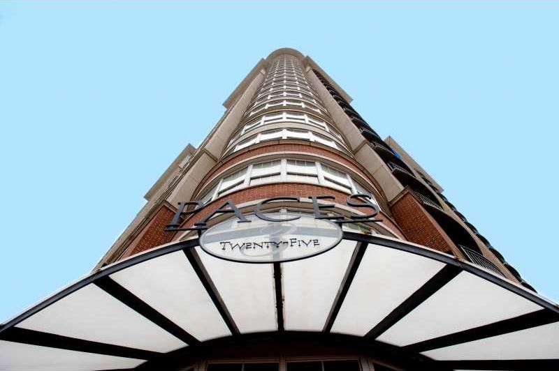
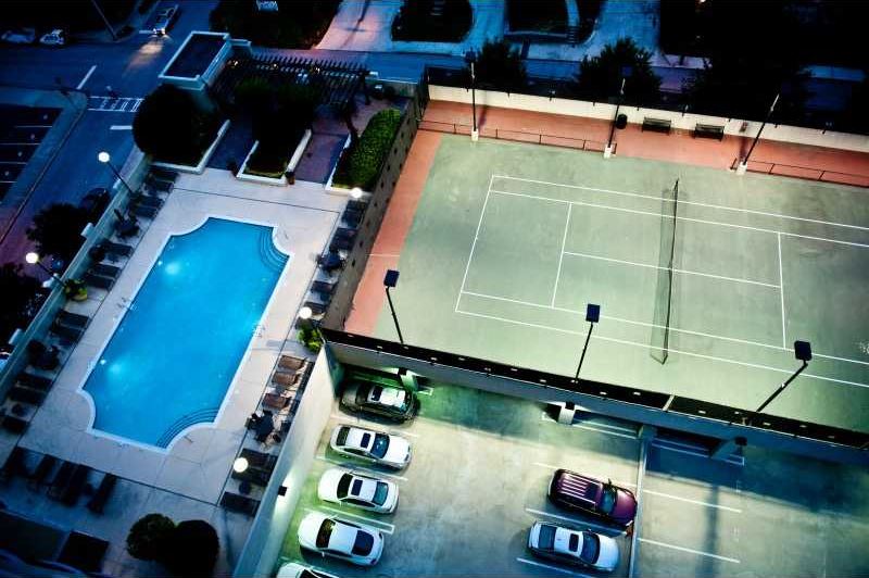
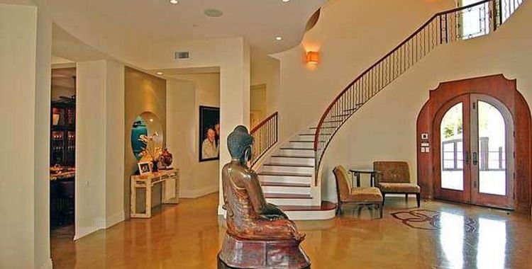
I’ve looked up, I’ve looked down, I’ve looked around… this is a *nice* place. For the hefty price you do get a decent amount of space (over 1400sq ft) and *2* parking spaces. Never underestimate the value of reserved parking in an urban setting. The neighborhood seems to be coming along, too. A few small older buildings but a number of multistory buildings under construction. A potential problem – the streets are narrow and in need of paving. Perhaps the city is waiting until construction is done. Or perhaps Atlanta lets its streets go to pot (holes) at an inordinate rate. If it’s a universal problem, more’s the pity. If not, then the moneyed folks in this tower will get new paving in due time.
As for the apartment, not bad. Lots of windows, a semi-open layout. A nice sized master bath, unlike the master bedroom which is a bit tight, as is the kitchen. For the money the kitchen should have been roomy enough for more than one person to move around comfortably. If there’s no way to enlarge, I’d remove the back splash portion of the wall next to the living room, but leave cabinets above to act as a semi-divider. With the more open feel I’d take the sink to the outer corner and angle both it and the inside corner of the counter top. I’d leave the dishwasher against the long wall and would move the stove there too. I’m wary of no free horizontal space next to a fridge or a stove, a place to set down heavy or cumbersome things, things that are hot but done cooking, or things you don’t want getting warm next to a hot oven. Even if none of this is possible (which it ought to be as a condo), I’d think again on the sky blue back splash. It’s kind of a weird color that doesn’t go with anything else. I’d go with a neutral color – gray, silver, black, or white. Given the mottled granite counter I’d personally choose a light to medium gray.
The only other thing that needs addressing is the lack of shade at poolside. It’s a lovely pool with nice potted plants and bushes, but no shade in Atlanta? Ouch. Street view suggests the pool is atop a 3 story parking deck so there’s no room for tree roots. But a jaunty tarp or a pavilion would work. Better still, an open pergola with container grown vines twisting through it. Wisteria would be nice. :)
I dunno. Maybe it’s my basic reluctance to consider living in Atlanta, but the money-shot “views of the city” (complete with “lit at night”) seem made for visions of asteroid strikes.
@anodean: Wait… what?
@Emerald63: Oh, sorry, rambling. I mentally christened picture #10 (view of city off patio) as “the Money Shot,” suspecting that the realtor meant the aspirational buyer to imagine he might someday sit there dreaming of empire whilst sipping the displayed wine… and then there was picture #18, same view of the city, lit, among dramatic twilight clouds.
Unable to imagine yearning to rule Atlanta, I guess my mind naturally turned to whether the place seemed at safe enough distance from a Hollywood-type asteroid strike…
@anodean: Ah, understood.