Not the craziest taxidermy room we’ve seen, but it’s definitely up there near the top.
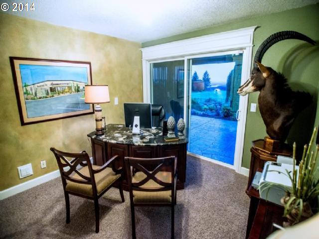
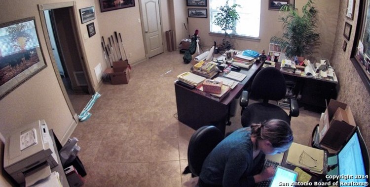
The great part about this one is how that room doesn’t show up until the 11th photo in the set. Every other photo before that is of a fairly tame home, with only one clue you get before that is the office antelope.
Wait, office antelope?
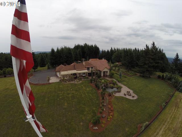
I’m definitely also a fan of the bendy flagpole.
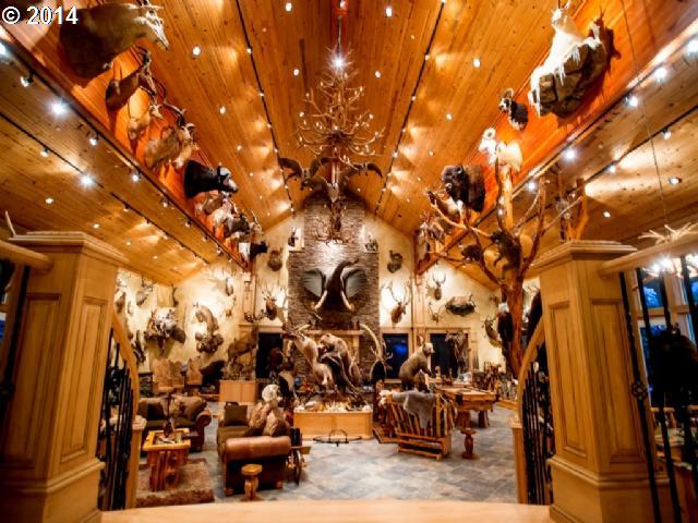
An elephant head… with tusks… seriously? Well, we now know what happened to that part of the poor guy.
Aside from the kinds of trophies in the “trophy room”, it’s an intriguing buy. From what I can see, the main house is nice.
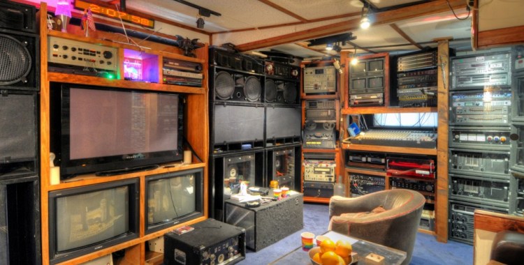
But what I find the most interesting is that the additional buildings could serve any number of business endeavors. I think it likely that the selling owner used it as a taxidermy shop… or maybe an armory… or both. I could dream of many a business venture here: high-end automobile restoration, recording studio, video production, custom finish carpentry, software development, leadership development center, high-end custom clothing design…
@Frodo: I’m at a loss to explain the elephant head myself. It’s illegal to buy/sell/import elephant ivory and it’s illegal to own it in some circumstances. I can’t imagine anyone would go to the trouble of installing fake tusks on a real elephant head, especially since even killing an elephant would imply having “harvested” the entire animal, tusks included. It could be an older taxidermy sample, but it would have likely had to have been with the same owner for a looong time, otherwise it would have been illegal to purchase it. I honestly don’t know if there are exceptions to any of legal restrictions other than being grandfathered in, but I would hope the pictures and house tours might prompt someone to call wildlife officials to check it out. The only true exemption would be if it’s simply not real at all, but I wouldn’t bet on it.
If I ever have a taxidermy room in my house, it will be filled with things like this: http://www.drseussart.com/taxidermy/
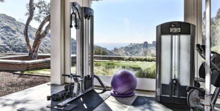
The exterior on the private side of this home, with terraces, lovely plantings, and a waterfall, is lovely, but I’m don’t care for the entrance side being tailored to vehicles rather than people. The main entry is via the port-cochere and there’s too much asphalt and concrete visible, extending over to and around the large outbuilding. The latter problem could be remedied with additional landscaping. The one thing I’d change on the private side are the mini-Stone Henge benches by the fire pit. I’d prefer something that’s comfortable.
Despite the attractive outdoor areas, the inside, while nice, seems to have missed its potential. Most of the rooms are fairly small and the ceilings are too low for an upper-end home (Pics 6-10). The living area in Pic 5 is pleasantly larger, but the only true exception is the grisly “trophy room.” (It’s telling that it’s the one room to which they devoted so much space. Without so many examples of the current owner’s need to dominate and kill everything on four legs and two wings, as well as continuously prove that prowess to himself and everyone who comes into his “castle,” it would be an awesome space.)
Sadly, the decor is mostly tan and brown. *…yawn…* The few other colors are also warm, even heavy, which doesn’t help with the small room/low ceiling feel. Yet there’s sensory overload in some areas due to excessive use of patterns. For example, in the entryway (Pic 4) we see tiled floors and stairs (with large lighting features on every riser, alternating sides), white wainscoting with mill-work outlined sub-sections, more sub-sections on the brown newel posts, fancy iron stair rails, popcorn textured ceiling, sponge applied mottled paint job (seen throughout the house), and a door with multiple sections of windows, each of which, along with the two sidelights, have multiple small panes of beveled glass. While it’s not nearly as overwhelming as some spaces we’ve seen, it could have been better pulled together for a much nicer result. The door is the best feature; while it’s “busy,” set among better chosen materials it could have made the entire space a real winner.
The one other odd thing I noticed is a total lack of cornices, not even minor 2″ ones that could work with the low ceilings. The abrupt, unheralded change from wall to ceiling adds to the oppressive feeling. Even a tiny cornice might provide a sense of transition and ease the effect. As I said… missed potential. In spades.
@Marty E.: Oh Marty, those are awesome! Hey, would it be OK if we make up some plush jackelopes to hang, too?
Very cool! It puts the “zoo” back into “Seuss”.