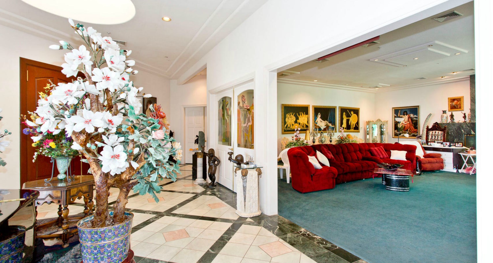
Is that a velvet sofa? Of course it is. This is Vegas, after all.
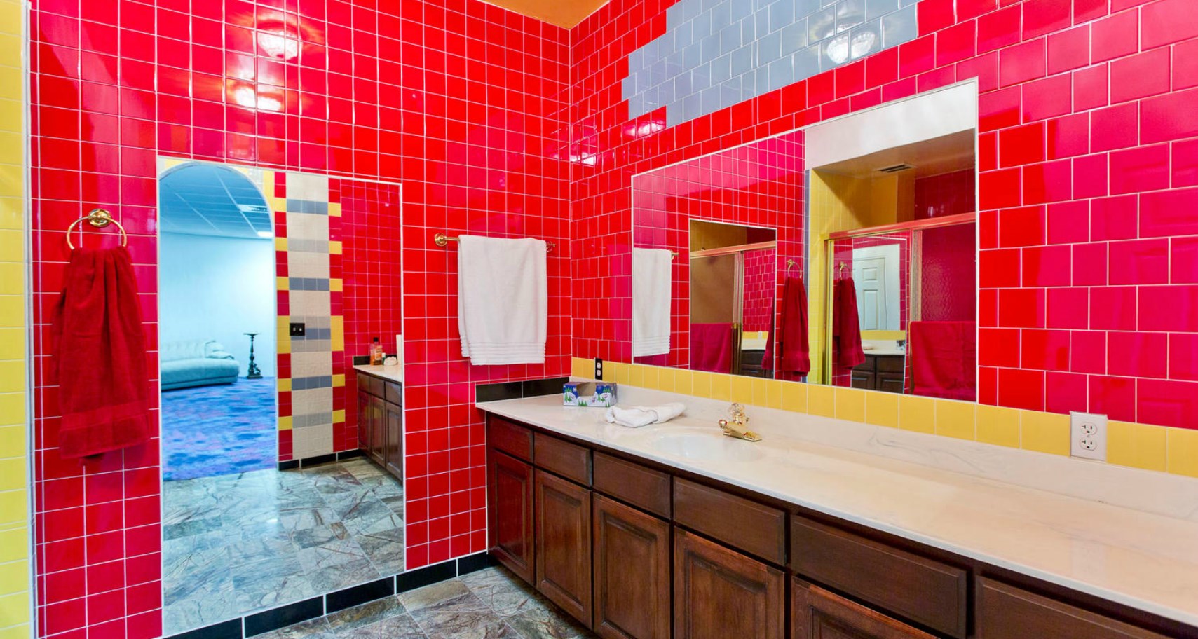
Wow, that bathroom. And what’s with the patch of blue/grey tiles above the mirrors on the right?
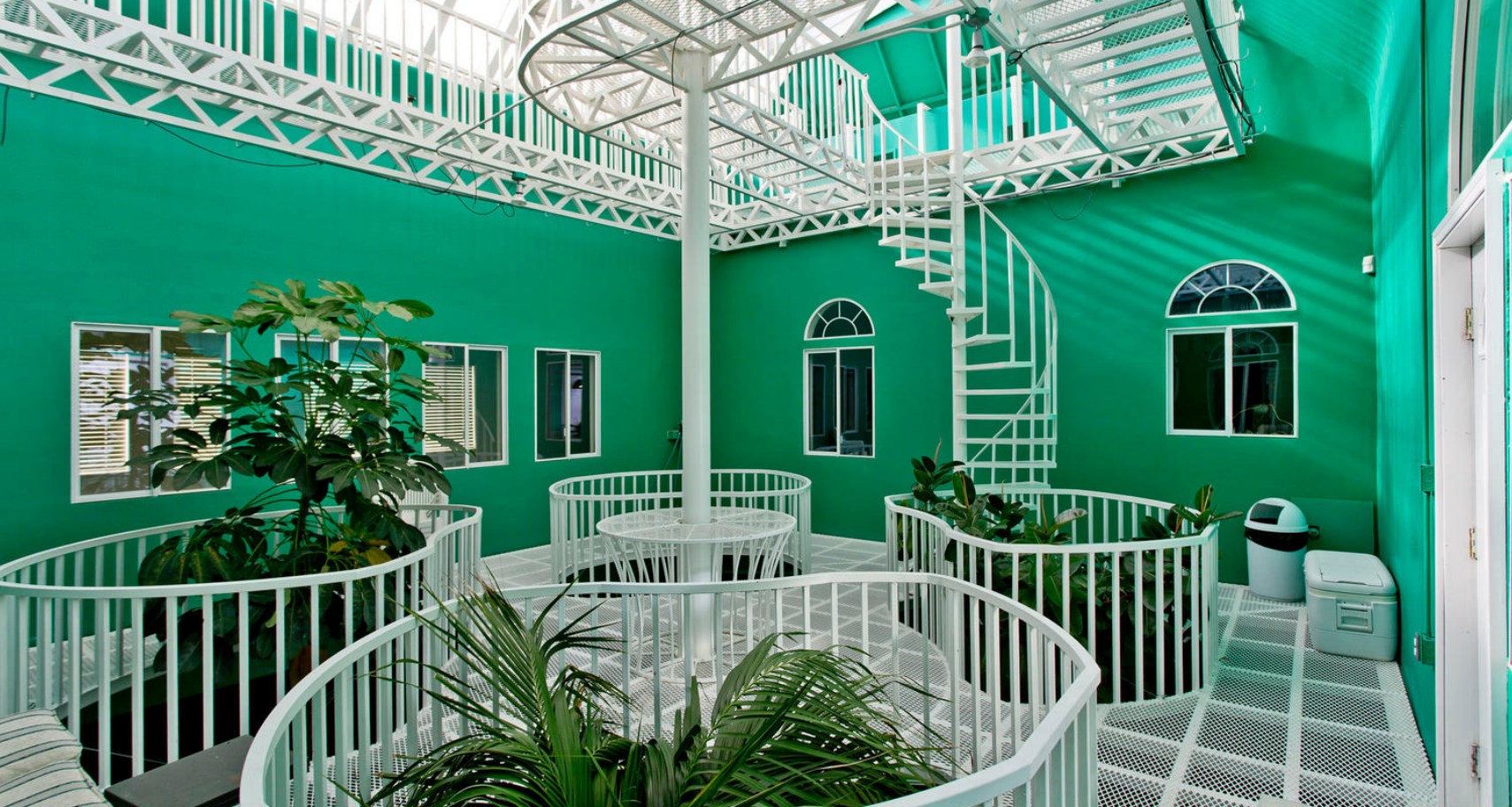
I’m trying to figure out the purpose of this green room.
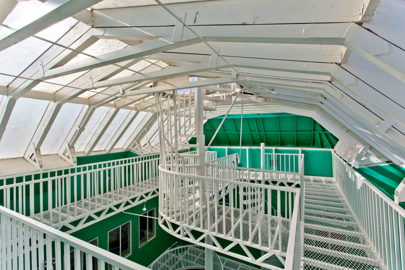
I mean, scaffolding is cool but… why? Oh right. Vegas.
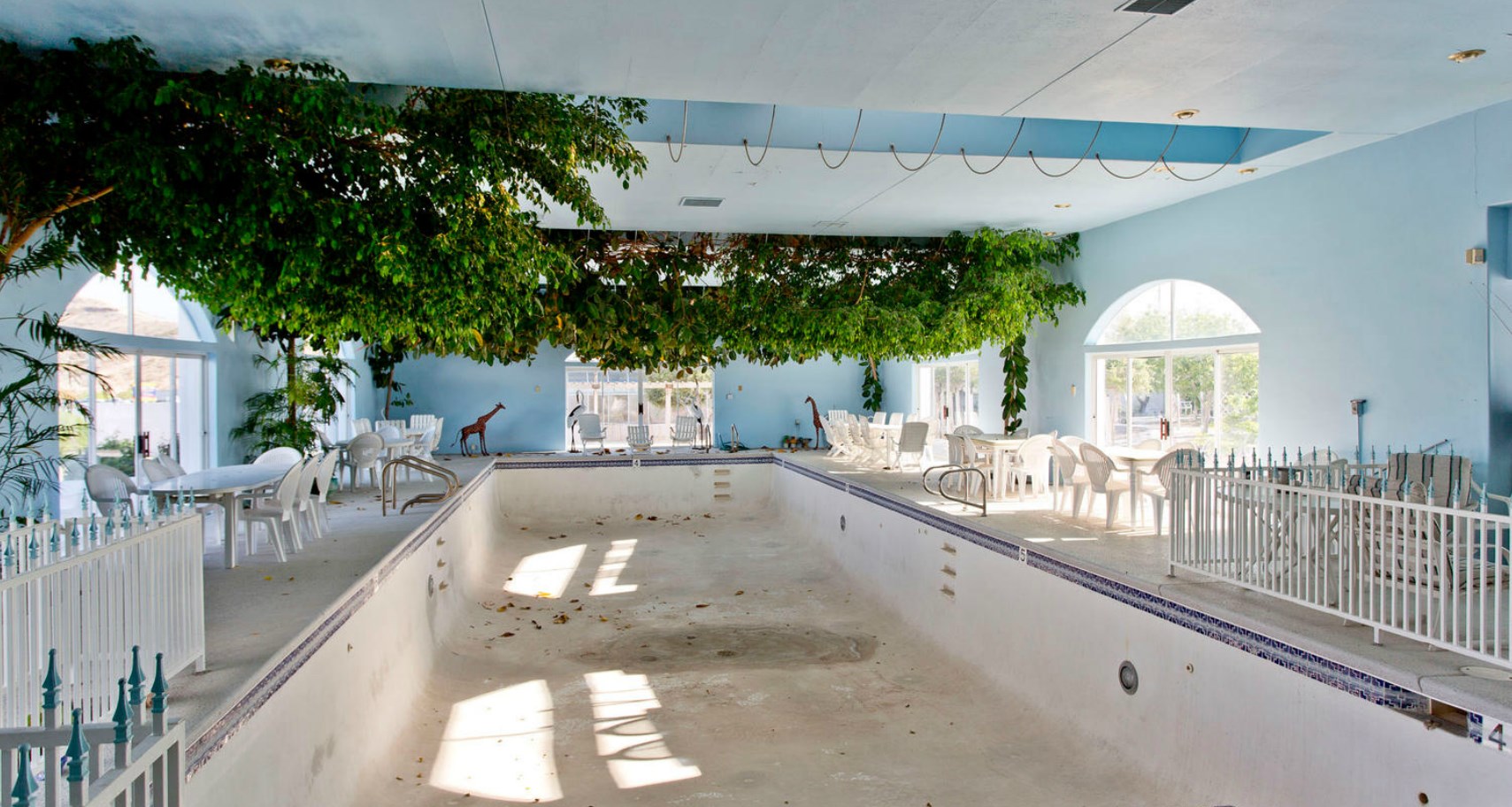
Cool pool room, but… um… I think you forgot a crucial ingredient.
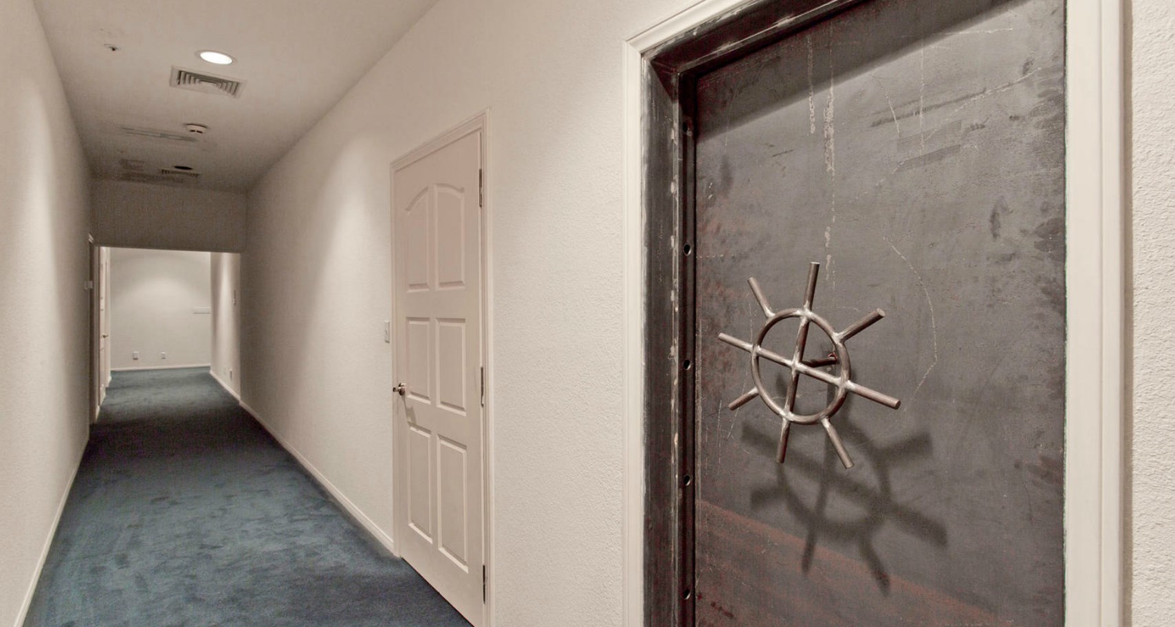
Okay what? You can’t just show a sweet vault door like that and not even mention it in the listing? What’s behind there?
Lots more photos (but no more answers) on the “virtual tour.”
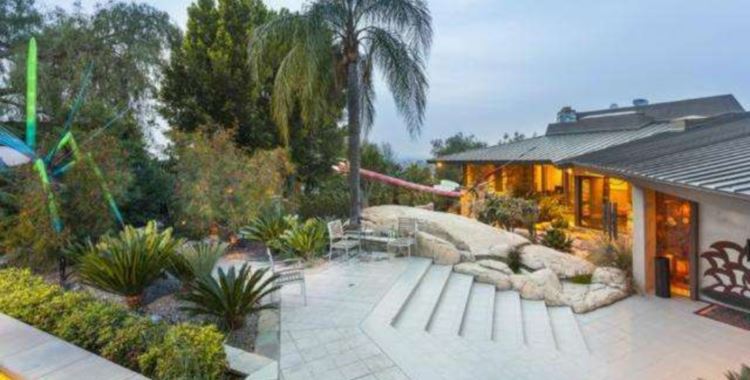
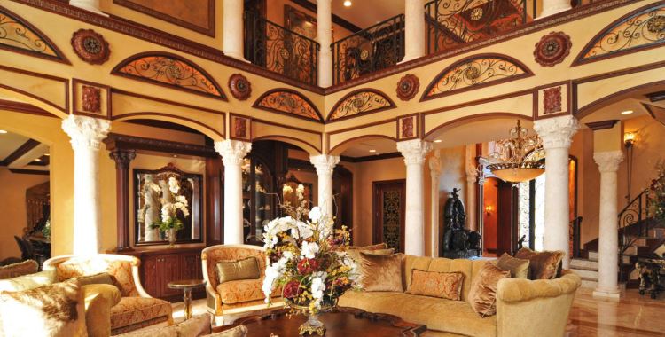
Good Lord, take me now! This place is hideous! I don’t even know where to start. The best space in this whole place is among the arboreal garden in the back. Let’s see if I can list the crap I hate:
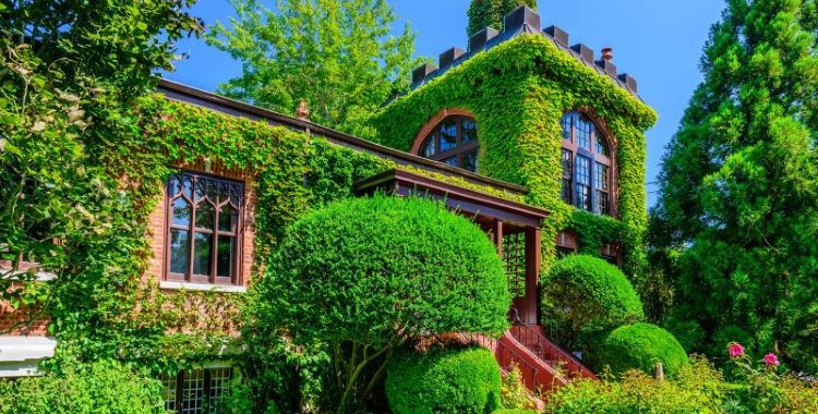
Photo 1: Drive-thru entrance with a concrete front yard. This shouts “institutional” to me: maybe a funeral home or an overpriced restaurant. And what’s with the outside spiral metal staircase next to the entrance? How do you even get on the thing if you wanted to?
Photos 3 and 13-15: Yes, a lovely view of the crappy desert from the metal crow’s nest. Bleah! Although, nice attempt at offsetting electrical costs with solar panels and solar water heaters.
Photos 4-8, 22 Am I in a Greek or Italian funeral parlor, or what? All this weird seating, closed doors, and random art from God-knows-what back room, cellar, or attic of an artist that needs to get a day job. What’s up with the carved tusks around the fireplace in the front room? And that fireplace is a waste of good marble.
Photos 9 and 10 – The need to start form scratch on the kitchen. I also noticed that they like urns. Whose ashes are in those? I hope that’s pepper on the food.
Photo 11 – What’s up with the doors that close all over the place? Why the ugly blue carpet all over the place? That’s a nice shade for an accent color somewhere, but not underfoot I think. Did they really have to do the lace doilies all through the china cabinets?
Photo 12 – As open as this weird, roofed, reeeeely greeeeen, courtyard is, it makes me feel claustrophobic.
Photos 16 and 17 – The plants are coming down to drown me! Good thing the pool is dry. It needs to be cleaned and refinished. The hot tub is disgusting. The painted ironwork can go and the heated water feed from the roof should be replumbed. It would be nice if the ceiling in there were raised and skylighted. So, basically, the whole thing needs to be different.
Photo 21 – Someone likes their plants. Is that an AC unit or a humidifier on the greenhouse? Why are they shading the greenhouse? That seems counterproductive.
Photo 23 – Is that a youth room in the basement? Cheap furniture and storage for the crap that wasn’t good enough for the rest of the house.
Photo 24 – I like cool main staircases. This isn’t one of those.
Photos 25-32 – I’m trying to wrap my head around the utter horridness of the bedrooms. (When the carpet is brighter UNDER the bed…) When you won’t even take a photo of the shower and toilet in the red monstrosity.
And the vault door: why even have a vault door that doesn’t lock?
I’m just amazed that someone was tasteless enough to dream up this place. I guess, you’re right: chalk it up to Vegas.
It’s a cool house that badly needs a remodel. FYI: For those of us who live in Vegas, we love the desert and think it’s beautiful. Don’t be haters because you don’t live here, too…we know you’re jealous.
@Frodo: So, Frodo…. tell us how you really feel. LOL! Honestly, dude, you sound like you’re chaneling… me. You sure you’re feeling OK? hehehehe……….
I was gonna say there aren’t enough words in the English language to describe how bad this place is, but Frodo both beat me to it and disproved the theory. Whoo-ee… someone’s going to interior design hell when their time comes, which hopefully will be before they “sin” again.
I agree it looks institutional, but I was thinking more of a defunct motel, like the kind sometimes used for Grade B porn (so I’m told). Who cares what the background looks like, right? I don’t know that I’ve ever seen a combo of both so much blobby overstuffed modern “comfort furniture” (like comfort food – no discernible quality yet still as reassuring as a baby blanket) and the typically craptastic French Rococo schlock to which those with money, but no taste, tend to gravitate. Speaking of money but no taste, it also explains how these people know of art, yet know nothing about art. Art isn’t just “a thing” you have; there’s an additional art to choosing and displaying it as well, something missing here, with stomach churning results. Just like the result from the drop panel ceiling and celestially patterned carpet in the round bedroom…
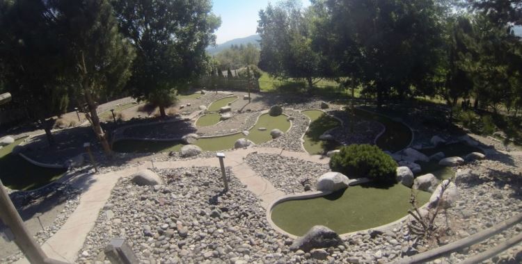
Equally unappealing are the outdoor areas. Whydid they include so many photos of trellised gazebos with nasty peeling paint? Or of the pool, when they didn’t even bother to sweep the leaves off the (interior) deck? And what’s with the sidewalks criss-crossing barren ground? What’s the point? It’s not like you’re gonna kill the dirt and rock if you walk on it. Was this area once covered in plantings? If so, the shade shield over the greenhouse makes sense. Ever try keeping green things alive under the desert sun?
I must admit two things: 1) I would dearly love to own any of the giant amethyst studded geodes seen lying about, and 2) I kinda like the floral appliqued toilet, although the companion sink is a little overdone. Also, I figured kids would really go for the playground equipment, until I remembered the typical daily temps much of the year in Vegas. At least the slides aren’t metal.
I suppose we shouldn’t really be surprised by any of this. After all, that’s what Vegas is famous for – people spending outrageous amounts of money with absolutely nothing to show for it.
@K: Not jealous, K, though I wholeheartedly agree there is definitely a special ethos in desert settings. Despite seeming harsh, there are things about it that are incredibly delicate and that messing with tends to destroy. All the more reason why less-then-half-assed pieces of crap like this one should never exist.
I may not personally be able to take the climate, but I don’t think less of those who enjoy it. So long as they don’t cram it full of said crap… ‘Cause that’s just wrong anywhere.
@Emerald63: I think I was channeling you. I have to say, though, if this place doesn’t put you in the mood for a design tirade, i don’t know what will. Even a rank amateur like me can point out the poor taste in a place like this. I kept thinking to myself, “Someone thought that looked good?”
@K: You got me on that, K. I’m definitely not a desert dweller. I lived in the desert of Saudi Arabia for a short time and have been to the desert of California. Between the two, I prefer the desert of Cali. Nevertheless, I will always be at home in Appalachia. Give me lush hills any day.
That home was there when I was a kid and I’m 53 now. It was a long way out of town back in the day so I imagine the view from the tower was nice back in the day. The history of the homeowner/home is old Vegas lore. Some of us know it just like we know the history behind the underground home here. Or the Liberace home. Liberace had similar taste and his home was interesting but gaudy at best.As ugly as some think it is the history still delights some of us natives.