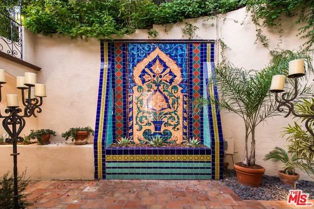
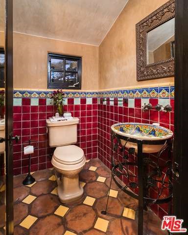
From the outside, it looks like an average home in the Hollywood hills. And granted, the tile-work does start out nicely enough with traditional patterns…
…and even traditional Spanish-inspired colors.
But then variations come into it.
More and different colors and patterns keep popping up…
…and popping out. Eyeballs, that is.


Well, I’d say it goes over the line in a few places, but not too awful bad. The places I don’t particularly like:
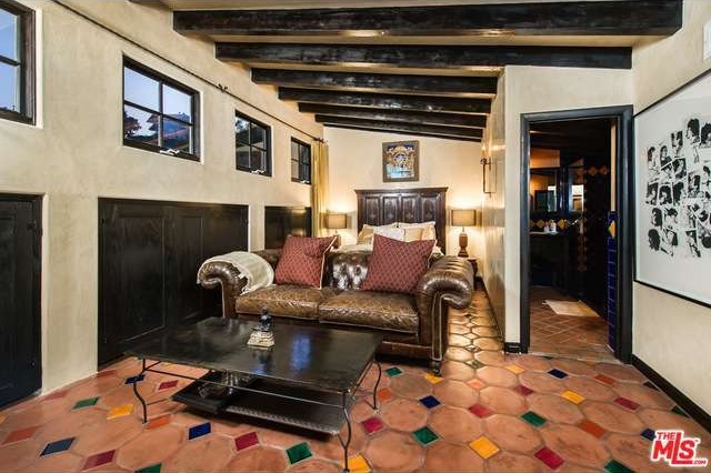
The octagonal/square tile floors. They’re okay, but I don’t prefer the color combinations. There is a sense in which the floor of the weird, skinny bedroom in photo 22 reminds me both of the colorfulness of some of the places south of the border, which is more nostalgic, but also of a jester’s outfit, which is more, well, o.O.
The dining room seems a bit heavy.
The kitchen seems narrow and inaccessible. Open up the dishwasher and it looks like you would have trouble getting from one side of it to the other.
(Odd crystal skull on the table in photo 21)
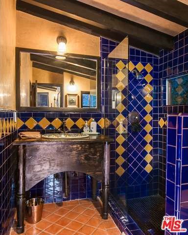
The bathroom with the dark blue tiles in photo 23 just looks scary.
Otherwise, the rooms are smallish, but livable. I have larger rooms in my little country cottage.
@Frodo: I agree, there are some really nice things about this house, especially the outdoor areas. As for the small rooms, the house was built in 1925 in the Spanish Colonial style. Traditional materials limit room size due to wall thickness and available spanning material, except in VIBs (aka very important buildings) like churches.
The thing that gets me about Pic 22 is the weird room and furniture layout and how tight it makes access to the bed. Unless that’s some hefty photo distortion, it looks like you’d have to thread your way back there or maybe crawl over the sofa. Definitely another (O_o) thing.
Agreed on the dishwasher but at least they were able to set back the stoves!! Hadn’t even noticed the crystal skull, but it’s fitting given the South-of-the-Border theme. (Well, “south of” these days.)