Check out those groovy ’60s curves.
Inside is just as groovy, if perhaps a bit of a brick overload…
Those large white overhangs certainly make for an interesting effect inside.
If you live in the Chicago area, don’t expect this unique home to host an open house:
PRIOR TO CONFIRMED APPT PROSPECTIVE CLIENTS TO PROVIDE PROOF OF FUNDS TO LISTER!
You can tell they are serious because of the all-caps and the exclamation point.
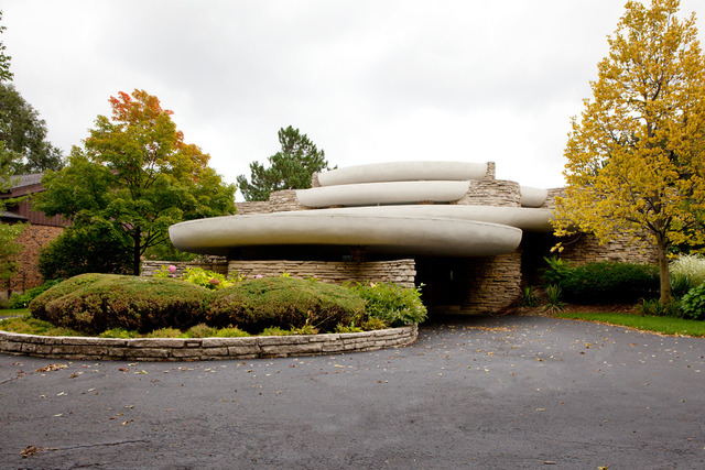
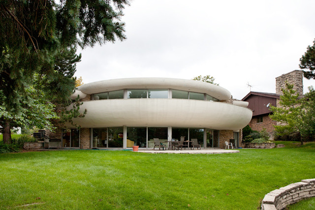
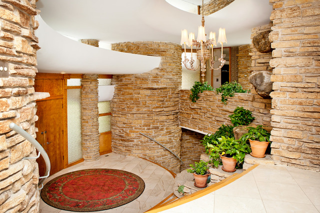
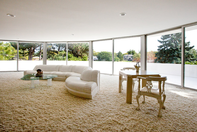

Far out! This pad is a stone groove. But- “PROOF OF FUNDS”…? For real, man? Bummer. Nobody but nobody wanna crash here if that’s your bag.
Well, there are flakes in every bowl; I can dig it.
Maybe they fearin’ some flower child might drink all the moo juice or lay a five-finger discount on their cool threads- and before callin’ the fuzz they’d have to stash their grass! Bad trip, man; I’m hip.
Now; can I make the scene, or will I have to beat the feet? They wanna see some bread; hmmm, I got $27. Outta sight! It’s a happenin’ thing…
Marty, them white overhangs just blow me away, but I wonder who gets the job of cleaning the dead bugs off the tops? What a drag! That would not be psychedelic.
Maybe we just hold a Chinese fire drill in that twitchin’ driveway? Then boogie on outta there.
@Paradox: …I wonder who gets the job of cleaning the dead bugs off the tops?
I was thinking precisely the same thing as I imagined that the money might be for paying someone to dust up there week after week, month after month, year after year…
Also, you’re bringing back memories with the old ’60s lingo there. I was born in the ’60s but much of the hip talk from the era was still being used in the ’70s where I was old enough to understand it.
Damned interesting looking place. I’d love to learn more about the structural aspects. Still, it seems at some point since ’66 someone less than clear on the design concept got in there, which will necessitate a tear-out to fix. For example, the kitchen looks entirely wrong for the house, as does the classical motif above the vanity in Pics 18 & 20. Also, the bedroom suite in Pic 15, though lovely in itself, is wrong for the house and it looks built in. Less problematic is the Louis Somethingth dining chairs with the WTF chandelier above, along with the entry chandelier. But hey… the entry is so awesome it (almost) makes up for it. Overall, things would look a lot better throughout with suitably modernish contents… things that pick up on the warmth of so much field stone (nope, not brick) juxtaposed against the curves and sleeker mid-century aspects.
Not sure about the location for something this show-piecey, though. It might well have been an exclusive locale back in the day. It still is to a degree out back. But the property fronts onto a major artery (there’s a ‘designated snow route’ sign at the curb), with a couple of apartment blocks, a gas station, and a large cemetery within half a block. (To be fair, the cemetery looks to have been their first.) The true downer, though, is that O’Hare Airport is about 2 miles away. I gotta wonder what the low flying jet harmonics have done to the horizontal concrete elements.
@Paradox: “What a drag! That would not be psychedelic.”
It’s cool, man… just check out the bar stools in Pic 10 and breeeethe slowly. If you’re still doin’ a downer, meditate on the street name a while… you’ll feel a lot better.
@Frodo: “I was thinking precisely the same thing…”
We practical-minded folk must drive ’em crazy sometimes…
I was old enough by the mid-sixties to be jealous that kids just a couple years older could partake of the excitement. In my case though, simply missing a haircut was reason enough for a truly epic parental freak-out. :-)
@Emerald63: “just check out the bar stools in Pic 10 and breeeethe slowly…”
I see what you mean. Not out of place in this house at all- *at all.* And until you mentioned it I had completely overlooked the synchromystic possibilities of the street name. The compass used to design this place would have held no mysteries for him, but if the new buyer’s name happens to be Kelley… :-D