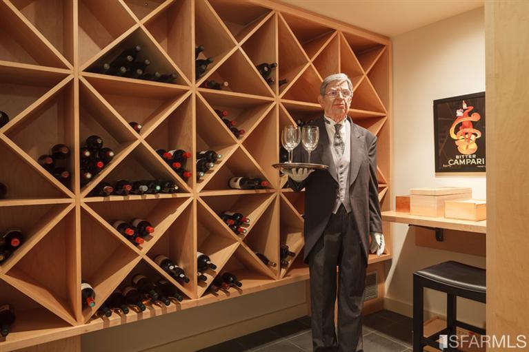
I’m not sure which thought is more creepy, that they would photograph the wine cellar with a butler posing at-the-ready, or that it might actually be a wax sculpture, not a real person.
Personally, I’d much rather have C-3PO serving my wine than the guy in the first photo.
What I love about these photos is that it’s really not clear here whether the home owner is actually trying to sell their ($12M) home, or if they just wanted to show off all their cool toys online.
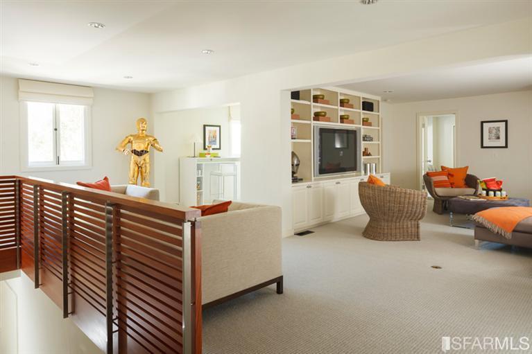
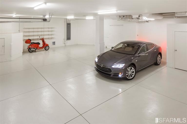


At first, I could imagine C3PO running errands on the orange scooter at the behest of the android sommelier. Then, as I paged through the photos of this utterly soulless property, there was this Parson’s Project soundtrack:
Remember your daddy
When no one was wiser
Your ma used to say
That you would go farther
than he ever could
With time on your side
With nothing to say
And no one to say it to
Nothing has changed
You’ve still got it all to do
Surely you know
The chance has gone by
So I tried to think about C3PO on the orange motor scooter again. It didn’t work.
Anodean… soulless? Really? Isn’t it odd how two people can have very different reactions to the same property? I was very impressed with the combination of clean, modern lines without the often attendant sterile feel. That is, sterile in the sense of no color, no texture, cold, hard surfaces, etc.
Having reread your thoughts, though, I looked again and did notice a distinct lack of artwork, which is strange given the location and price. As for interior design, though, for me this strikes a nice balance of providing a variety of visual input without detracting from stunning views. It would have been so easy to do so by either gussying up the place too much or going the opposite direction and being so minimalist as to make the interior space look completely alien to the lovely, lush exterior surroundings.
That said, I googled the designer mentioned in the listing, Holly Hulburd, and did find that some of her other projects were indeed modern to the point of being sterile. A few, though, were like this one – to my eye, a good blend.
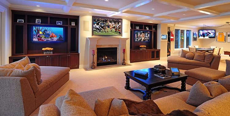
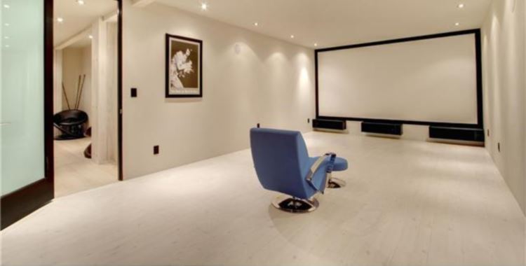
So, a couple of details… In Pic 13 there are a number of shelf niches surrounding the big screen. Each one has the exact same… thing… in it, a low boxy item with what looks like a shallow bowl on top of it. WTH are those things? And in Pic 18, just inside the bedroom door is another… thing in a niche. It looks almost like a giant, odd-shaped version of a spiral fluorescent light bulb, a home version of some nifty Art Deco neon fixture. Again, anyone know for sure what it is? I’d hate to think it was a bug zapper in a house that nice (and pricey).
I think I started to lose it at picture 7, the repetitive dish display in the dining room. Everything so color co-ordinated, identically shaped, evenly spaced… same as what you noticed in pics 12-13, all those shelves filled with the same color co-ordinated bowls-on-boxes, pic 14, all three desks with the same pencil arrangements atop mystery boxes and silver paint cans in all the same shelves… everything looks dutifully placed, spaced, measured, colored, and waiting. Waiting for the lively magic that all this gorgeous living space was supposed to confer… waiting… waiting…
@anodean: I see your point. For me, though, that’s just the ridiculous aspect of staging for a photo shoot. No one is going to actually live like that or, if they do, they certainly deserve the “soulless” description. The only examples I know of that ever kept the (literally) picture-perfect “don’t you dare mess with my creation” original configuration are by Frank Lloyd Wright. He wasn’t soulless, he just wanted everyone else’s soul to be exactly like his and those who didn’t agree be… damned.
@Emerald63: Par usual, you put your finger on the effect: for me, this place fell into the “uncanny valley” – in this case, between staging and real life. There were many touches that suggested actual living (wine butler, C3P0, orange scooter, Foosball, dishes on the table, comfortable colors), but they were all seamlessly absorbed (if not trumped) by aspects one could only excuse as staging… and the more I looked, the less I could find any clear line of demarcation. This left me to imagine an owner who had simply had the place furnished and waited for the magical feeling such possession was meant to confer…