Commentary by submitter Emerald63. Thanks!
If you like beige, do we have the house for you!
There are even two – count them two – added bonuses! In addition to a bevy of beige, there’s a great gray room included at no extra cost!
And… there’s a premium small child and pet entertainment system!
Lookit, Fluffy… watch it go round and round!! An amazing setting for the whole family!
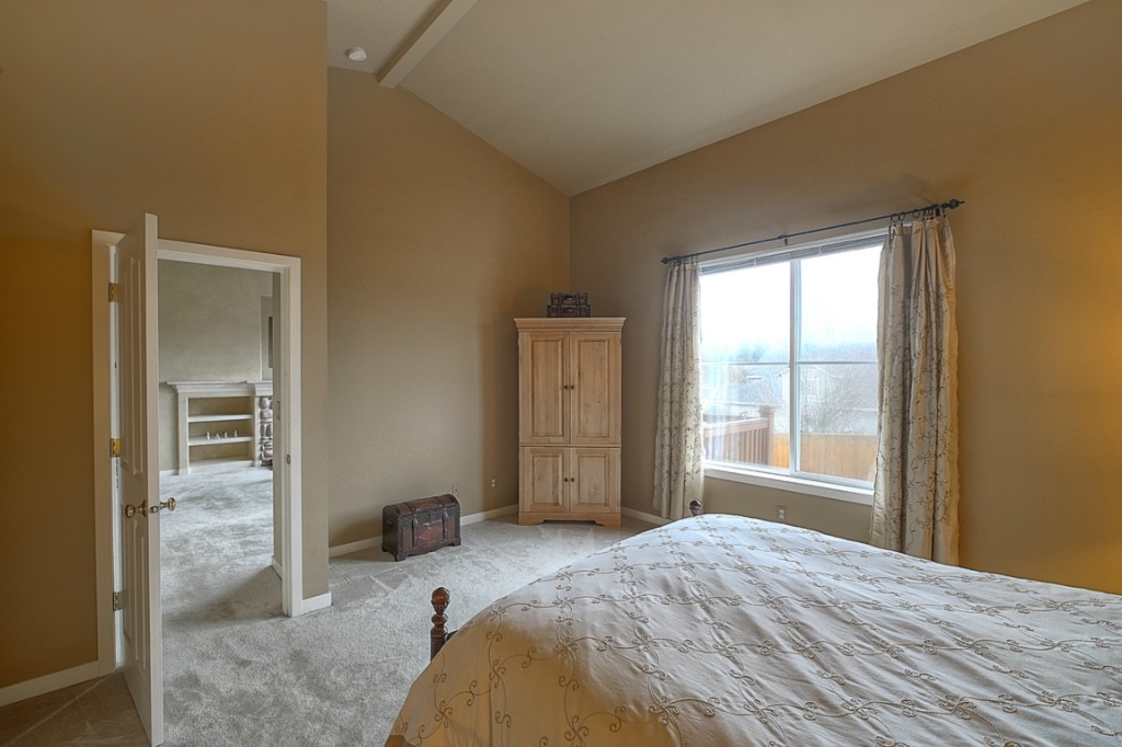
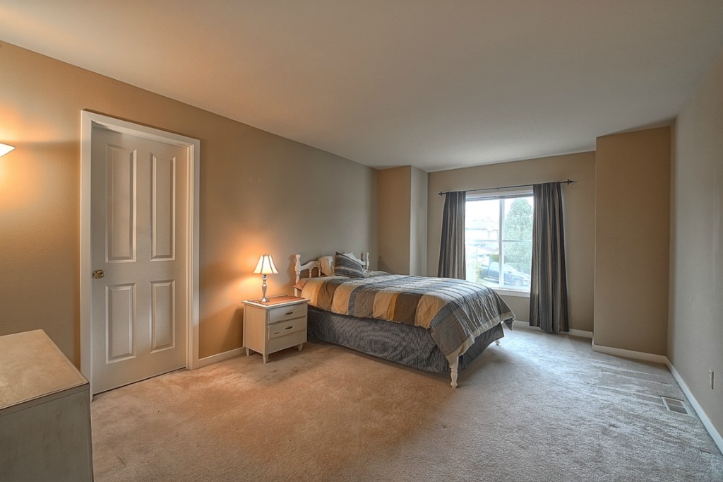
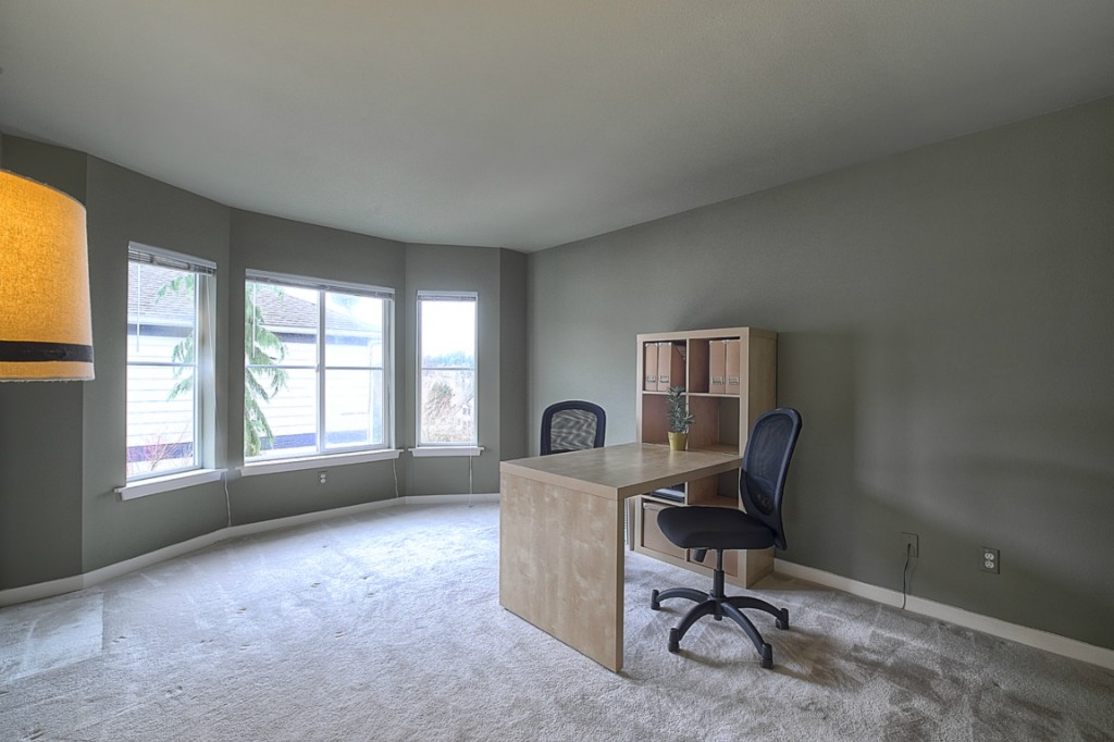
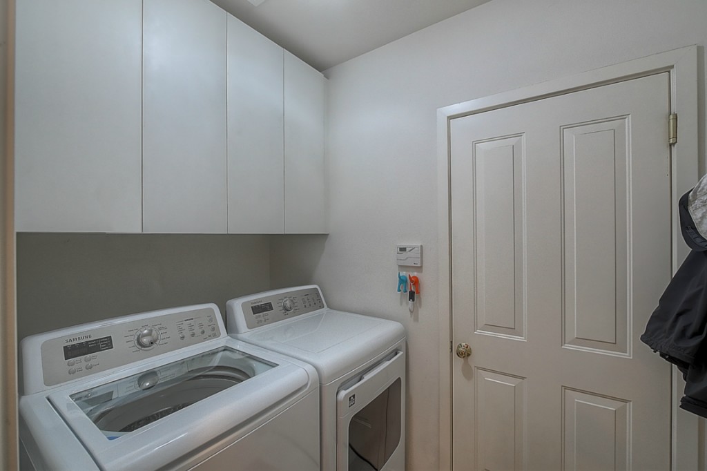
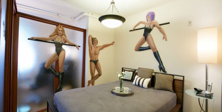
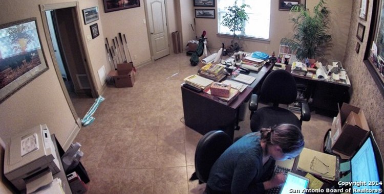

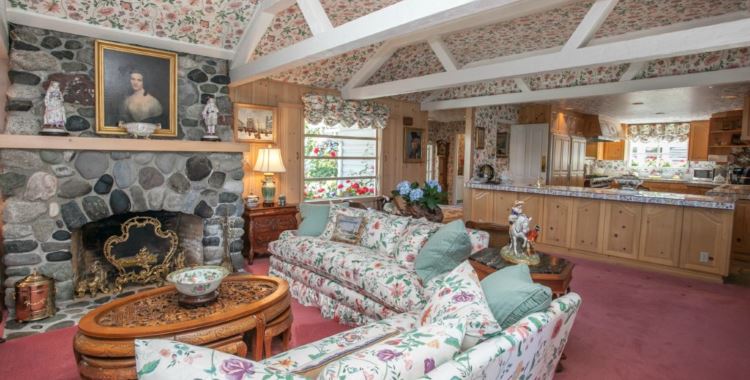
It’s like a hundred different shades of beige. I feel like I need to turn up the contrast on my monitor. We’ve got to draw some other colors out of that somehow.
@Frodo: Or how about just “50 Shades of Beige”? AKA, “The Most Boring Bedroom Setting EVER”? I wish I knew more about the book; I sense there are loads of humor opportunities in comparing it with this place.
OK, in all fairness the house is really nice; the spaces are good, there’s plenty of them, the exterior is quite attractive, etc. But as in so many other cases it’s the dang decor that kills it as an eye grabber. I pity the listing photographer because there was just nothing to work with… If it sells to someone with, you know, actual interest in life, I’d love to see what they do with the place.
I didn’t spot it until the next to last picture – then I had to look at ’em all twice again to believe it: this place isn’t (just) receding-beige-boring, it’s huge. All the furniture gets lost because the proportions are spectacularly out of normal scale. I swear, there is not a single standard door or window in the place – every opening is custom-ordered, half-again-as-wide. When you look at the exterior shot, your eye involuntarily “corrects” the perceived size of the place by assuming the windows are standard – they’re not. I bet your jaw about drops when you walk inside and it hits you – and I bet it echos, too. The place is simply not normal human scale; it’s like someone took the original blueprints and ran them through an enlarging copier.
Honestly, I thought it was some photographic effect, but I don’t think so. You guys who would know should check me on this. :D
@anodean: I’m afraid I’m not seeing what you are. I’ve looked through all the listing pics again and I actually do see camera distortion. For exampled, compare Pics 9 and 11. Pic 11 makes it look like there’s a lot of room between the area with the sofa and the dining area. But then look at Pic 9. Not so much. Also, look at the top of the washing machine in the last image above. It looks positively rectangular, while the dryer – right next to it but in the background – seems more normally proportioned.
I grant the place is roomy, but at 2300sqft it still falls in the average size category. As for the doors seeming “half again as wide” I think they’re probably somewhat wider, as they would be to better accommodate wheelchairs, but again with some of what seems to be excessive width contributed by camera distortion.
I’ll grant you that the living/dining area seems most “normal” of the lot (maybe because it’s got the most open space), but try this.
Look at picture 3. See how very large the window is? It’s the same size as the bed, and both are much larger than the reasonably sized end tables. Then look at picture 4, and compare a matching super-size window to the door – and note how both door and window dwarf the wardrobe in the corner…
After bouncing between those long enough to really grasp the size of that window, go back to picture 1, look at the window over the garage and ask yourself how big that window is… because there are eight lights in that garage door; it’s a full double garage that somehow looked like a one-and-a-half.
Fun house! :D
Then, for giggles, it’s practically a funhouse! :D
Proportionally a funhouse, yes. But definitely not chromatically.
I do now see what you mean about how the windows seem over-sized, especially compared to the wardrobe in Pic 4. However, I’m still seeing some distortion on the periphery of both Pic 3 and 4. In 3, look how narrow the bed looks compared to its length. Then look also at the perspective of the right hand end table to the one on the left. See how the one on the right, in the foreground, seems bigger, even taller, than the one further back in space? For me, that and the not-quite-right proportion of the bed, is what makes me think at least some (though perhaps not all) of the foreground window to the left seem much bigger than it should.
This “smaller in the middle, drawn-out on the sides” thing may also explain why the wardrobe of Pic 4, smack in the middle, looks so tiny. Another possible example – in Pic 6, see how small the exterior door in the middle of the pic looks compared to the interior door to the right? It’s almost always true that exterior doors are wider than interior ones. But not here. Also, look at the flooring in Pics 14, 15, and 17. Unless this really is a funhouse, there’s no reason I can think of for it to look that way without camera distortion.
Sorry, don’t mean to belabor the point. And I’m not claiming to be right, either. Just relating what my sense of the situation is.
Left out a word: the right hand end table… compared… to the one on the left.
@Emerald63: You’ve got the eye and the experience, so I know you’re right about the weird lens effects: the pictures as such just aren’t “right.” I wonder if a semi-talented photographer may have thought this fish-eye effect was the only way to yank the capriciously outsized parts of the room into the picture… yielding a true fun-house effect indeed. :D
(and sorry about my doubled ending above)
@anodean: It’s weird – it’s sort of a fish eye lens effect, but not the usual obvious one. It’s more subtle, so I wonder if the lister didn’t see it, or felt it was close enough to the real thing that it didn’t matter? Even more strange, a fish eye lens is usually used to capture all of a very small space on camera. But the rooms in this place are quite obviously not small.