From submitter Emerald63:
Can’t get enough loudly patterned floors, walls, and even ceilings, not to mention built-ins? Well come on in!
I like how every room has a wildly different pattern and theme than the one before. No wait did I say I like that? I meant it’s sort of hideous.
Okay well aside from the floral wallpaper I actually do kind of like the kitchen.
Whoa. That is some entryway. Dig the velvet yellow throne. Yikes.
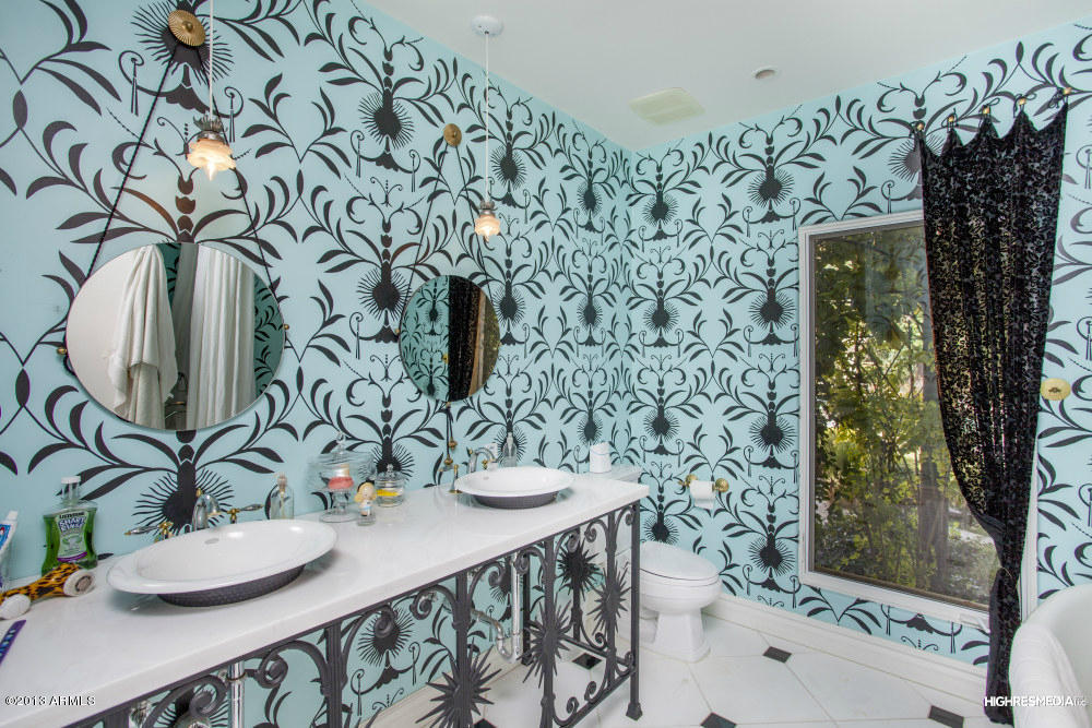
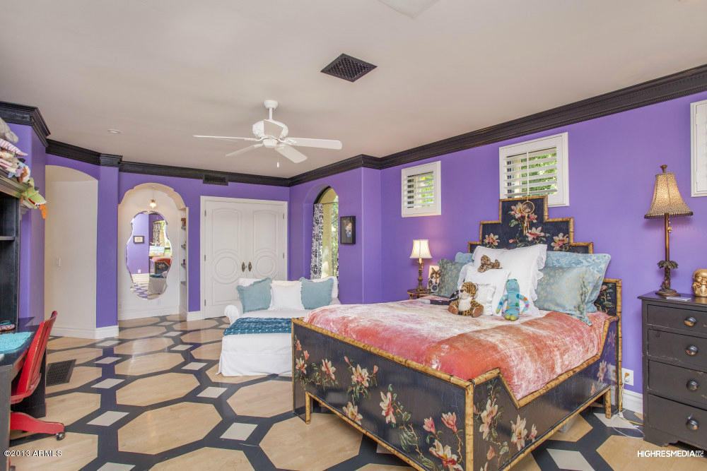
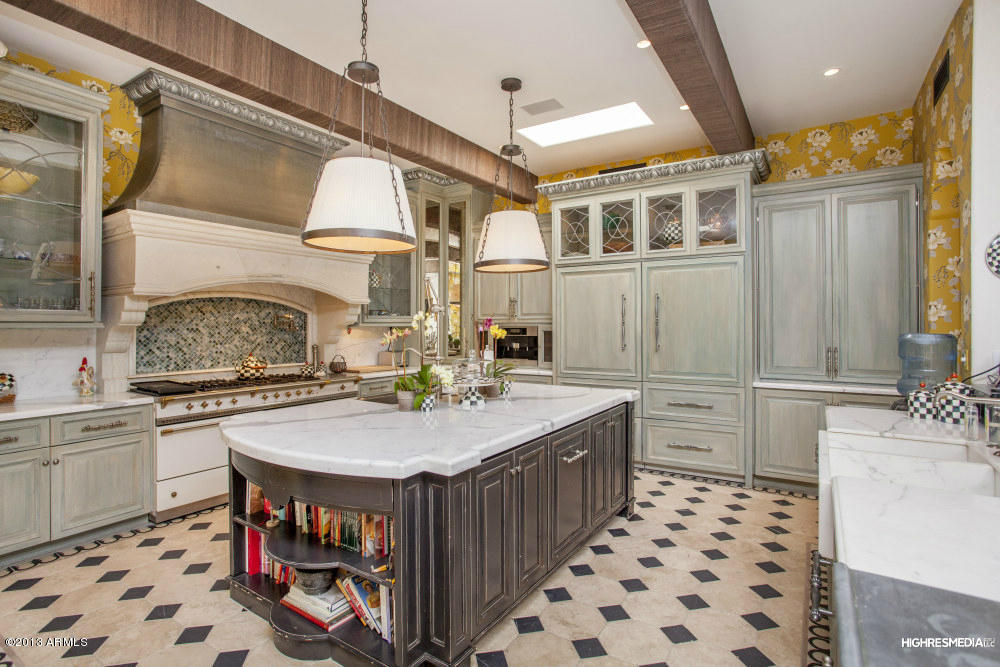
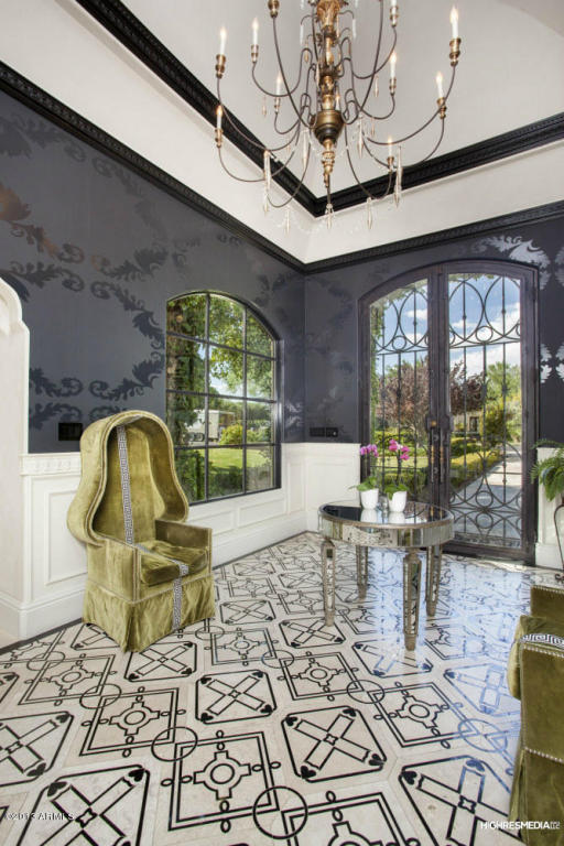
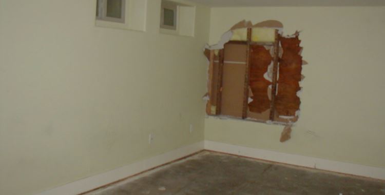

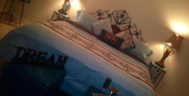
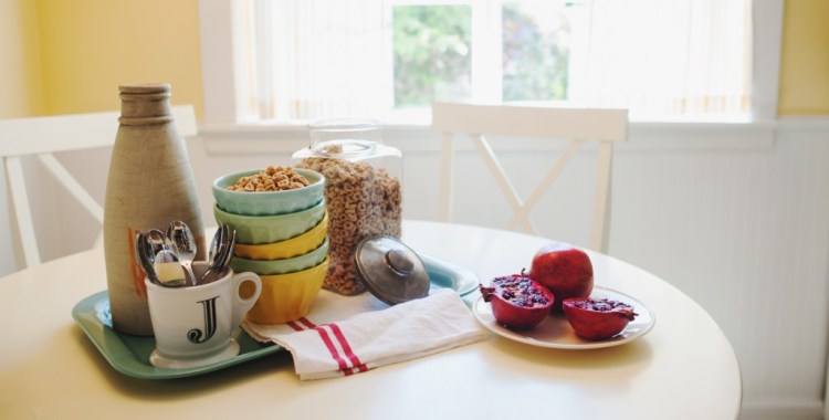
As usual, the house itself is nice; it’s the decor that leaves a lot to be desired in many rooms (but not all). I might hold onto my sanity if I kept to any one of them indefinitely, but having to move between them? ~shudder~ The visual chaos is intense.
Although… I do like the detailing in the living/dining room (Pics 5, 6) That’s a gorgeous Art Nouveau inspired lighting fixture. Never seen anything quite like it before. And parts of the other living room (Pics 10, 11, 12) are cool, like the full-on Medieval chandeliers and the articulated ceiling. But not the loud drapes and screen on the built-in, despite being set in a near-monochromatic room.
The kids’ rooms are pretty spartan, but the ones in Pics 24-28 make up for them. Maybe they don’t want the little ones having nightmares? Even the patio set is loud, but under the endless Arizona sky it works. The patio area is lovely, especially the Alhambra-like fountain and tiles. Except… I never knew there were bocci ball courts at the Alhambra.
Ow!
Ever wonder whether these properties are for sale because the unfortunate owner had to let the interior design contract to their cousin/paramour/drunken brother-in-law… and it was just easier to put the whole thing on the market than to say anything about it?
@anodean: Easier, and a whole lot more profitable. Huh. My relations usually cost me money…
…and the sale is pending!